
Correlational Designs
When scientists passively observe and measure phenomena it is called correlational research. Here, we do not intervene and change behavior, as we do in experiments. In correlational research, we identify patterns of relationships, but we usually cannot infer what causes what. Importantly, with correlational research, you can examine only two variables at a time, no more and no less.
So, what if you wanted to test whether spending on others is related to happiness, but you don’t have $20 to give to each participant? You could use a correlational design—which is exactly what Professor Dunn did, too. She asked people how much of their income they spent on others or donated to charity, and later she asked them how happy they were. Do you think these two variables were related? Yes, they were! The more money people reported spending on others, the happier they were.
More details about the correlation
To find out how well two variables correspond, we can plot the relation between the two scores on what is known as a scatterplot (Figure 1). In the scatterplot, each dot represents a data point. (In this case it’s individuals, but it could be some other unit.) Importantly, each dot provides us with two pieces of information—in this case, information about how good the person rated the past month (x-axis) and how happy the person felt in the past month (y- axis). Which variable is plotted on which axis does not matter.
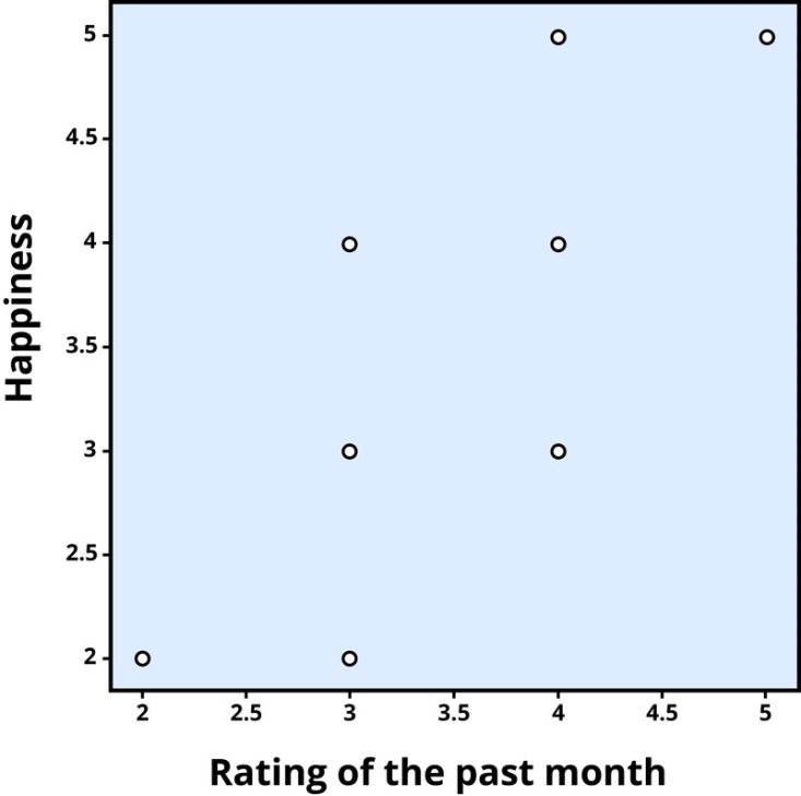
Figure 1. Scatterplot of the association between happiness and ratings of the past month, a positive correlation (r = .81). Each dot represents an individual.
The association between two variables can be summarized statistically using the correlation coefficient (abbreviated as r). A correlation coefficient provides information about the direction and strength of the association between two variables. For the example above, the direction of the association is positive. This means that people who perceived the past month as being good reported feeling more happy, whereas people who perceived the month as being bad reported feeling less happy.
With a positive correlation, the two variables go up or down together. In a scatterplot, the dots form a pattern that extends from the bottom left to the upper right (just as they do in Figure 1). The r value for a positive correlation is indicated by a positive number (although, the positive sign is usually omitted). Here, the r value is .81.
A negative correlation is one in which the two variables move in opposite directions. That is, as one variable goes up, the other goes down. Figure 2 shows the association between the average height of males in a country (y-axis) and the pathogen prevalence (or commonness of disease; x-axis) of that country. In this scatterplot, each dot represents a country. Notice how the dots extend from the top left to the bottom right. What does this mean in real-world terms? It means that people are shorter in parts of the world where there is more disease. The r value for a negative correlation is indicated by a negative number—that is, it has a minus (–) sign in front of it. Here, it is –.83.
The strength of a correlation has to do with how well the two variables align. Recall that in Professor Dunn’s correlational study, spending on others positively correlated with happiness: The more money people reported spending on others, the happier they reported to be. At this point you may be thinking to yourself, I know a very generous person who gave away lots of money to other people but is miserable! Or maybe you know of a very stingy person who is happy as can be. Yes, there might be exceptions. If an association has many exceptions, it is considered a weak correlation.
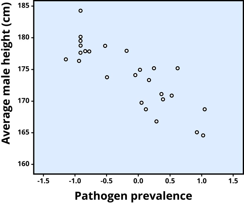
Figure 2. Scatterplot showing the association between average male height and pathogen prevalence, a negative correlation (r = –.83). Each dot represents a country. (Chiao, 2009)
If an association has few or no exceptions, it is considered a strong correlation. A strong correlation is one in which the two variables always, or almost always, go together. In the example of happiness and how good the month has been, the association is strong. The stronger a correlation is, the tighter the dots in the scatterplot will be arranged along a sloped line.
The r value of a strong correlation will have a high absolute value. In other words, you disregard whether there is a negative sign in front of the r value, and just consider the size of the numerical value itself. If the absolute value is large, it is a strong correlation. A weak correlation is one in which the two variables correspond some of the time, but not most of the time.
Figure 3 shows the relation between valuing happiness and grade point average (GPA). People who valued happiness more tended to earn slightly lower grades, but there were lots of exceptions to this. The r value for a weak correlation will have a low absolute value. If two variables are so weakly related as to be unrelated, we say they are uncorrelated, and the r value will be zero or very close to zero. In the previous example, is the correlation between height and pathogen prevalence strong? Compared to Figure 3, the dots in Figure 2 are tighter and less dispersed. The absolute value of –.83 is large. Therefore, it is a strong negative correlation.
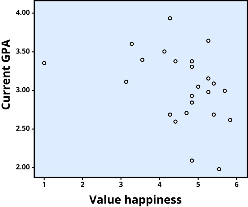
Figure 3. Scatterplot showing the association between valuing happiness and GPA, a weak negative correlation (r = –.32). Each dot represents an individual.
Can you guess the strength and direction of the correlation between age and year of birth? If you said this is a strong negative correlation, you are correct! Older people always have lower years of birth than younger people (e.g., 1950 vs. 1995), but at the same time, the older people will have a higher age (e.g., 65 vs. 20). In fact, this is a perfect correlation because there are no exceptions to this pattern. I challenge you to find a 10-year-old born before 2003! You can’t.
Problems with the correlation
If generosity and happiness are positively correlated, should we conclude that being generous causes happiness? Similarly, if height and pathogen prevalence are negatively correlated, should we conclude that disease causes shortness? From a correlation alone, we can’t be certain. For example, in the first case it may be that happiness causes generosity, or that generosity causes happiness. Or, a third variable might cause both happiness and generosity, creating the illusion of a direct link between the two. For example, wealth could be the third variable that causes both greater happiness and greater generosity. This is why correlation does not mean causation—an often repeated phrase among psychologists.
