Goodness of Fit and Related Chi-Square Tests
13 Frequency Distributions
13.1 Analyzing Distributions of Data
Throughout this text, we will focus on using frequency analysis and descriptive statistics. These simple but powerful analyses enable you to examine your data and identify patterns including the shapes and distributions of data, missing values, and outliers. Frequencies and distributions are important concepts in the quantitative analysis of data that underlie the overall statistical approach covered in this book. In fact, this approach is often referred to as “frequentist statistics” because it relies on frequencies to make inferences about the data. An alternative approach is called the Bayesian statistical analysis which relies on probabilities. While we won’t go into detail about the differences between frequentist and Bayesian statistical approaches, it is important to recognize that frequencies play a key role in the approach that we are demonstrating here but that a frequentist approach is not the only way to analyze your data.
A frequency is simply the number of times something happens. It could be, for example, the number of people with brown hair, the number of children in a family, the number of deaths in a hospital. It could also be the number of times an electrical signal with a given level of energy-intensity is recorded.
A distribution shows the relative frequencies of each possible value or category for a variable. Distributions are used to describe the organization or shape of a set of scores or values for a particular variable. If you studied statistics previously you are most likely familiar with the normal distribution or bell curve. What you may not realize is that distributions other than the normal distribution are also used in statistic analyses and that datasets can take the shape of these other distributions. For example, datasets that include only discrete scores ranging from 1 to 5 would not be expected to fit a normal distribution curve but would rather be compared to a categorical distribution curve – like the chi-square distribution or the Poisson distribution.
Distributions can be obtained by counting the number of events that occur or how many participants in a sample have a specific score on a questionnaire or measure (i.e., counting frequencies). For example, you might look at the number of patients presenting to the Emergency Department for different reasons: cardiovascular concerns, accidents, infections, reported symptoms. You might also consider responses to an anxiety questionnaire scored on a Likert scale (using discrete scaled scores) ranging from 1 to 5. You may consider reviewing the number of respondents in your sample had each possible score (i.e. 1, 2, 3, 4, or 5) – in other words, how frequent each score appeared within the total set of scores.
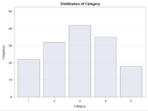
The following is an example of a table showing a frequency distribution for a set of responses to a categorical variable ranging from 1 to 5, and a graphical representation of the frequency of responses in each category. The Category Label is presented on the x-axis, and the number of responses—frequencies for each response are presented on the y-axis.
Table 13.1 Frequency Distribution For Categorical Responses
The PROC FREQ Procedure
| Category | Frequency | Percent | Cumulative Frequency |
Cumulative Percent |
| 1 | 22 | 14.77 | 22 | 14.77 |
| 2 | 32 | 21.48 | 54 | 36.24 |
| 3 | 42 | 28.19 | 96 | 64.43 |
| 4 | 35 | 23.49 | 131 | 87.92 |
| 5 | 18 | 12.08 | 149 | 100.00 |
SAS Code to produce the Frequency Distribution and Corresponding Figure
OPTIONS PAGESIZE=55 LINESIZE=120 CENTER DATE;

DATA FREQ13_1;

INPUT CATEGORY 1 RESPONSES;

DATALINES;

1 22

2 32

3 42

4 35

5 18

;

TITLE1 'TABLE 13.1. FREQUENCY DISTRIBUTION FOR CATEGORICAL RESPONSES';

PROC FREQ ORDER=FORMATTED;

TABLES CATEGORY/PLOTS=FREQPLOT;

WEIGHT RESPONSES;

RUN;
Figure 13.1 Frequency Distribution For a Categorical Response Variable
Frequency distributions are useful in describing variables, helping to identify errors (impossible values) and outliers, assessing how well a continuous variable fits the normal distribution, or to test hypotheses using specific statistical tests such as using a chi-square test to evaluate categorical variables.
Frequency & Distribution of a Count Variable
Count variables refer to those that simply tally the number of items or events that occur. For example, you might want to count the number of adverse events that occur when people take a medication, the number of times nurses wash their hands during their shift or the number of babies born in each month of the year. In health research, there are many items or events that can be counted!
Note that for a count variable, the values are arithmetically meaningful and represent the number of events or items for a specific variable– the count variable is quite literally storing the count of items of interest. Therefore, values differ by a magnitude and are meaningful. For example, 4 adverse events are twice as many as 2 adverse events.
Count variables are different than categorical variables.
Categorical variables are used when the researcher wishes to use numbers to represent different kinds of items or events. In the categorical variable the numbers are arbitrary. For example, hair colour could be coded as 1 = blonde, 2 = brown, 3 = gray, 4 = red, and 5 = other but it could also be coded as 11 = blonde, 22 = brown, 33 = gray, 44 = red, and 55 = other. The numbers representing a category label are not mathematically meaningful and do not represent the number of people with a specific hair colour. Of course, you can analyze the frequency of people with each response which we will cover later when we talk about categorical variables in more detail.
Working example to process a “count” variable
Let’s say we would like to take a sample of 50 families from a population of 1000 households in a small town and record the number of children in each household. Here we will create two variables, the first we will call “NKIDS” and the second we will call “HOUSEHOLDS”. The variable NKIDS is the categorical variable for the number of children in each household that we sampled, while the variable HOUSEHOLDS represents the number of response houses that report having a given number of children.
The Scenario
We arrive at the small town and knock on the front door of the first house. Below is the dialogue between the researchers and the respondents.
“Good day, we are Biostatisticians and we are conducting a study of the number of children in your family.”
“Oh we don’t have any children.”
“Okay, thank-you.”
We note that for Household #1 there are 0 children. We then knock on the front door of the second house.
“Good day, we are Biostatisticians and we are conducting a study of the number of children in your family.”
“We have 7 children. Would you like some?”
“No thank-you, but have a nice day.”
We note that for Household #2 there are 7 children. We then knock on the front door of the third house, and continue our process for each of 50 houses in the town.
In this example, the categorical variable is NKIDS and is considered the independent variable, while the continuous-discrete variable is HOUSEHOLDS and is considered the dependent variable – aka the measure of interest.
Since there can only be whole numbers for the variable NKIDS (i.e., you can’t actually have 1.2 children), the variable NKIDS is a discrete categorical variable, and likewise, because we are counting families on a whole number line (i.e. not partial families) then the variable NFAMILIES is a discrete random variable.
The frequency distribution recording sheet for this example is shown below. Notice that as a rule, we want to keep our variable labels at or near 8 characters so that HOUSEHOLDS is shortened to HSEHLD.
Table 13.2 Tally Sheet to produce the Frequency Distribution for Number of Children in Each Household Sampled
| Number of Children | Tally of Households | Frequency (f) | Relative frequency (f/n) |
| 0 | ||||| |||| | 9 | 9/50 = 0.18 |
| 1 | ||||| || | 7 | 7/50 = 0.14 |
| 2 | ||||| ||||| || | 12 | 12/50 = 0.24 |
| 3 | ||||| |||| | 9 | 9/50 = 0.18 |
| 4 | ||||| | 5 | 5/50 = 0.10 |
| 5 | ||||| | | 6 | 6/50 = 0.12 |
| 6 | —- | 0 | 0/50 = 0 |
| 7 | || | 2 | 2/50 = 0.04 |
| N=50 | Proportion = 1.00 |
Counting events such as the number of children in a family, the number of needles found on the ground near a safe injection site, or the number of patients readmitted to the hospital after discharge, typically follow the whole number line. Frequency tables are often used to show how many times an event has occurred.
In our example, we can say that the variable HOUSEHOLDS is a discrete random variable because in a given sample of 50 families the variable can take on (contain) any value between 0 and 50 (the total sample) on the whole number line.
Table 13.1 shows how we can determine the frequency and relative frequency (percentage out of 100) for the number of children in each of the families in our sample. Of the 50 families in our sample, nine families did not have children, 7 families had 1 child, 12 families had 2 children, 9 families had 3 children, 5 families had 4 children, 6 families had 5 children, no families had 6 children, and 2 families had 7 children. Notice here that the variable of interest is the number of families reporting each of the possible number of children.
Relative frequency refers to the proportion of the entire sample that had a particular value. In this example, the relative frequency tells us what percentage of the sample had a specific number of children. To calculate the relative frequency, simply divide each frequency by the total number of families and then multiply the result by 100 to calculate the percentage value. For example, from the data in Table 4.1 we see that in this sample, 24% of the families had 2 children while only 4% had 7 children.
Creating the SAS Program to compute a frequency distribution for a discrete random variable
Below are the SAS commands to produce the frequency distribution table of the data recorded for the number of children in our sample of 50 families.
SAS Code to produce a Frequency Distribution Table For Number of Children in Each Household sampled
DATA FREQ13_2;

INPUT ID NKIDS HSEHLD;

DATALINES;

01 00 9

02 01 7

03 02 12

04 03 9

05 04 5

06 05 6

07 06 0

08 07 2

;

PROC FREQ DATA=FREQ13_2 ORDER=DATA;

TABLES NKIDS;

WEIGHT HSEHLD;

RUN;
In this SAS program, we are using the PROC FREQ statistical processing command with the keyword TABLES to produce a frequency distribution for the data recorded for our sample of 50 households. Notice in the PROC FREQ command sequence we included the statement WEIGHT HSEHLD. In this example, the independent or categorical variable is NKIDS and the dependent discrete random variable is HSEHLD. The WEIGHT command enables us to enter the summary data for the dependent variable HSEHLD as the count related to the categorical variable NKIDS.
Notice the table indicates that 9 households reported no children, while no households reported having 6 children. The table also indicates that most households reported having 2 children.
TABLE 13.3 Frequency distribution for number of children in each household
The FREQ Procedure
| NKIDS | Frequency | Percent | Cumulative Frequency |
Cumulative Percent |
| 0 | 9 | 18.00 | 9 | 18.00 |
| 1 | 7 | 14.00 | 16 | 32.00 |
| 2 | 12 | 24.00 | 28 | 56.00 |
| 3 | 9 | 18.00 | 37 | 74.00 |
| 4 | 5 | 10.00 | 42 | 84.00 |
| 5 | 6 | 12.00 | 48 | 96.00 |
| 7 | 2 | 4.00 | 50 | 100.00 |
The following is a SAS program to compute elements of PROC FREQ for frequency distributions. The data are fictitious and are used here to enable you to work through the various options and features of the PROC FREQ command with relevant options.
As you work through the SAS program take note of the specific features that are identified, therein. The scenario is based on a public health study in which a group of researchers intended to determine the number of discarded needles left on the ground within a 100-metre radius of safe injection sites. We begin the program first by reading the data set and then using the essential SAS statistical processing commands with relevant options for PROC FREQ.
The program begins by labeling the working SAS program as DATA FREQ13_4; – which simply creates a label for the SAS program in the present SAS work session;
The second line is the listing of variables to be read within the sample data set. The SAS command begins with the SAS keyword INPUT which is followed by the names of each variable. Notice that the variable names are kept to eight characters and each variable name begins with an alphabetic character rather than a number or a special character. In this example the variables SITE, NDLCNT and INCREG are used to indicate that we have a variable to list the various sites from which the data were collected (SITE), the number of needles found on the ground within a 100-metre radius of the exit door of the safe injection site (NDLCNT), and the estimated average household income reported in thousands of dollars for the region in which the injection site is located (INCREG).
We also use simple IF-THEN logic commands to create summary groups for both the variable NDLCNT – number of needles recorded at each site, as well as to group the average household income – INCGRP.
SAS Code to Demonstrate Features of PROC FREQ
INPUT SITE NDLCNT INCOME;
LABEL SITE = ‘INJECTION SITE’
NDLCNT=’# NEEDLES FOUND’
INCOME = ‘AVE HSHLD INCOME ($000.00)’
INCGRP = ‘INCOME GROUPS’
NDLGRP =’GROUP # OF NEEDLES’;
IF INCOME <=25 THEN INCGRP=1;
IF INCOME >25 AND INCOME <=50 THEN INCGRP=2;
IF INCOME >50 AND INCOME <=75 THEN INCGRP=3;
IF INCOME >75 AND INCOME <=100 THEN INCGRP=4;
IF INCOME >100 THEN INCGRP=5;
IF NDLCNT<=5 THEN NDLGRP=1;
IF NDLCNT>5 AND NDLCNT<=10 THEN NDLGRP=2;
IF NDLCNT>10 THEN NDLGRP=3;
DATALINES;
01 10 23
02 10 24
03 8 32
04 4 45
05 7 38
06 0 150
07 4 85
08 10 19
09 10 20
10 5 52
11 4 54
12 3 78
13 0 144
14 6 36
15 7 15
16 4 80
17 3 95
18 6 70
19 4 90
20 0 101
;
PROC SORT; BY INCGRP;
PROC FREQ; TABLES NDLCNT;
TITLE1 ‘FREQ DIST FOR # NEEDLES FOUND ACROSS ALL SITES’;
RUN;
PROC SORT; BY INCGRP;
PROC FREQ; TABLES NDLGRP*INCGRP;
TITLE1 ‘FREQ DIST FOR GROUP NEEDLES BY INCOME GROUP’;
RUN;
FREQUENCY DISTRIBUTION FOR THE NUMBER NEEDLES FOUND ACROSS ALL SITES
| Frequency of Needle Count | ||||
| Needle Count | Frequency | Percent | Cumulative Frequency | Cumulative Percent |
| 0 | 3 | 15.00 | 3 | 15.00 |
| 3 | 2 | 10.00 | 5 | 25.00 |
| 4 | 5 | 25.00 | 10 | 50.00 |
| 5 | 1 | 5.00 | 11 | 55.00 |
| 6 | 2 | 10.00 | 13 | 65.00 |
| 7 | 2 | 10.00 | 15 | 75.00 |
| 8 | 1 | 5.00 | 16 | 80.00 |
| 10 | 4 | 20.00 | 20 | 100.00 |
The SAS commands to sort the data and run the PROC FREQ using the * between variables helps to summarize the data into 2-way frequency distribution tables. In this way, we can see at a glance, a summary of the dataset.
In the sequence of SAS processing commands, we first sort the data using PROC SORT, followed by the SAS commands PROC FREQ with the keyword TABLES and then the two variables that we wish to include in the 2-way table – NDLGRP * INCGRP.
Code Snippet for SAS Code to Demonstrate PROC SORT code added to PROC FREQ
PROC SORT; BY INCGRP;
PROC FREQ; TABLES NDLGRP*INCGRP;
TITLE1 ‘FREQ DIST FOR GROUP NEEDLES BY INCOME GROUP’;
RUN;
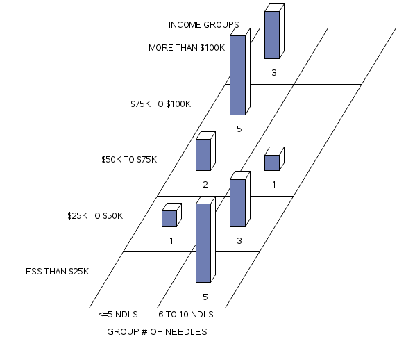
The result of this sequence of commands enables us to produce the 2-way SAS table of the groups of needles found arranged by income groups. The problem with this table is that the delivery of information is not optimized for the reader if the reader does not know what an income group of 5, or an NDLGRP of 3 refers.
Using the PROC FORMAT command enables us to explain the categories within each variable. The code to explain the levels of each category uses the following two-step approach.
1.) At the start of the program add the PROC FORMAT statement and the VALUE for each categorical variable.
In our example, we have two categorical variables: INCGRP and NDLGRP. The variable INCGRP has 5 levels, while the variable NDLGRP has three groups.
| PROC FORMAT;
VALUE INC 1=’LESS THAN $25K’ 2=’$25K TO $50K’ 3=’$50K TO $75K’ 4=’$75K TO $100K’ 5=’MORE THAN $100K’; VALUE NDL 1 = ‘<=5 NDLS’ 2= ‘6 TO 10 NDLS’ 3= ‘>10 NDLS’; DATA TAB4_3; INPUT SITE NDLCNT INCOME; |
Later in the program, after we call a SAS procedure, like in this case we call PROC FREQ, we then call the FORMAT function and assign the predefined format to each variable used by the SAS procedure.
Notice we first call the variable – in this example the variable of interest is NDLGRP and this is followed by the PROC FORMAT VALUE name NDL. Notice also that when we include the VALUE name we follow it with a period(.). This command will place the full text for the variable category in the frequency distribution.
|
PROC SORT; BY INCGRP; FORMAT NDLGRP NDL. INCGRP INC. ;
|
The results of this analysis demonstrate that the highest number of needles found near the areas of safe injection sites tended to be higher among low-income neighborhoods than the number of needles found near the safe injection sites located in more affluent areas.
Figure 13.5 Features of Proc Freq: Adding Proc Format to the Frequency Procedure for a block chart
In the following output the SAS syntax is shown here.
At the top of the program add:
FORMAT NDLGRP NDL. INCGRP INC. ;
TITLE1 ‘BLOCK CHART OF FREQ DIST FOR GROUP NEEDLES BY INCOME GROUP’;
RUN;
13.2 Distribution for a categorical variable
As previously discussed, categorical variables involve grouping items, persons, or attributes, whereby the assignment of numbers to each group is arbitrary. For example, you might be interested in looking at the employment status of nursing home workers. The variable: employment status would be a categorical or grouping variable and might contain the following categories: full-time, part-time, casual, and temporary. You could assign any number you wish to represent the group label because the number is merely a label when applied to represent the category and doesn’t hold any mathematical significance – the number simply enables you to group persons based on that variable (in this case, employment status).
It is important to remember that with categorical data our interest is not to compute measures of centrality or variance like means and standard deviations, and therefore we won’t compare the distribution of items of persons to a normal distribution (i.e., the bell curve). Rather, the data that is held in the categories are counts and so our evaluation approach is to use statistical methods based on frequencies and ranks.
In the following steps, we calculate frequencies, relative frequencies, proportions, and percentages for categorical variables. Consider this simple data set.
| Participant ID | Employment Status | Code |
| 01 | Casual | 3 |
| 02 | Full-time | 1 |
| 03 | Part-time | 2 |
| 04 | Casual | 3 |
| 05 | Casual | 3 |
| 06 | Full-time | 1 |
| 07 | Part-time | 1 |
| 08 | Part-time | 2 |
| 09 | Casual | 3 |
| 10 | Casual | 3 |
We add up how many participants are in each employment status group and transfer the information to our chart:
| Employment Status | Number of Participants | Frequency (f) | Relative Frequency (f/n) | Cumulative Percent |
| 1 | ||| | 3 | 3/10= 0.30 | 30% |
| 2 | || | 2 | 2/10 = 0.20 | 50% |
| 3 | |||| | 5 | 5/10 = 0.50 | 100% |
Better yet, here we will use SAS to produce a frequency distribution table.
SAS code to produce a frequency distribution for employment status
PROC FORMAT;VALUE EMP 1= 'FULL-TIME' 2 = 'PART-TIME' 3= 'CASUAL';DATA EMPSTAT;LABEL ID = 'PARTICIPANT ID' EMPSTAT = 'EMPLOYMENT STATUS';INPUT ID 1-3 EMPSTAT 4;DATALINES;01 302 103 204 305 306 107 108 209 310 3;PROC FREQ; TABLES EMPSTAT;FORMAT EMPSTAT EMP. ;TITLE1 'FREQUENCY DISTRIBUTION OF EMPLOYMENT STATUS';RUN;This program produces the basic frequency distribution table for a set of categorical data and since we included the PROC FORMAT commands we can explain the data output clearly.
Features of Proc Freq: Distribution for a Categorical Variable
FREQUENCY DISTRIBUTION OF EMPLOYMENT STATUS
The FREQ Procedure for Employment Status
| EMPSTAT | Frequency | Percent | Cumulative Frequency |
Cumulative Percent |
| FULL-TIME | 3 | 30.00 | 3 | 30.00 |
| PART-TIME | 2 | 20.00 | 5 | 50.00 |
| CASUAL | 5 | 50.00 | 10 | 100.00 |
Distribution for a continuous variable
Now let’s talk about analyzing data for continuous variables.
Suppose we recorded the heights (in inches) of 200 students. In this example, height is a continuous variable since the possible values include decimals (not just whole numbers), there are equal intervals between each line on a tape measure, and there is a meaningful 0.
While we can examine frequencies and create a histogram for a continuous variable, it is likely that we will have many different values in our dataset because each student will have a slightly different height. For example, Tom might be 61.5 inches tall while Cara is 61.6 inches tall. As a result, few students will record the exact same height. It may be, therefore, more meaningful to group these data and create categories. In other words, you can transform a continuous variable into a categorical variable simply by grouping the data with the IF-THEN logic statements.
In the following example, we will use the grouping approach so that we can create a more comprehensive frequency distribution.
Let’s start with a dataset that includes two variables for our sample of 200 students (ID and HEIGHT). For each participant, we assign an ID and then record the height in inches for each of our participants. (note: despite that in Canada we use the metric scale for most of our measurements, we continue to refer to our heights in inches and feet – old habits die hard!)
Here we can use SAS to produce the frequency distribution table based on our grouping strategy for the data. We start by naming the working file and then include the appropriate SYNTAX to describe the variables and add the simple logic statements.
Raw Dataset 13.1 Two-hundred Height Measurements (inches)
073 67.75 074 67.76 075 67.77 076 67.78 077 67.80 078 67.82 079 67.91 080 67.94 081 67.95 082 67.97 083 67.99 084 68.01 085 68.03 086 68.05 087 68.07 088 68.10 089 68.12 090 68.15 091 68.17 092 68.20 093 68.23 094 68.31 095 68.32 096 68.38 097 68.65 098 68.75 099 68.87 100 69.00 101 69.37 102 69.50 103 69.56 104 69.60 105 69.70 106 69.75 107 69.78 108 69.80 109 69.83 110 69.87 111 69.90 112 69.94 113 70.00 114 70.05 115 70.09 116 70.10 117 70.14 118 70.15 119 70.16 120 70.18 121 70.23 122 70.27 123 70.30 124 70.49 125 70.51 126 70.65 127 70.72 128 70.77 129 70.80 130 70.82 131 70.85 132 70.90 133 70.95 134 70.97 135 71.00 136 71.05 137 71.10 138 71.15 139 71.20 140 71.23 141 71.25 142 71.31 143 71.35 144 71.38 145 71.40 146 71.44 147 71.48 148 71.50 149 71.53 150 71.56 151 71.59 152 71.63 153 71.67 154 71.70 155 71.75 156 71.80 157 71.81 158 71.83 159 71.87 160 71.90 161 72.00 162 72.07 163 72.09 164 72.10 165 72.13 166 72.20 167 72.30 168 72.23 169 72.34 170 72.45 171 72.50 172 72.57 173 72.65 174 72.69 175 73.26 176 73.28 177 73.30 178 73.37 179 73.40 180 73.45 181 73.48 182 73.53 183 73.65 184 73.75 185 73.79 186 73.83 187 74.00 188 74.25 189 74.35 190 74.53 191 74.67 192 74.78 193 74.95 194 76.25 195 76.34 196 76.45 197 78.59 198 79.25 199 79.40 200 79.47
Below is the SAS code required for the frequency analysis for the dataset above:
PROC FORMAT;
VALUE HT 1=’LESS THAN 66.0′ 2=’66.1 TO 68.0′
3=’68.1 TO 70.0′ 4=’70.1 TO 72.0′ 5=’MORE THAN 72.0′;
DATA HEIGHTS;
LABEL ID = ‘PARTICIPANT ID’
HEIGHT = ‘PARTICIPANT HEIGHT’ HTGRP=’HEIGHT GROUP’;
INPUT ID HEIGHT @@;
Notice some specific features of the INPUT statement above. Here we list two variables: ID and HEIGHT, followed by two @ symbols at the end of the list of variables. When two @ symbols are presented together SAS does not skip to a new line after reading the list of variables (in this case ID and HEIGHT), but rather reads across the page. This format enables us to read the data as a constant stream across the page for as many rows as is required to present the entire dataset. The computer reads the data in the order of the variables listed. That is, the computer reads through the dataset assigning the first value as the ID and the second value as the HEIGHT until all data are read.
Below is the paragraph of simple logic statements that follow the INPUT format statement. With these simple IF-THEN logic statements we organize the large unwieldy data set into six manageable groups.
IF HEIGHT <=66.0 THEN HTGRP=1;
IF HEIGHT >66.0 AND HEIGHT <=68.0 THEN HTGRP=2;
IF HEIGHT >68.0 AND HEIGHT <=70.0 THEN HTGRP=3;
IF HEIGHT >70.0 AND HEIGHT <=72.0 THEN HTGRP=4;
IF HEIGHT >72.0 THEN HTGRP=5;
DATALINES;
001 58.5 002 58.8 003 60.1 004 61.3 005 61.75 006 61.96
. . .
199 79.40 200 79.47
;
PROC FREQ; TABLES HEIGHT; RUN;
PROC FREQ; TABLES HTGRP;
FORMAT HTGRP HT. ; RUN;
As you see in the partial output presented in Figure 13.4 below, when we run the SAS command: PROC FREQ; TABLES HEIGHT; RUN; most of the values occur only once because height is a continuous variable which allows greater variation than categorical or count type variables. When reading this output, make sure that you screen for outliers by looking at the high and low values for the variable. SAS will also indicate the number of missing values which is also important when you are cleaning and screening your data.
Table 13.4 The output from PROC FREQ Applied to Continuous Data –Participant Height.
| HEIGHT | Frequency | Percent | Cumulative Frequency |
Cumulative Percent |
| 58.5 | 1 | 0.50 | 1 | 0.50 |
| 58.8 | 1 | 0.50 | 2 | 1.00 |
| 60.1 | 1 | 0.50 | 3 | 1.50 |
| … | ||||
| 79.25 | 1 | 0.50 | 198 | 99.00 |
| 79.4 | 1 | 0.50 | 199 | 99.50 |
| 79.47 | 1 | 0.50 | 200 | 100.00 |
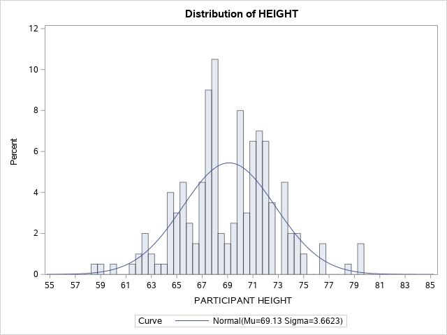
13.3 Creating a Histogram in SAS
Producing graphs in SAS enables us to examine the distribution of the data visually rather than in a table. The SAS code shown here includes the option to produce a histogram. A histogram is more than a vertical bar chart. Histograms use rectangles to illustrate the frequency and interval, whereby the height of the rectangle is relative to the frequency (y axis) and the width of the rectangle is relative to the interval (x axis).
The SAS code used here provides the analysis for our sample of 200 measures of height within a cohort of children. In order to establish the appropriate number of intervals in our sample we calculate the range of our set of scores. The range refers to the spread of scores between the lowest estimate from our sample, and the highest estimate from our sample. We can estimate the range apriori by running the PROC UNIVARIATE command. When we include the command MIDPOINTS= we can customize the output. Here we include the command HISTOGRAM /MIDPOINTS = 55 TO 85 BY 0.5, to produce the expected RANGE of highest and lowest values and then plot the midpoints for all categories within the range.
PROC UNIVARIATE; VAR HEIGHT;
HISTOGRAM / MIDPOINTS=55 TO 85 BY 0.5 NORMAL;
RUN;
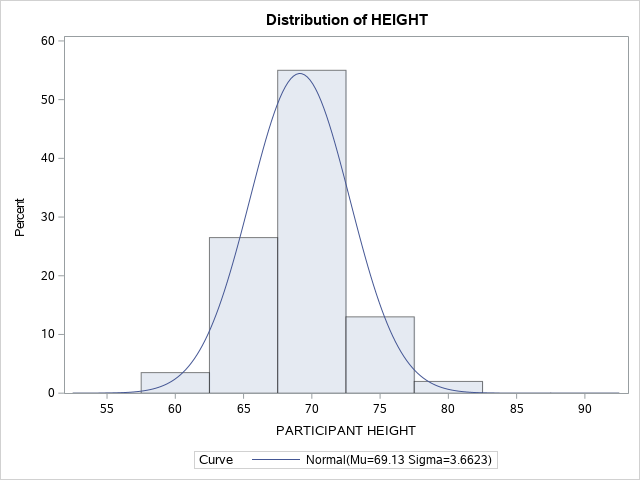
Notice in Figure 13.6 that the x-axis is a continuous variable. An overlay of the shape of the distribution is represented by the blue BELL-SHAPED normal curve.
Figure 13.6 Histogram for Heights of Students in Sample of 200 Participants
Use the following SAS Code to group the data into categories and add a representation of the shape of the distribution (CTEXT = BLUE) when plotting the histogram.
proc univariate; var HEIGHT; histogram HEIGHT /
normal midpoints = 55 60 65 70 75 80 85 90 CTEXT = BLUE;
Of you can use: proc sgplot;
histogram HEIGHT; density HEIGHT;
Figure 13.7 Histogram for Heights of Students N= 200 Grouped Data
 Dividing a continuous variable into categories
In the example shown above, it is easy to see how helpful it is to arrange these continuous data into categories that represent a range of values rather than individual values on a continuum.
In our height example, we can optimize these data by creating height categories rather than exact heights because there is so much variance in exact heights. However, in this process of arbitrarily categorizing our response variable by grouping the data together we recognize that there will be a loss of information. When grouping data we are essentially saying that the responses are exactly the same even though differences are observed. For example, when you group a student who is 61.5 inches tall with a student who is 64 inches tall, the difference between the two individuals will be ignored within the category. There is absolutely nothing wrong with using categories that represent a range of continuous values but if you are planning to collect your own data, it is usually best to collect continuous data from the source and group the data later. Generally speaking, you can always convert data from continuous data to categories but without the original estimates, you cannot go the other way!
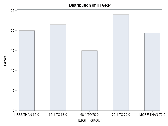
Once you deem it helpful to transform a continuous variable into categories, next you need to decide how to chop up your data. Ideally each you should have an equal range of values in each group. In our example, which you can see the would-be participants are quite tall, we decided to transform the continuous height data into categories that are each 2 inches wide. Group 1 includes students with a height of less than 66 inches, Group 2 starts at 66.1 and tops out at 68 inches, Group 3 starts at 68.1 and tops out at 70 inches … and so on.
Alternatively, we could have decided to group students in intervals of 5 inches or even 1 inch. As the researcher, you decide how to group the data based on what will make meaningful groupings. This might be based on past literature, clinical reference values, logic, or a combination of these factors. Once we create our categories we can sort students into each group based on their height. Then we can count how many students fall into each group and create a frequency distribution table (Table 13.5) and a histogram. Notice that the shape (distribution) of this histogram is the one we created using the continuous version of the height variable (Figure 13.6). This is because in the first histogram exact values are included and the data is divided into quintiles based on the mean. On the other hand, in the second histogram students are grouped together in 2-inch height intervals – depending on the cut-off values that we chose the distribution would be different.
Using the grouping routines with simple logic statements helps to simplify the organization of the data. The output for the grouped data is invoked with the SAS command: PROC FREQ; TABLES HTGRP; FORMAT HTGRP HT. ; RUN;
Table 13.5 Grouping PROC FREQ output for –Participant Height.
| HTGRP | Frequency | Percent | Cumulative Frequency |
Cumulative Percent |
| LESS THAN 66.0 | 40 | 20.00 | 40 | 20.00 |
| 66.1 TO 68.0 | 43 | 21.50 | 83 | 41.50 |
| 68.1 TO 70.0 | 30 | 15.00 | 113 | 56.50 |
| 70.1 TO 72.0 | 48 | 24.00 | 161 | 80.50 |
| MORE THAN 72.0 | 39 | 19.50 | 200 | 100.00 |
Figure 13.7 Histogram for Heights of Students using Height Group (N=200)
In addition to the histogram, SAS also includes a number of tables in the output with the PROC UNIVARIATE command. The data in these tables provide important information about our variable (height, in this example). As you can see in Table 13.8 the moments’ table provides descriptive statistics about our variable including the mean, standard deviation, and standard error, as well as the overall variance. Skewness and kurtosis are also provided which provide valuable information about how well the variable fits the normal distribution. Keep your critical thinking hat on when looking at these data because some of this information is not relevant for categorical variables. For example, you cannot have an average for a categorical variable and the normal distribution doesn’t make sense.
Table 13.8 Descriptive Statistics for the Dataset of Heights
| N | 200 | Sum Weights | 200 |
|---|---|---|---|
| Mean | 69.1297 | Sum Observations | 13825.94 |
| Std Deviation | 3.66230697 | Variance | 13.4124924 |
| Skewness | 0.00184013 | Kurtosis | 0.45301492 |
| Uncorrected SS | 958452.17 | Corrected SS | 2669.08598 |
| Coeff Variation | 5.29773306 | Std Error Mean | 0.25896421 |
The next table presents the Basic Statistical Measures (Figure 13.9). In addition to the mean, standard deviation, and variance, this table also provides the median, mode, range, and interquartile range for the variable.
Table 13.9 Basic Statistical Measures Table
| Median | 69.18500 | Variance | 13.41249 |
|---|---|---|---|
| Mode | 67.72000 | Range | 20.97000 |
| Interquartile Range | 4.54000 | ||
| Location | Variability | ||
| Mean | 69.12970 | Std Deviation | 3.66231 |
Finally, Table 13.10 is the Extreme Observations Table which identifies the highest and lowest values of the variable. Here the data do not differ from what we would expect but when datasets contain outliers, this table is one way to identify the outlier data points easily. Notice that the table provides the case number along with the data point value, making it easy to revisit the original dataset and verify original values or consider adjustments to extreme values if needed.
Figure 13.10 Extreme Observations Table
| Lowest | Highest | ||
| Value | Observation | Value | Observation |
| 58.50 | 1 | 76.34 | 1 |
| 58.80 | 2 | 76.45 | 2 |
| 60.10 | 3 | 78.59 | 3 |
| 61.30 | 4 | 79.25 | 4 |
| 61.75 | 5 | 79.40 | 5 |
Below is a SAS program to produce a graphical presentation of the data while also creating an organized frequency distribution table.
OPTIONS PAGESIZE=55 LINESIZE=120 CENTER DATE;
DATA RPRT1;
INPUT DIVISION $ 1-12 CASES 14-16;
LABEL DIVISION=’CATEGORIES’;
DATALINES;
58.5-61.5 4
61.5-64.5 12
64.5-67.5 44
67.5-70.5 64
70.5-73.5 56
73.5-76.5 16
76.5-79.5 4
;
RUN;
PROC GCHART DATA=REPORTS.RPRT1; VBAR DIVISION/SUMVAR=CASES; RUN;
Figure 13.8. Vertical Bar Chart of height categories produced in SAS.
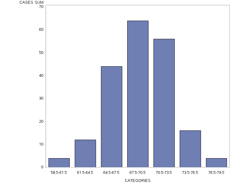
PROC FREQ DATA=REPORTS.RPRT1; WEIGHT CASES; TABLES DIVISION; RUN;
Table 13.11 Frequency table of height categories produced in SAS
| division | Frequency | Percent | Cumulative Frequency |
Cumulative Percent |
| 58.5-61.5 | 4 | 2.00 | 4 | 2.00 |
| 61.5-64.5 | 12 | 6.00 | 16 | 8.00 |
| 64.5-67.5 | 44 | 22.00 | 60 | 30.00 |
| 67.5-70.5 | 64 | 32.00 | 124 | 62.00 |
| 70.5-73.5 | 56 | 28.00 | 180 | 90.00 |
| 73.5-76.5 | 16 | 8.00 | 196 | 98.00 |
| 76.5-79.5 | 4 | 2.00 | 200 | 100.00 |
13.4 Outliers
As depicted in Table 13.12. below, outliers can be defined as Cases with extreme values on one (univariate) or more variables (multivariate) (Tabachnick & Fidell, 2013). Outliers can be either error outliers (incorrect values) or “interesting” outliers (correct but unusual) (Orr, Sackett, & Dubois, 1991). Error outliers need to be checked against the original data for verification and then either corrected or removed from the data set. Interesting outliers are less easy to deal with (see Tabachnick and Fidell, 2013 for recommended strategies) but they are important to think about because they pull the mean towards them and have a stronger influence on the data than other values. The bottom line is that before you move on to further analysis or data transformation, it is essential to run a frequency analysis and screen your data for outliers.
Error outliers can be detected using PROC FREQ and checking for values that don’t make sense. For example, if you had 976 as someone’s age, that would be a red flag and you would investigate further.
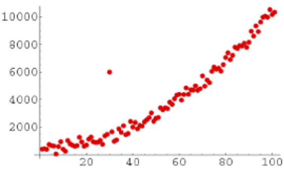
Interesting outliers, while unusual, are still within the realm of possibility. They can be identified using the PROC GPLOT procedure outlined here This command produces a table with the five highest and five lowest values for a particular variable.
In the graph below, one person’s data doesn’t follow the same pattern as the rest of the sample. This is an example of an outlier.
Figure 13.12. Example of an Outlier within a Distribution