
II. FROM OPTICAL TO VISUAL EFFECTS
21. COLOR VISION
The concentric organization of photon intensity and wavelength information in the retina begins the processing that enhances the difference between a ganglion cell’s central visual field and what immediately surrounds that field. The result is an ability to see subtle differences in that image as differences in brightness and color.
These figures illustrate a visual image of these differences in terms of:
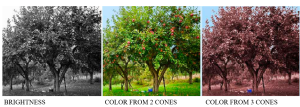 Brightness differences represent light intensity modified by the sensitivity to the various wavelengths. The image for a two-cone system approximates what many mammals, such as dogs and horses, would see.
Note the distinctiveness of ripe fruit in our three-cone system.
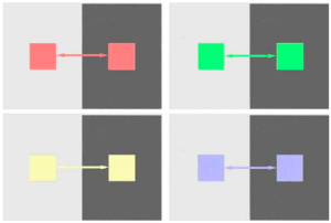
The concentric organization of the ganglion cell’s visual field results in the brightness contrast effects shown earlier. Combining intensity and wavelength information also results in colors undergoing brightness contrast:
Color Contrast
Just as concentric visual-fields produce brightness contrast, they also enhance color differences between adjacent areas: [1]
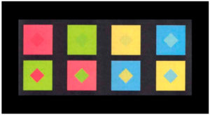 The colors of the upper and lower diamonds are the same in each vertical pair.
Color Assimilation
However, there must be enough border length between two color areas for lateral inhibition to produce contrast. If the border is too small or indistinct, the opposite occurs – the different colors blend to produce a new color.
The upper and lower central composite diamonds below contain the same colors in each pair. They differ only in which color borders those composite diamonds. Lean back and let them merge.
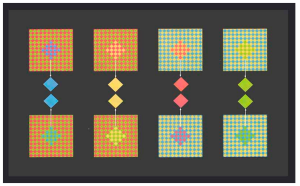
It takes unusual figures like these to make evident an effect you experience every time you look at a color monitor. Look closely with a magnifying glass. There are only red, green, and blue pixels – even where yellow appears. The same is true for your computer monitor and TV.
Evidently, at some point, there is little value to transmit that much color detail, and it is more efficient for the visual system to blend the colors.
Color Constancy
The visual system has evolved to use color to indicate the chemistry of light reflecting surfaces. Therefore, there is value in not being misled depending on lighting conditions.
Earlier, we saw how the visual system could evaluate the general intensity in various areas of the retinal image and adjust the brightness level separately in each area – local adaptation. Similarly, it evaluates the general wavelength distribution across the retinal image. This can change when the source of light changes in spectral composition such as from midday to evening:
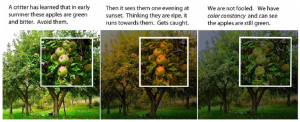 Just as the visual system shifts its light-to-dark range of brightness levels (Ch 17), it can subtract a general wavelength bias compared to what occurs in daylight. This shifts its range of subjective hues to compensate for bias in the lighting. This automatic color balancing is called color constancy processing. [2]
- The next two figures are reproduced from Stockman D & Brainard DH (2010) Color vision mechanisms. in Bass (ed.) OSA Handbook of Optics (3rd Ed.) Pp. 11.11-11.104 with permission. Tile mosaics in Mesopotamian temples from the 3rd millennium BC and French pointillist painters such as George Seurat in the 1880's used color contrast and assimilation effects to create unique color effects not achievable with pigments. These methods are used by potters today because many pigments breakdown during high temperature firing. ↵
- The figures demonstrate that color constancy can be localized like brightness constancy. Note the blueish tinge in the shaded areas of the photographs compared to what you actually see. That’s because blue sky is the principal source of light in shaded areas. Cameras are becoming adept at localizing “color balance” in their image processing, accomplishing what Photoshop did in the 3rd photo. Lest we think too highly of ourselves, goldfish do this too: Ingle DJ (1985) The goldfish as a retinex animal. Science, 227, 8 Feb., 651-654. ↵