
Chapter 4: Digitization in QGIS
Stream B: Creating Vectors from Your Georeferenced Map
Mapping Georgetown’s Decline
In Stream B, you will get to see how some elements of Georgetown remained the same while others changed between 1880 and 1991. By seeing these continuity and change over a century, you will begin to visually see the effects Georgetown’s decline.
Continuity as a Sign of Decline
- Turn off the NTS layer and turn on the Georgetown_modified layer of Georgetown in 1880.
- See how the points, line, and polygon we added in Stream A align with the data in and around Kent Square.
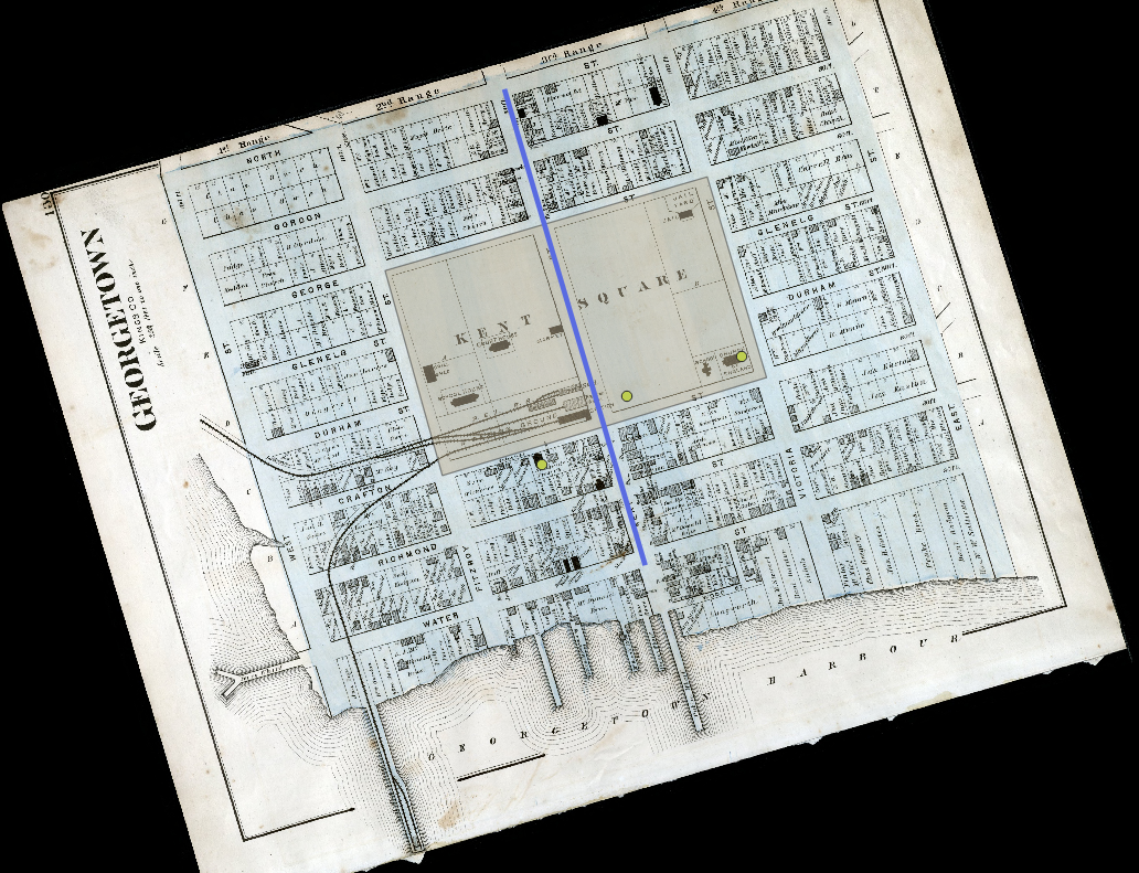
We can see how the town has changed very little between 1880 and 1991 and how this lack of change is indicative of the town’s stagnation.
The two churches are still in their same locations. Often, when a town’s population expands, more churches are built to accommodate the newcomers. In Georgetown, it seems that the demand for churches remained the same between 1880 and 1991, which perhaps suggests a stagnation. The only new feature that we can see between 1880 and 1991 is the King’s Playhouse.
Between 1880 and 1991, there was no additional road built with which to enter Georgetown. Kent Street has remained the only way into the town. This shows that Georgetown’s settlement and commercial activity has only ever required one main entrance into the town. By contrast, there are many roads by which to enter the Island’s major towns, Summerside and Charlottetown.
There was very little change to Kent Square between 1880 and 1991. This shows that, despite over 100 years passing, the heart of the town remained largely the same between 1880 and 1991. That settlers’ homes and merchants’ buildings never really encroached on the square over a period of 100 years shows that Georgetown’s development had stagnated.
Change as a Sign of Decline
We will now digitize features that existed in Georgetown in 1880 but had disappeared by 1991. This loss of features will perhaps reveal more aspects of Georgetown’s decline.
To start with, we will digitize Georgetown’s railway station, its customs house, and shipbuilder Benjamin Davies’ shipyard as points. We will also digitize Georgetown’s ferry wharf as a line and its railway wharf as a polygon.
The railway came to Georgetown in 1872, and it augmented the town’s status as a port of trade. Passengers and goods were shipped into the port, from which the railway could take them inland. To facilitate this process, Georgetown’s railway station and railway wharf were built.
That Georgetown had a customs house further shows that the town was a key port of entry in 1880.
Benjamin Davies, a significant Island shipbuilder of the late nineteenth century, presumably built ships in Georgetown as part of Georgetown’s booming shipbuilding industry in the late nineteenth century.
The ferry connection between Georgetown and Pictou was a key driver of Georgetown’s prosperity in the nineteenth century, before it was replaced by the ferry link between Borden-Carleton and Cape Tormentine in the twentieth century. The ferry wharf for which we will create vector data was the place at which the ferry docked in Georgetown.
All of the above features were part of Georgetown in 1880 and were keys to its prosperity. So, their disappearance by 1991 is indicative of the town’s decline.
Creating Vectors: Points, Lines, and Polygons
An Important Note about Scale
Unlike the 1991 topographic map, the Georgetown map from Meacham’s Atlas (1880) is an urban map at a large scale. So, we do not have to consult the basemap to verify the locations of our points, lines, and polygons on the Georgetown map. Since we used the basemap and made sure that we mapped the vector data on the NTS map at a larger scale, we are able to make accurate comparisons between the 1880 and 1991 maps.
Points
Creating a New Shapefile
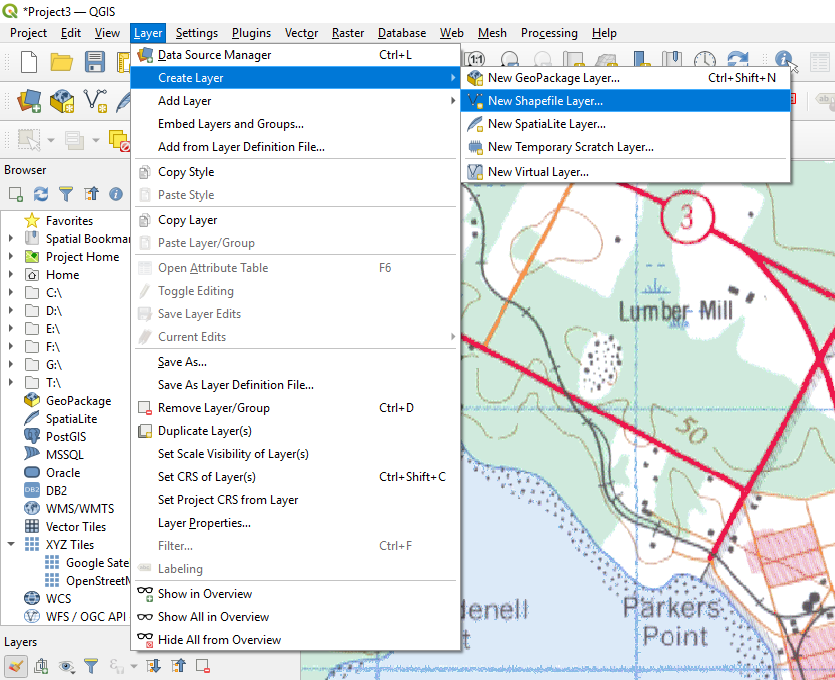
To create our vector data, we will first create a new shapefile layer. To do so,
- Click Layer
- Hover over Create Layer
- Click New Shapefile Layer
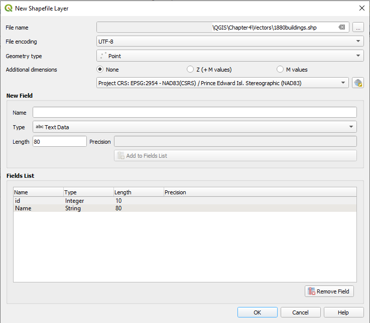
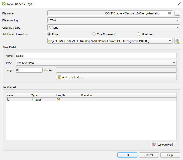
Fill out the following information in the dialogue box that appears:
File Name: …QGIS\Chapter4\Vectors\1880buildings.shp
- To save our shapefile in the correct location, click the ellipsis to the right of the File Name field. Navigate to QGIS\Chapter4\Vectors. Enter 1880buildings as a File Name, and then click Save.
File Encoding: UTF-8
Geometry Type: Point
Additional Dimensions: None
Underneath Additional Dimensions, we can also make sure the CRS is set to “Project CRS: EPSG: 2954.”
Under New Field, we can enter the following information:
- Name: Name
- Type: Text Data
We can leave the other settings.
- Click Add to Fields List.
We are creating this new field so that we can keep track of the names of the places for which we are creating points.
- Click OK

Adding Points to the Reference Map
Now that we have our new shapefile created, we can start to add our points to our 1880 map of Georgetown.
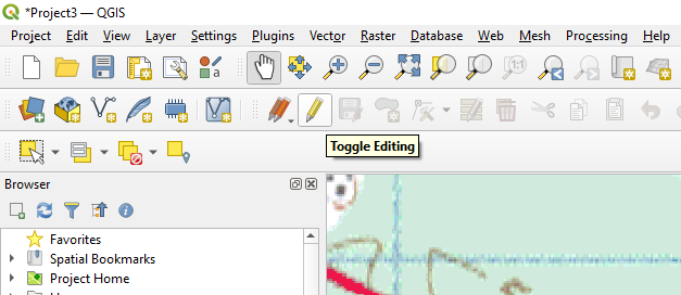
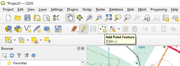
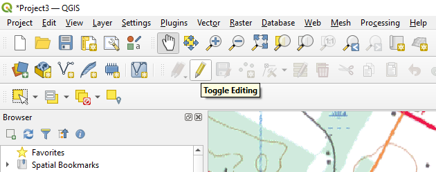
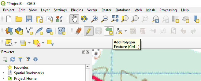
- Click Toggle Editing
- Click Add Point Feature
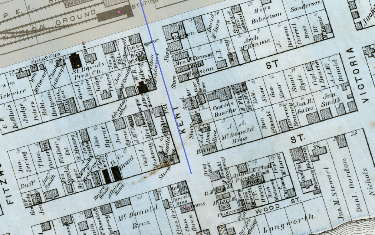
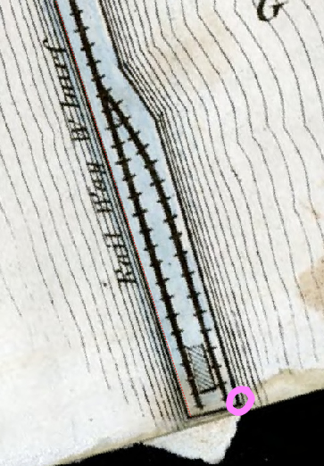
Adding a Point for Georgetown’s Railway Station
- Identify the railway station in the 1880 map of Georgetown. There are multiple buildings on the railway station ground, but the one we are interested in is the one circled in pink in the following screenshot:
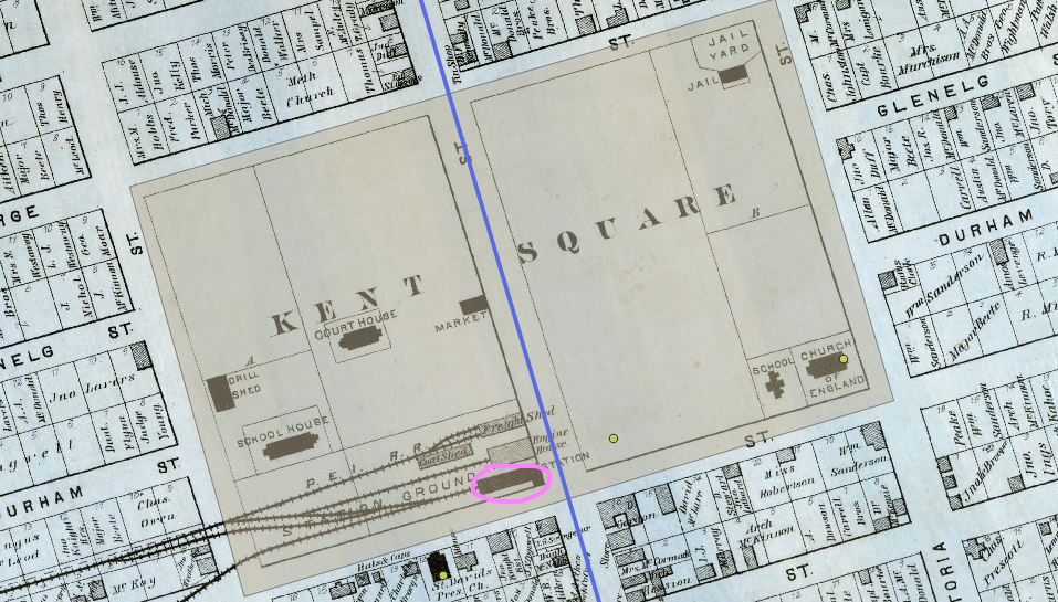
- Click on the location of the station building on the 1880 map of Georgetown to place our point.
- In the Feature Attributes dialogue box that appears, type in the following details:
- ID: 01
- As we add more points to the 1880buildings layer, we will give each new point a unique ID number.
- Name: Railway Station
- ID: 01
- Click OK.
You will now see a point appear where the railway station is located on the Georgetown map. In my case, the point is brown.
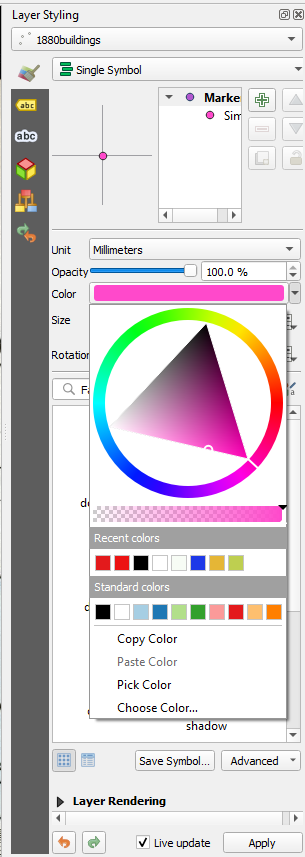
The polygon that we created in Stream A is also brown, so I am going to change this point’s colour to pink.
- In the Layer Styling panel to the right of your screen, under Color, click the dropdown arrow and select a shade of pink.
- Click Apply.
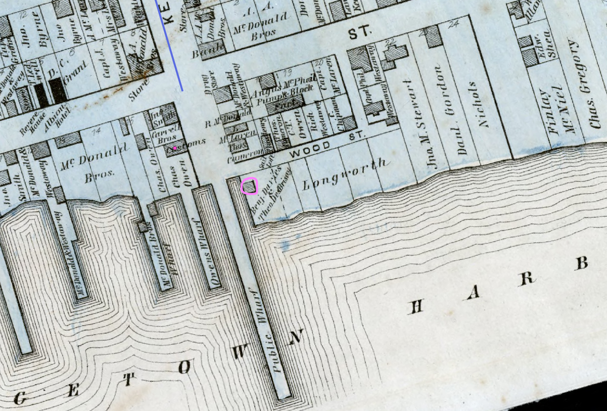
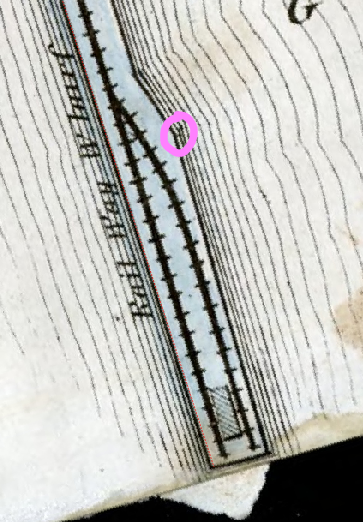
Adding a Point for Georgetown’s Customs House
- As we did when mapping Georgetown’s railway station, we will first identify Georgetown’s customs house on the map. It is circled in pink in the screenshot below:
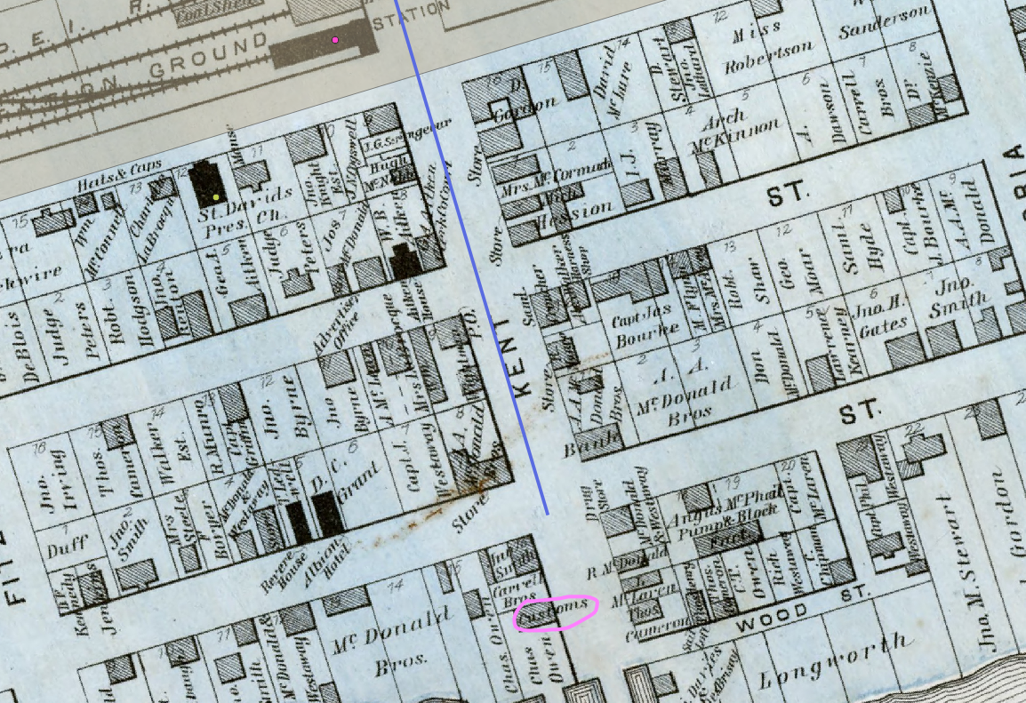
- Click on the location of the customs house on the Georgetown map to place our point.
- In the Feature Attributes dialogue box that appears, type in the following details:
- ID: 02
- Name: Customs House
- Click OK.
You will now see a point appear where the customs house is on the basemap.
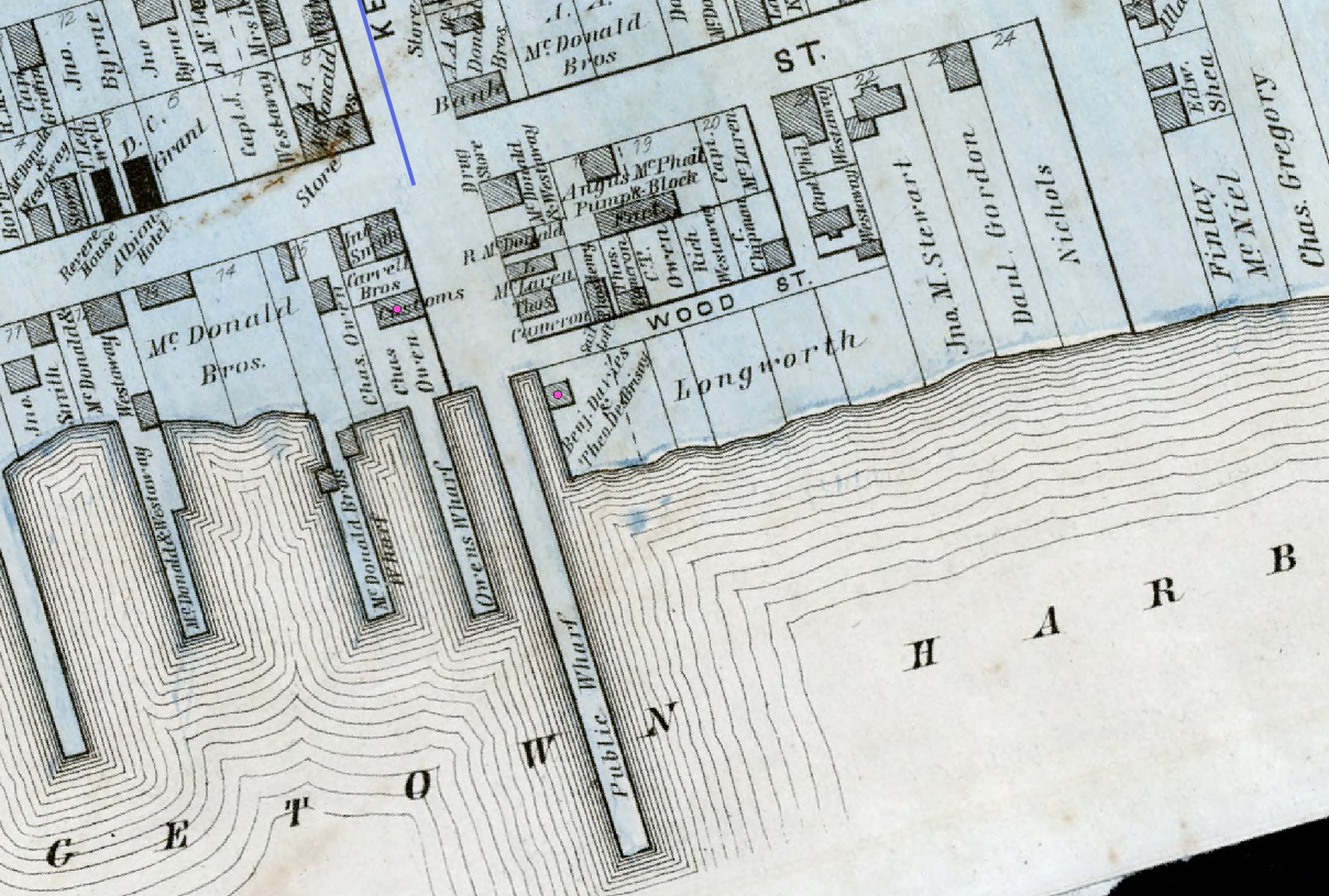
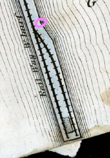
Adding a Point for Benjamin Davies’ Shipyard
- Let’s identify Benjamin Davies’ shipyard on the map. It is circled in pink in the screenshot below:
- Click on the location of Benjamin Davies’ shipyard on the Georgetown map to place our point.
- In the Feature Attributes dialogue box that appears, type in the following details:
- ID: 03
- Name: Shipyard
- Click OK.
You will now see a point appear where the shipyard is on the basemap.
Saving the Vector Data
As always, let’s save the vector data that we just created.
- Click the “Save Layer Edits” button.
Lines
Creating a New Shapefile Layer
Once again, we will first create a new shapefile:
- Click Layer
- Hover over Create Layer
- Click New Shapefile Layer
Fill out the following information in the dialogue box that appears:
File Name: …QGIS\Chapter4\Vectors\1880ferrywharf.shp
- To save our shapefile in the correct location, click the ellipsis to the right of the File Name field. Navigate to QGIS\Chapter4\Vectors. Enter 1880ferrywharf as the File Name, and then click Save.
File Encoding: UTF-8
Geometry Type: Line
Additional Dimensions: None
Underneath Additional Dimensions, we can also make sure the CRS is set to “Project CRS: EPSG: 2954.”
Under New Field, we can enter the following information:
- Name: Name
- Type: Text Data
We can leave the other settings.
- Click Add to Fields List.
We are creating this new field so that we can keep track of the names of the places for which we are creating lines.
- Click OK

Adding the Line
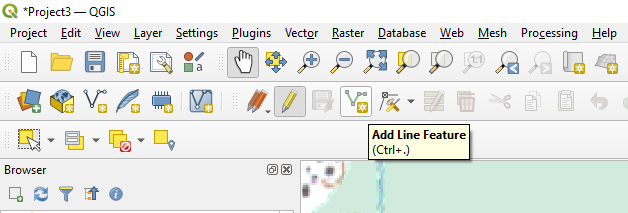
- Click Toggle Editing
- Click Add Line Feature
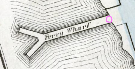
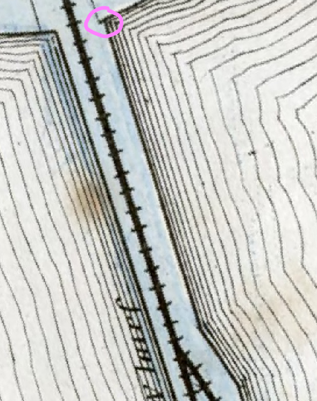
Adding a Line for the Ferry Wharf
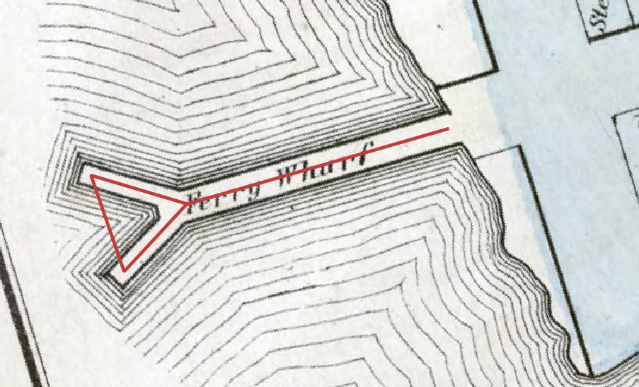
- Find the ferry wharf on the left side of the map. It is identified in pink in the following screenshot:
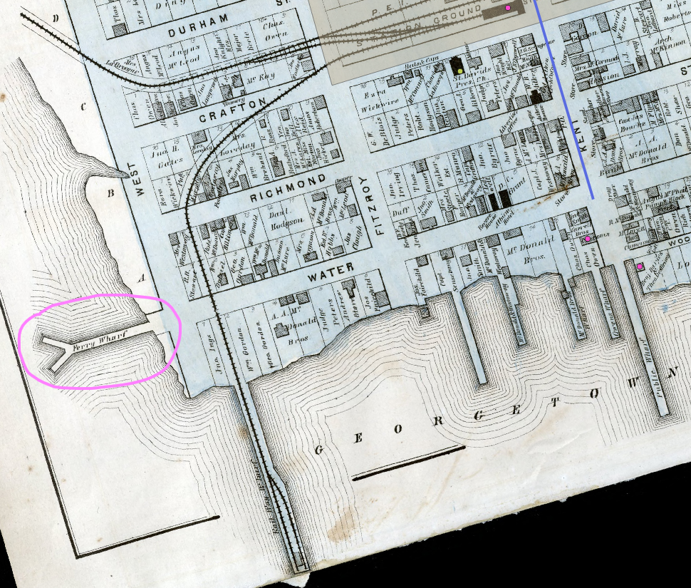
In Stream A, we created a line with only one segment. In this step, we are going to create a multi-segmented line.
- Left-click once at the base of the Y-shaped wharf.
- Move your mouse to the point of the Y where the forks begin and left-click again.
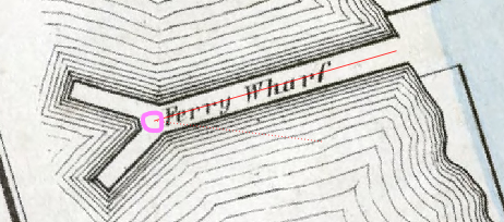
- Move your mouse to the end of the upper fork and left-click again.
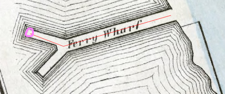
- Move your mouse across the to the end of the other fork and left-click again.
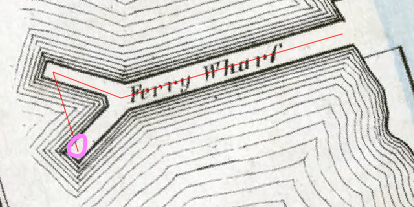
- Move your mouse to back to the point of the Y where the forks begin and left-click again.
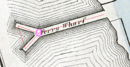
- Right-click to complete the line.
- In the Feature Attributes dialogue box that appears, type in the following details:
- ID: 01
- Name: Ferry Wharf
- Click OK.
The line is thin, which makes it difficult to see.
- In the Layer Styling Panel, change the line’s width to 1.00 and click Apply.
The line is now much easier to see.
Saving the Vector Data
As always, let’s save the vector data that we just created.
- Click the “Save Layer Edits” button.
Polygons
Creating a New Shapefile
Once again, we will first create a new shapefile:
- Click Layer
- Hover over Create Layer
- Click New Shapefile Layer
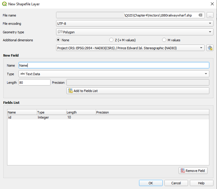
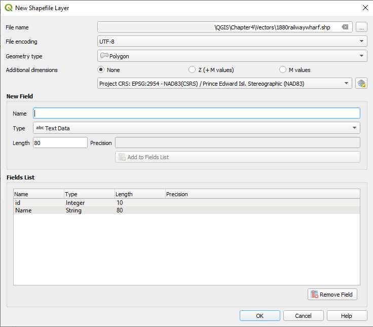
Fill out the following information in the dialogue box that appears:
File Name: …QGIS\Chapter4\Vectors\1880railwaywharf.shp
- To save our shapefile in the correct location, click the ellipsis to the right of the File Name field. Navigate to QGIS\Chapter4\Vectors. Enter 1880railwaywharf as the File Name, and then click Save.
File Encoding: UTF-8
Geometry Type: Polygon
Additional Dimensions: None
Underneath Additional Dimensions, we can also make sure the CRS is set to “Project CRS: EPSG: 2954.”
Under New Field, we can enter the following information:
- Name: Name
- Type: Text Data
We can leave the other settings.
- Click Add to Fields List.
We are creating this new field so that we can keep track of the names of the places for which we are creating polygons.
- Click OK
Adding the Polygon
- Click Toggle Editing
- Click Add Polygon Feature
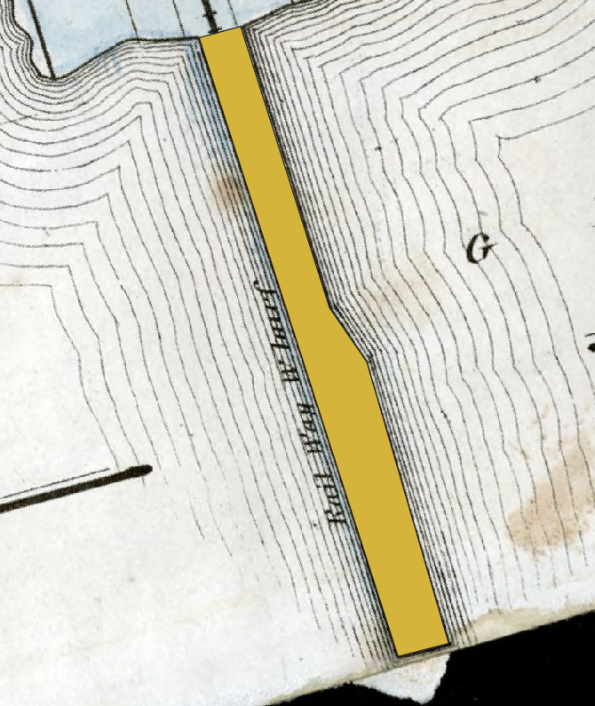
Adding a Polygon for the Railway Wharf
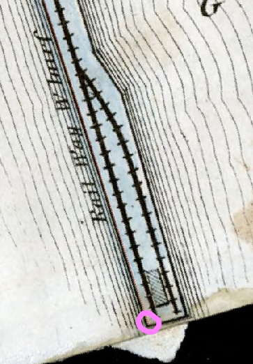
- Locate the railway wharf on the map. It is circled in pink in the following screenshot:
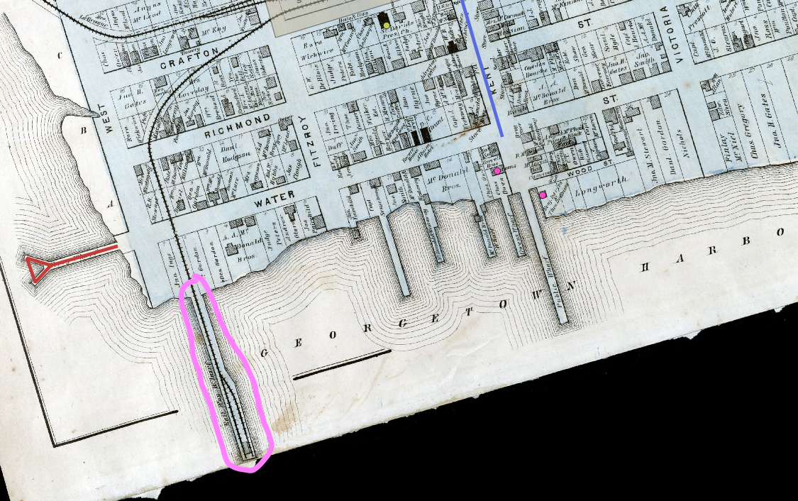
In Stream A, we created a rather straightforward, rectangular polygon. In this step, we will create a polygon for a shape that is slightly more complex.
- Left-click once at the top-left of the wharf.
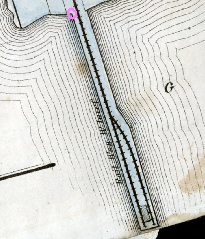
- Move your mouse to the bottom-left of the wharf and left-click again.
- Move your mouse to the bottom-right of the wharf and left-click again.
- Move your mouse to the next vertex that is above and left-click again.
- Move your mouse to the next vertex that is above and left-click again.
- Move your mouse to the next vertex that is above and left-click again.
- Right-click to save the polygon.
- In the Feature Attributes dialogue box that appears, type in the following details:
- ID: 01
- Name: Railway Wharf
- Click OK.
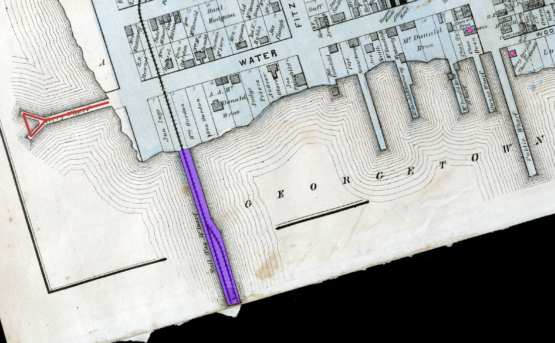
Here is our preliminary result:
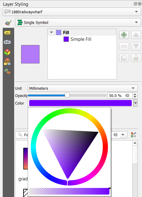
We liked how our polygon in Stream A had some transparency. Using the Layer Styling panel, we will change this polygon’s transparency to 50.0%. So that I can see it better, we will also change its colour to purple.
Here is the result:
Saving the Vector Data
As always, let’s save the vector data that we just created.
- Click the “Save Layer Edits” button.