
Chapter 2: Data Management, Symbols, and Styles in QGIS
Part II B: Labelling
Advanced Label Placement
In this section, our goal is to create a single map that shows both the AREA of the FOREST and REVERTING areas on the one hand and the LANDTYPE on the other. In effect, this one map will accomplish what it took two maps to accomplish earlier in this chapter. To do this, we will add labels to the Graduated map that we just made. However, since the labels in this layer are very dense, and the polygons on which we will place them are irregularly shaped, we are going to alter their positioning and rendering settings so that they are easy to read.
Activation: Turning On the 1935 Forest Map’s Labels
- In the table of contents, right-click the layer called 1935 inventory region filtered and graduated.
- Click Properties
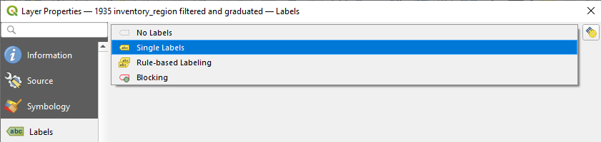
- Click Labels
- From the dropdown that initially says No Labels, select Single Labels.
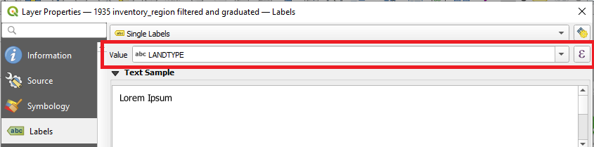
- In the dropdown menu next to Value, select LANDTYPE.
Formatting: Symbolizing the 1935 Forest Map’s Labels
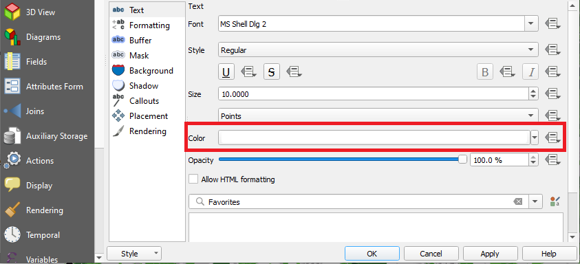
As in Chapter 1, we are going to alter the appearance of the map’s labels so that they are clearer.
- Under the Text menu, change the text colour to white.
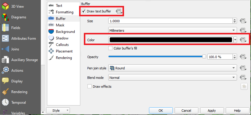
- Under the Buffer menu, check Draw text buffer and change its colour to black.
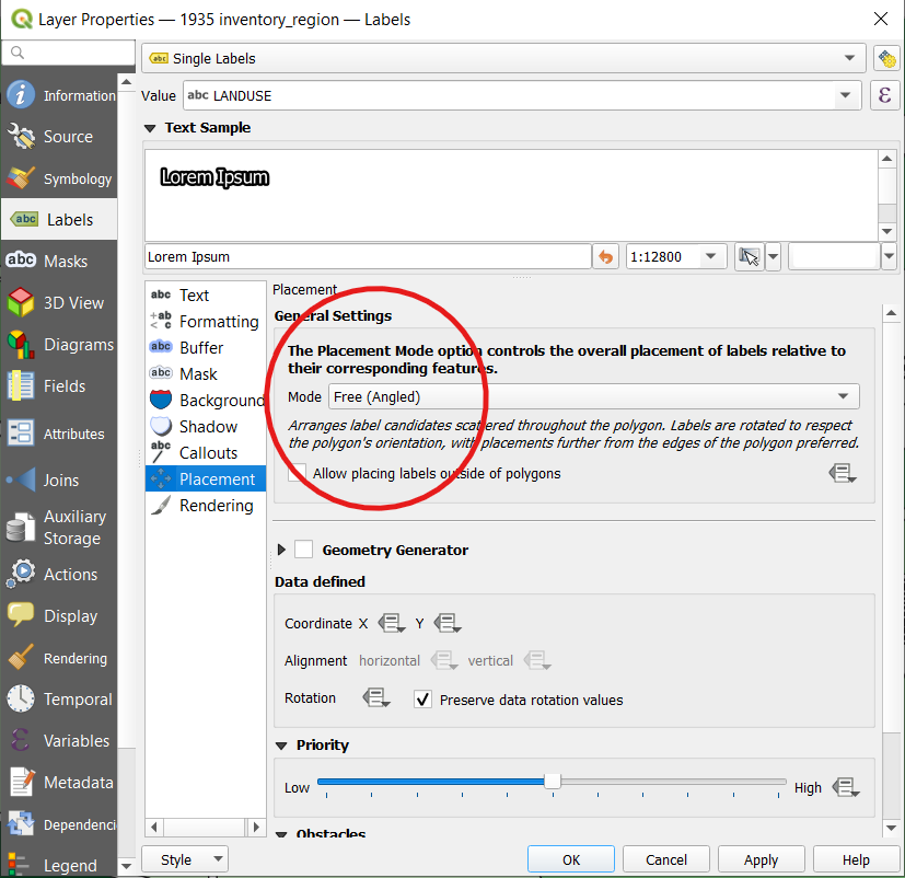
Placement: Adjusting the Placement of the 1935 Forest Map’s Labels
In Chapter 1, we went with the default Placement Mode, which is called Around Centroid. This mode tries to centre the labels over the top of their corresponding polygons. This mode is fine for regularly shaped polygons. But, since the 1935 inventory region layer contains a dense array of irregularly shaped polygons, the Around Centroid mode may not allow us to easily interpret which label goes with which polygon. So, we will use a different mode, one called Free (Angled).
- In the Placement menu, click the Mode dropdown menu and select Free (Angled).
- Click OK.
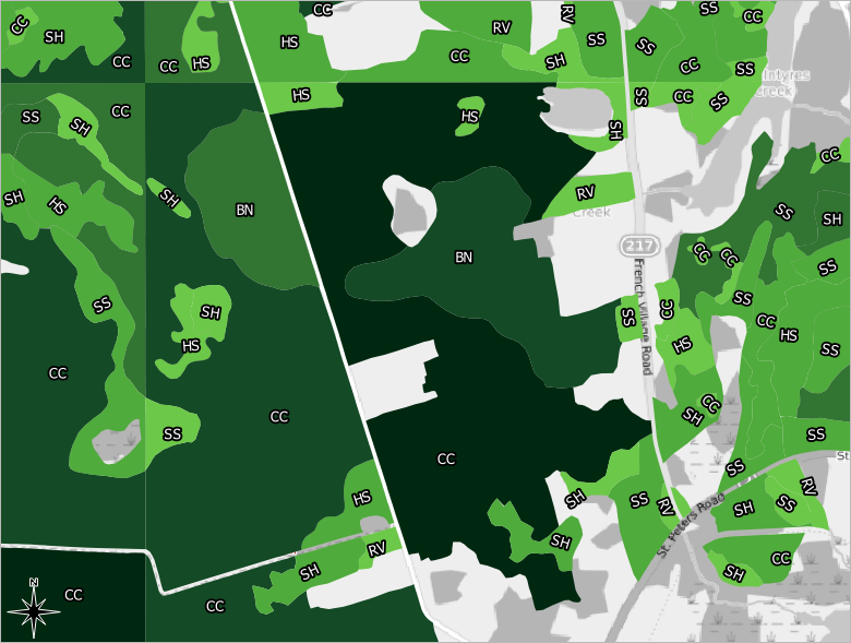
As in this example screenshot from northwest of Mount Stewart, you can see that the labels are now free to angle themselves so that they best fit within their corresponding polygons. This can make it easier to tell which label goes with which polygon.
Scale Visibility: Rendering the 1935 Forest Map’s Labels
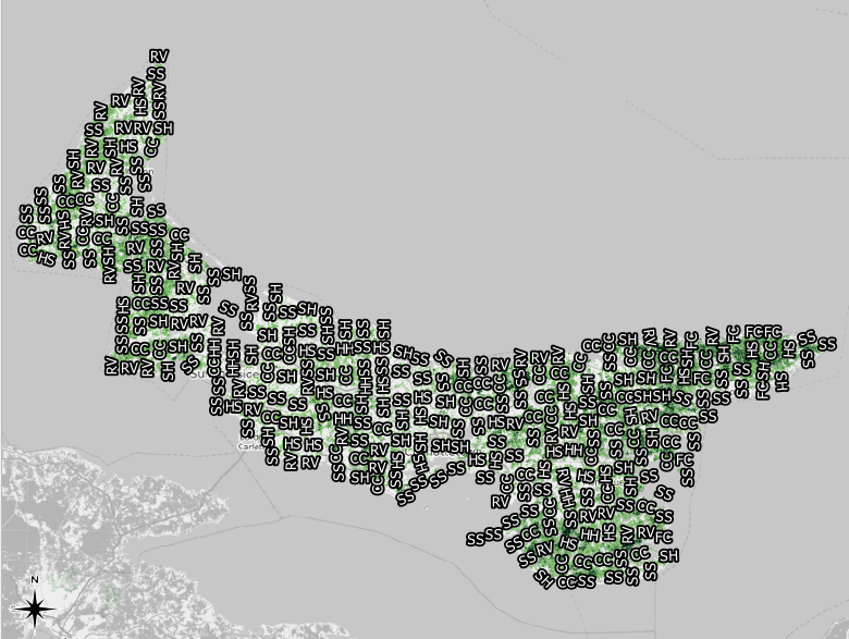
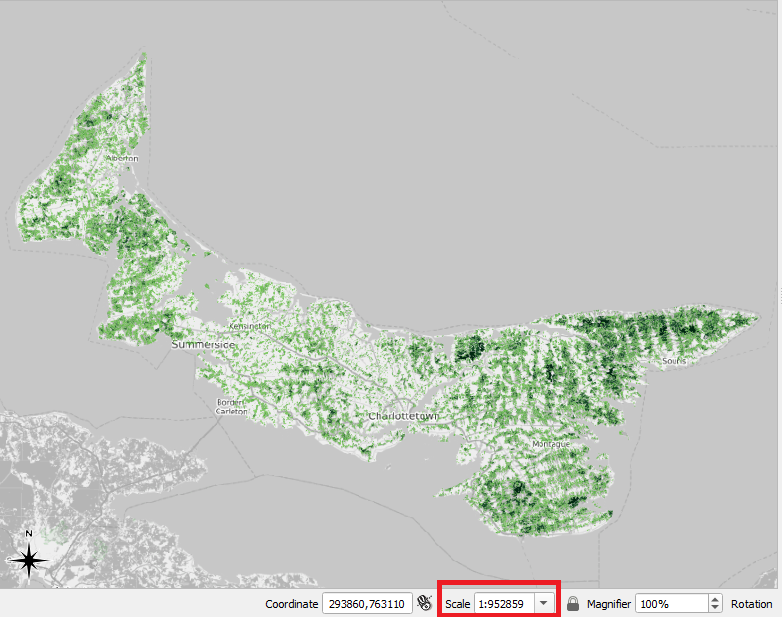
In the 1935 inventory region layer, our polygons are dense, irregularly shaped, and often small. So, if we were to turn on labels and then zoom out to view the entire Island, the individual labels would become far too crowded, and they would not correspond to any particular feature on the map. As in the screenshot below, our map would be unreadable. (Moreover, if QGIS has to load all of our labels at all scales, it takes longer to load our map.)
To fix this problem, we can tell QGIS to only show labels when we have zoomed in to a certain scale. At this scale, the labels will be readable. Then, when we zoom out, the labels disappear instead of becoming garbled and unintelligible.
- Return to the Labels menu in the Layer Properties window.
- In the Rendering menu, check the box next to Scale dependent visibility.
- This means that our labels’ visibility will be dependent on our map’s scale.
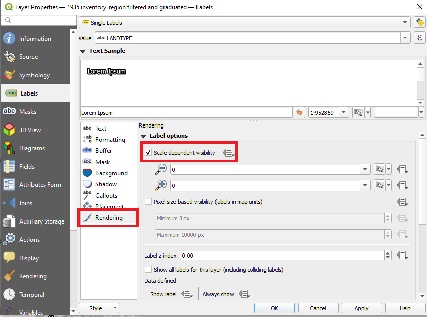
Under Scale dependent visibility, there are two boxes to fill out. Next to the first one is a magnifying glass encircling a minus sign. This box is where we set the Minimum Scale.
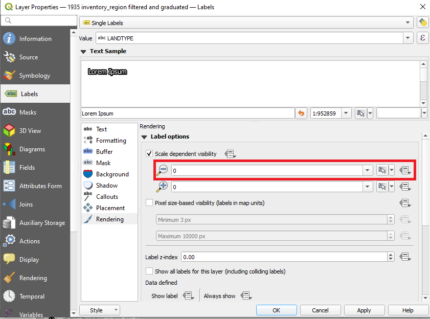
In this box, we want to enter the scale at which the labels begin to appear. If the user is at any scale that is smaller than the one that we set, the labels will not appear. So, for example, if we set the first box to 1:50000 and a user zooms to a scale of 1:60000, he or she will not see the labels. Once a user zooms into 1:50000 or beyond, the labels will appear.
The second box, the one featuring a plus sign, is where we set the Maximum Scale.
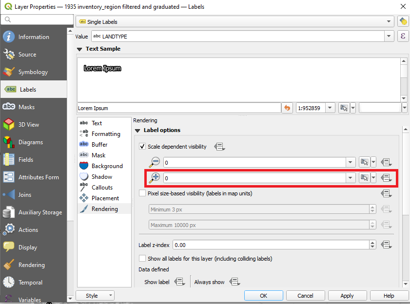
In this box, we will enter the scale at which the labels will disappear again. So, let’s say that we set the second box to 1:250. If a user zooms to a scale of 1:100, the labels will not be visible.
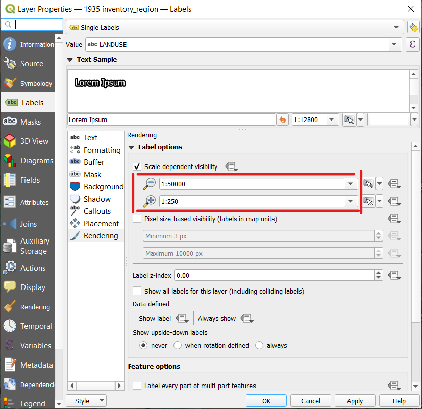
Used together, the two boxes allow us to define the scales between which a user will be able to see the labels.
- Set the Minimum Scale to 1:50000.
- Set the Maximum Scale to 1:250.
Now, when we view the entire Island, we do not see any labels because our scale is too small.
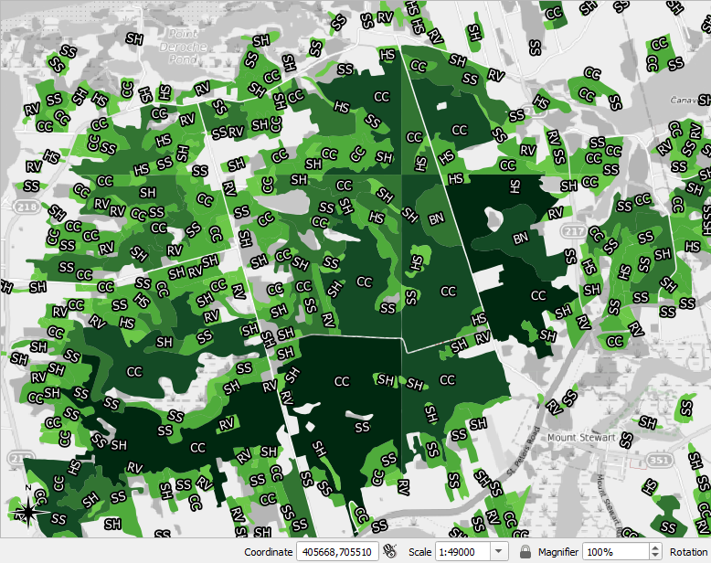
Here is the another screenshot of the area around Mount Stewart. Note that the labels are visible because we are at a scale of 1:49000, which lies between the Minimum and Maximum Scales that we set in the Rendering menu.
We have just learned how to use labels and colouring together to tell two aspects of PEI’s forestry story at the same time. Now, we can look at our map and understand two things about the forest environment in 1935: the colour of a polygon tells us the size of a continuous forest stand, and the label of a polygon tells us the type of forest cover that it was.
We can use the map we just produced to continue our assessment of land use in PEI in 1935. Which land use type is most often associated with the darkest colour? It appears as though most of the darkest green areas of the map have a LANDTYPE code of CC or SS, or “clear cut” and “mostly softwood,” respectively. Keep in mind that softwoods are usually the first type of tree to grow back in a cleared area once it starts to become a forest again. Thus, the results of our map suggest that a great deal of the trees in this part of PEI had either been recently harvested or they had been harvested earlier and had regrown by 1935. In the 1935 inventory region map, most of these large blocks appear as either “clear cut” or “mostly softwood.”
Attributes for Feature Labels
In Chapter 1, we covered how to turn on labels in the PEI_placenames layer and symbolize them. But there are only a few placenames included in this layer. We will create labels for more communities in PEI in this step. Labelling more Island communities will give our audience added context when they are reading our map.
Some of the communities for which we will create labels, such as Kensington and O’Leary, only emerged once PEI’s interior had been sufficiently cleared of trees.
Adding New Point Features for Labels
Before we can add new labels to the PEI_placenames layer, we must first check this layer’s attribute table in order to know which attributes we can assign to the newly created labels.
- Right-click the PEI_placenames layer in the table of contents.
- Click Open Attribute Table
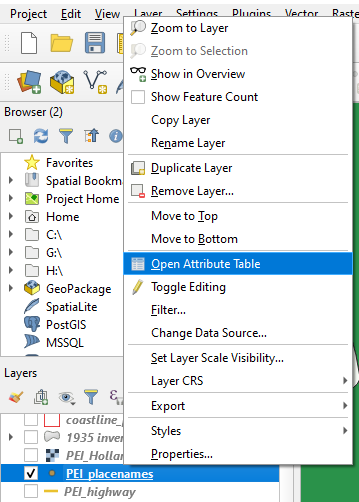
The Attribute Table appears.
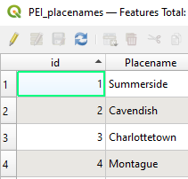
In the attribute table, we see that there are four rows of data corresponding to the four places for which a label has already been created. Each place has to have its own unique ID. If we wish to add a fifth label, we would give it an ID number of 5 alongside its name, for the numbers 1through 4 have already been used.
Now that we have checked the attribute table, we can proceed to create some new labels.
- For now, turn off the 1935 inventory region filtered and graduated map.
- We will use the OpenStreetMap base map as a guide for adding new labels. We can use either the regular one or the black-and-white one.
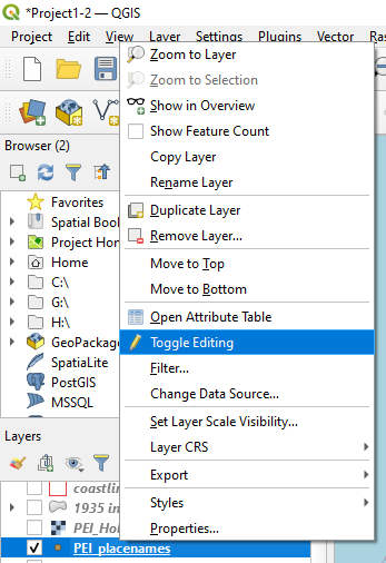
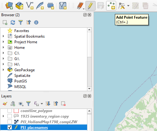
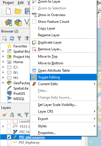
- Right-click the PEI_placenames layer in the table of contents.
- Click Toggle Editing
- Click on Add Point Feature
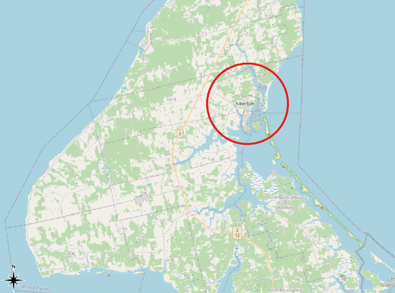
- Pan the OpenStreetMap base map to western PEI.
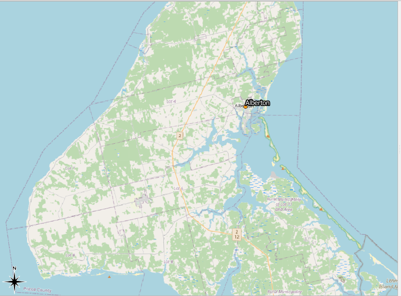
- Click on Alberton to place a point there. (See the screenshot below for its general location.)
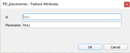
After you click to place a label, you will see the following dialogue box:
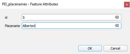
- In the ID field, enter 5.
- In the Placename field, enter Alberton.
- Click OK.
Alberton will now be labelled on the map:
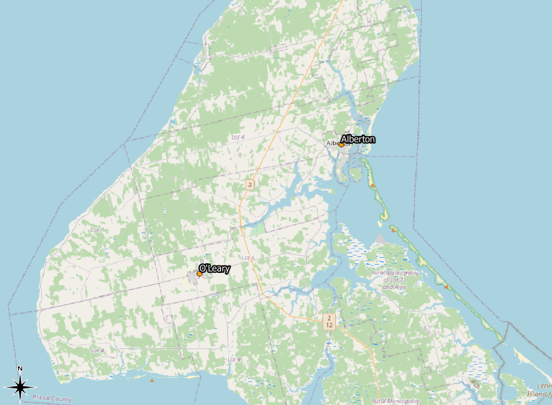
- Using the same process, add a label for the town of O’Leary. (See the screenshot below for its general location.)
- Make sure to provide O’Leary with an ID value of 6.
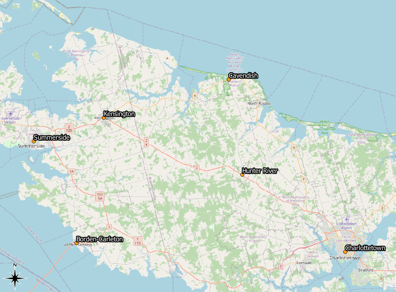
- Pan to central PEI and create labels for Kensington, Borden-Carleton, and Hunter River.
- Make sure to give them the IDs of 7, 8, and 9, respectively.
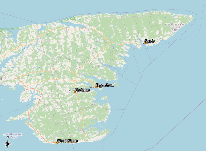
- Pan to eastern PEI and create labels for Souris, Georgetown, and Wood Islands. (See the screenshot below for their general locations.)
- Make sure to give them the IDs of 10, 11, and 12, respectively.
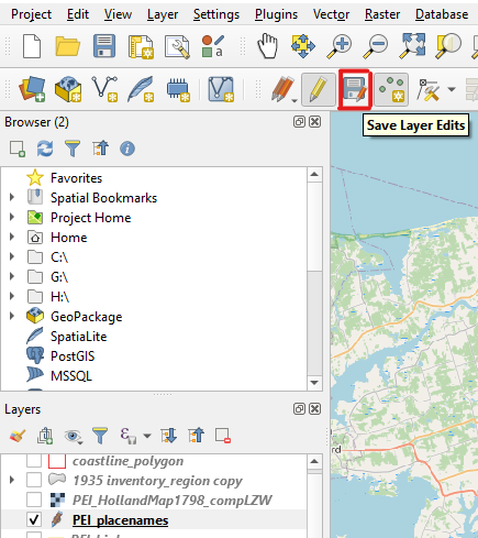
Now that we are done adding more labels,
- Click the Save Layer Edits button.
- In the table of contents, right-click the PEI_placenames layer and click Toggle Editing.
- This turns off the editing mode.
- In the table of contents, turn on the 1935 inventory region filtered and graduated layer again.