
Chapter 2: Data Management, Symbols, and Styles in QGIS
Part II A: More Symbology
We are going to further expand on the concepts around symbology first explored in Chapter 1.
Principles of Cartography When Using Symbology
Categorized Symbology
We used Categorized symbology for the first time in Chapter 1: Introduction to GIS. Each type of land use on Prince Edward Island was given a unique colour. This exercise was useful for introducing the concept of symbolizing a layer. However, we did not pause to think about which type symbolization would have been best to perform on this layer.
A principle of cartography is that we have to know our map data and the intent of its creators.
It is important that cartographers use a map in the way the mapmaker intended so that the data is displayed appropriately rather than in a misleading or ineffective way. Each map has strengths and weaknesses based on the mapmaker’s purpose and focus.
Attributes: Getting to Know Our Data
Sidebar text for the sidebar here. It’s all about attribute table to get to know our data. Once we know the strengths and weaknesses of our data, we can decide the best way to symbolize it. Sidebar text for the sidebar here. It’s all about attribute table to get to know our data. Once we know the strengths and weaknesses of our data, we can decide the best way to symbolize it.
We can use the attribute table to get to know our data. Once we know the strengths and weaknesses of our data, we can decide the best way to symbolize it.
- Right-click the 1935 inventory region layer in the table of contents.
- Click Open Attribute Table.
Here, we see a table containing the fields featured in our dataset.
- Click the LANDUSE header to sort the table alphabetically by this field.
Within this field, we can see the following attribute data under the LANDUSE column header: ALDER, DEVELOPED, FOREST, ORCHARD, REVERTING, and WETLAND. We can also see that there are different LANDTYPE attributes associated with each of these LANDUSE attributes. These associations are laid out in the table below.
| LANDUSE | Attributes | |||||
| Alder | Developed | Forest | Orchard | Reverting | Wetland | |
| LANDTYPE | AL | CL | CC | OR | BN | BO |
| Attributes | RD | FC | RV | WL | ||
| RR | HH | WW | ||||
| HS | ||||||
| MW | ||||||
| SH | ||||||
| SS |
We can see that the makers of this map were primarily focused on the Island’s forests, for they broke down this LANDUSE category into the most LANDTYPE subcategories.
But what do the LANDTYPE codes mean? As part of the process of getting to know our data, we can consult the metadata that accompanies it. We can view our data’s metadata by visiting the same website hosted by the PEI government from which we downloaded the 1935 inventory region shapefile. Instead of clicking on the 1935 inventory region’s SHP link, we can click on the Metadata link.
Under the heading called “How does the data set describe geographic features?,” under LANDTYPE, there is a web address to the page containing an explanation of the codes. Viewing this page, we can see that the LANDUSE code is a more general descriptor, while the LANDTYPE code is more specific. From this, we can gather that the mapmakers designed this dataset to show both the general and specific ways in which a parcel was used, represented by the LANDUSE and LANDTYPE variables, respectively. Furthermore, it seems that the LANDUSE attribute on which they focused the most was the one called FOREST, for there are the most subcategories for this variable in the LANDTYPE column.
So, it seems that the mapmakers created this land use map principally in order to evaluate the forest cover on PEI. Since the mapmakers focused on the FOREST attribute data and its subcategories, they are perhaps the most accurate data. So, we will focus our maps on this data too.
Filters: Mapping Only the Forested Land
We will filter the 1935 inventory region shapefile map so that our symbolization applies only to FOREST parcels. We will also include the REVERTING value in our filter.
Creating a filter in this way is useful for cases such as ours in which we do not want to permanently delete parts of our shapefile (i.e., the categories called something other than FOREST and REVERTING.) A filter can be a way to temporarily see how our shapefile would look with certain features excluded. Or you can leave a filter on indefinitely.
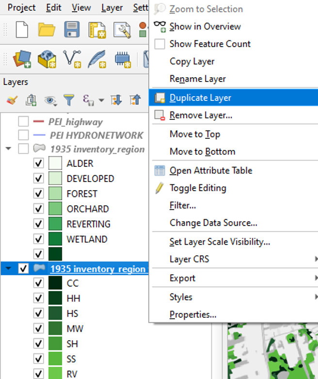
We will create a copy of our main 1935 inventory region layer in our table of contents. We will apply our filter to the copied version, which will allow us to leave this filter on indefinitely.
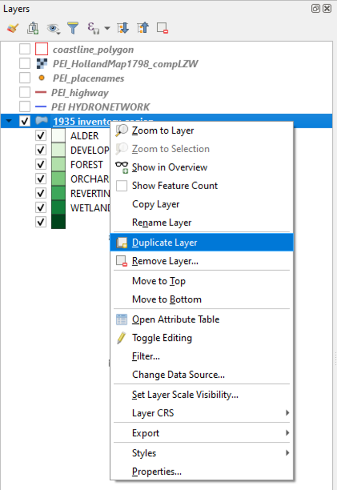
- In your table of contents, right-click the layer called 1935 inventory region.
- Click Duplicate Layer
This will create a copy of this layer in our table of contents.

We now have a layer in our table of contents called “1935 inventory region copy.”
- Right-click this layer and click Rename Layer.
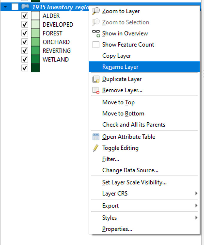
- Type in “1935 inventory region filtered” and press Enter on your keyboard.
We are now going to filter our layer so that it only shows the features that contain the FOREST and REVERTING attribute data. We can do this by creating a simple expression.
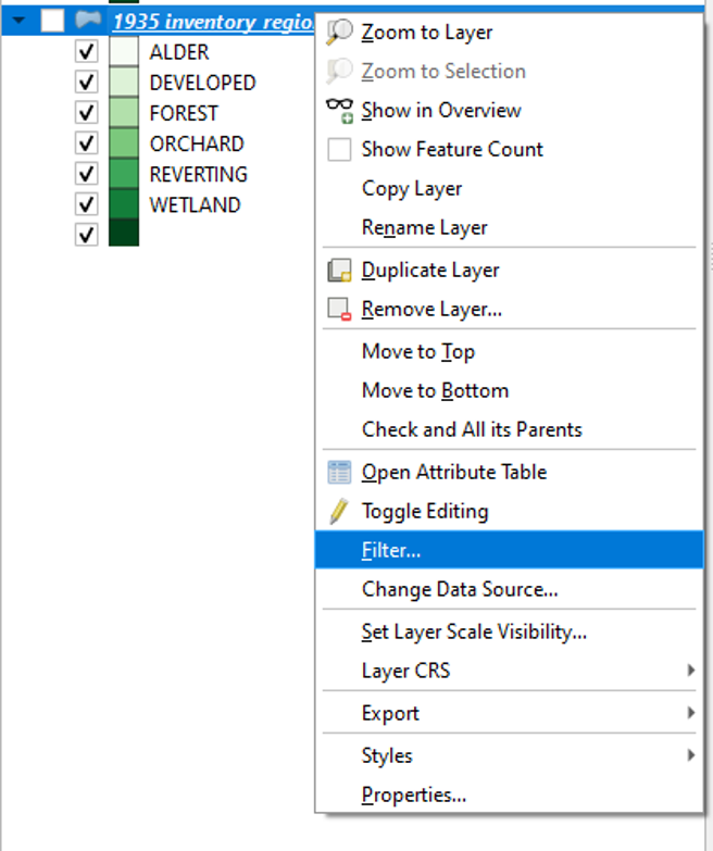
- Right-click the 1935 inventory region filtered layer.
- Click Filter
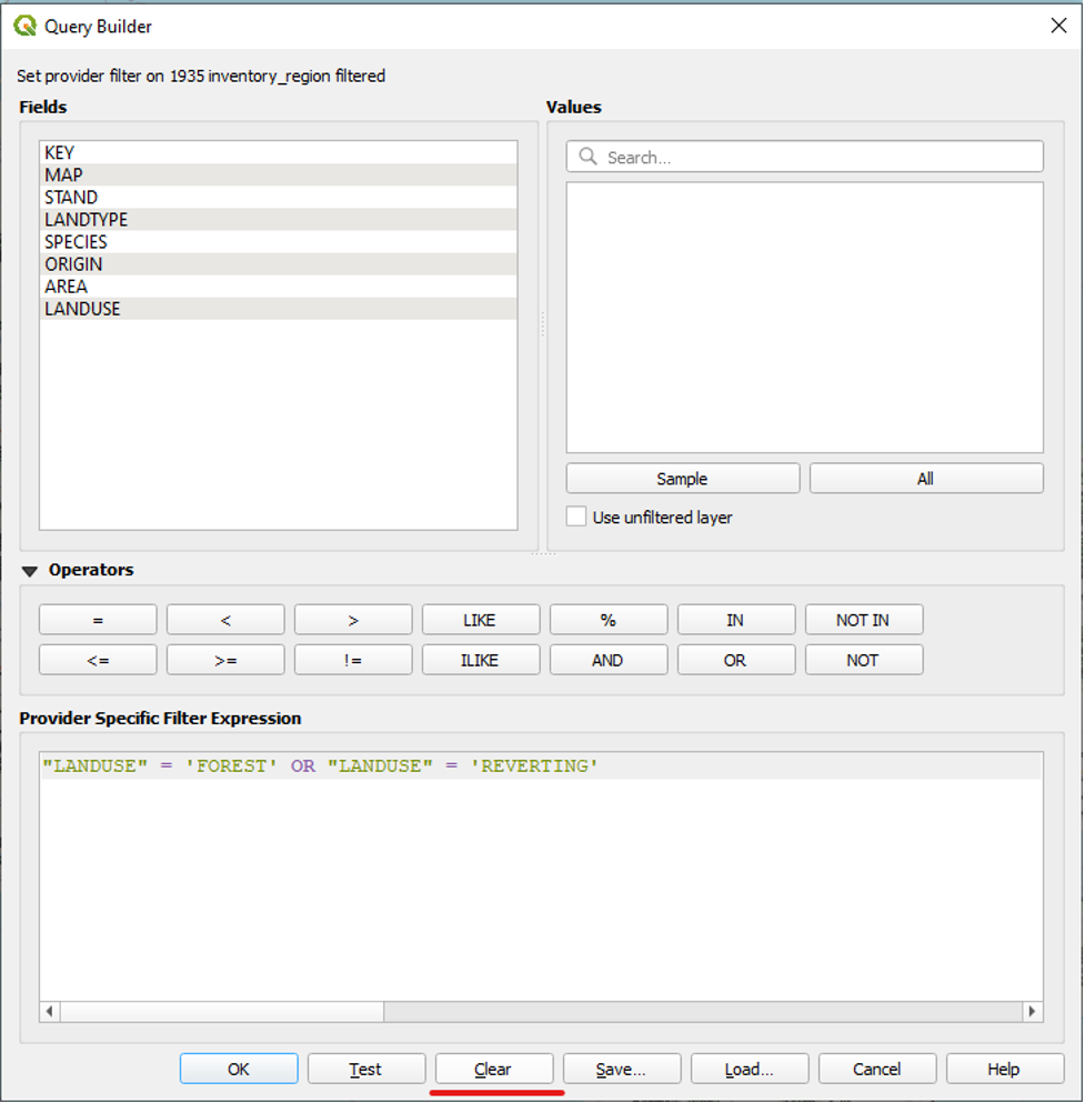
The Query Builder window will appear.
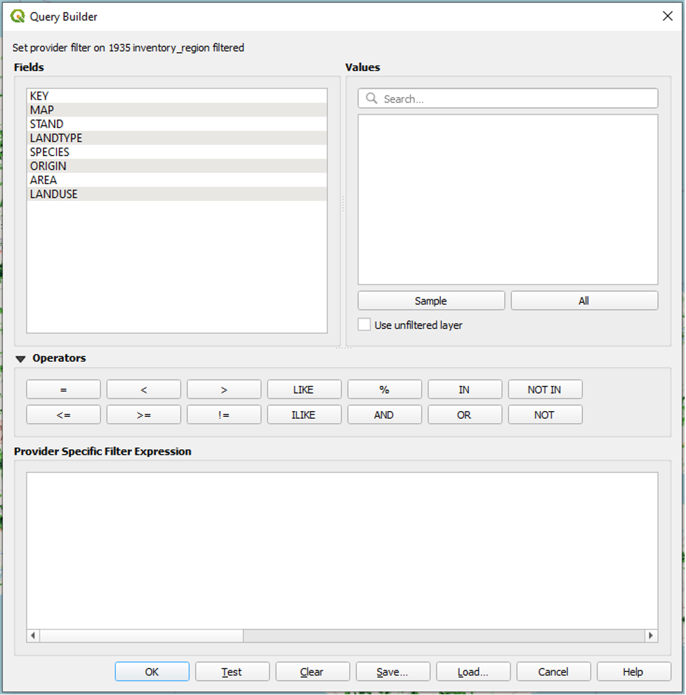
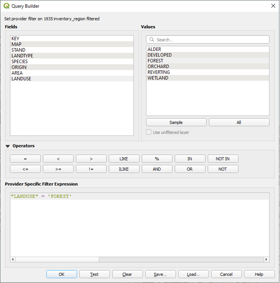
- Under Fields, left-click once on the LANDUSE field to select it.
- Under Values, click All.
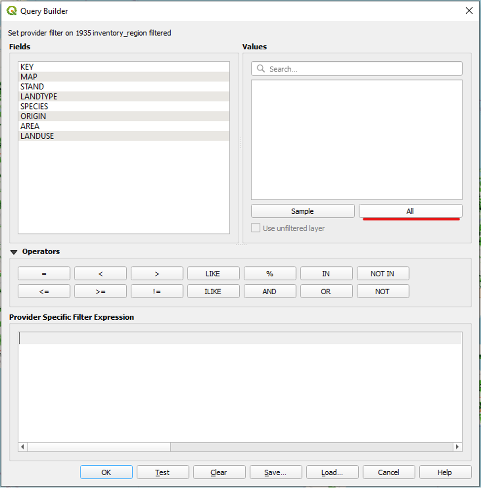
Under Values, all of the values associated with that field will appear.
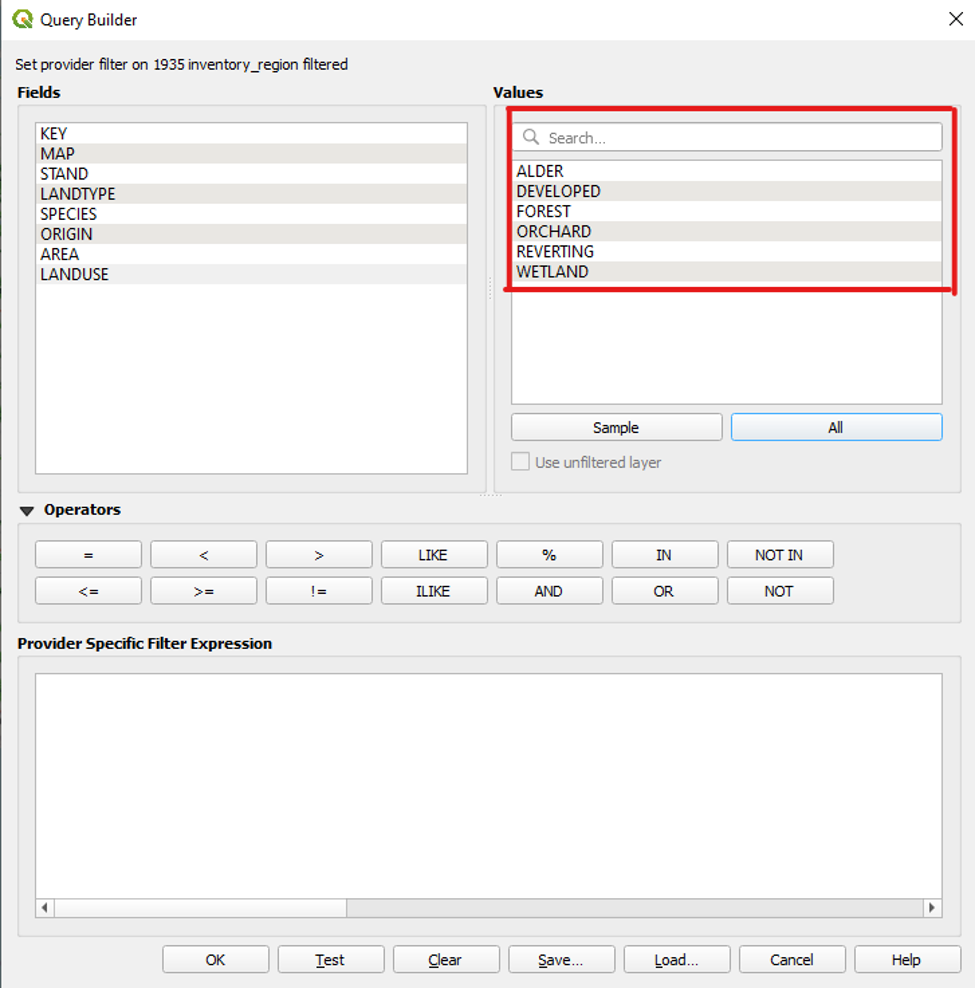
We want to include only the FOREST and REVERTING values. To do so,
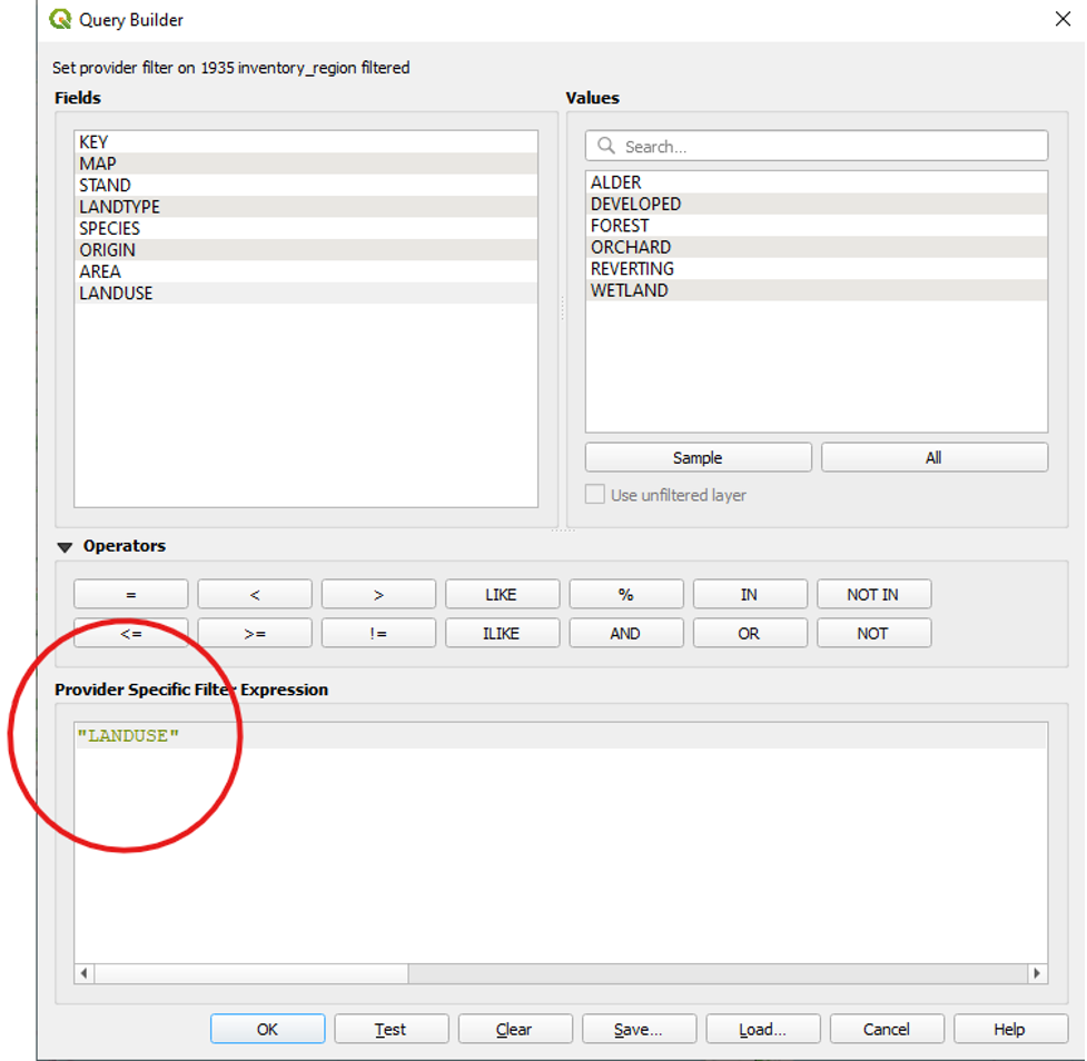
- Under Fields, double-click on LANDUSE to add it to our expression.
We will now tell QGIS that the only two values in the LANDUSE field that we want it to display are the FOREST and REVERTING values. To do so, we will use the operators “=” and “OR.”
- Under Operators, click the equals sign (i.e., “=”).
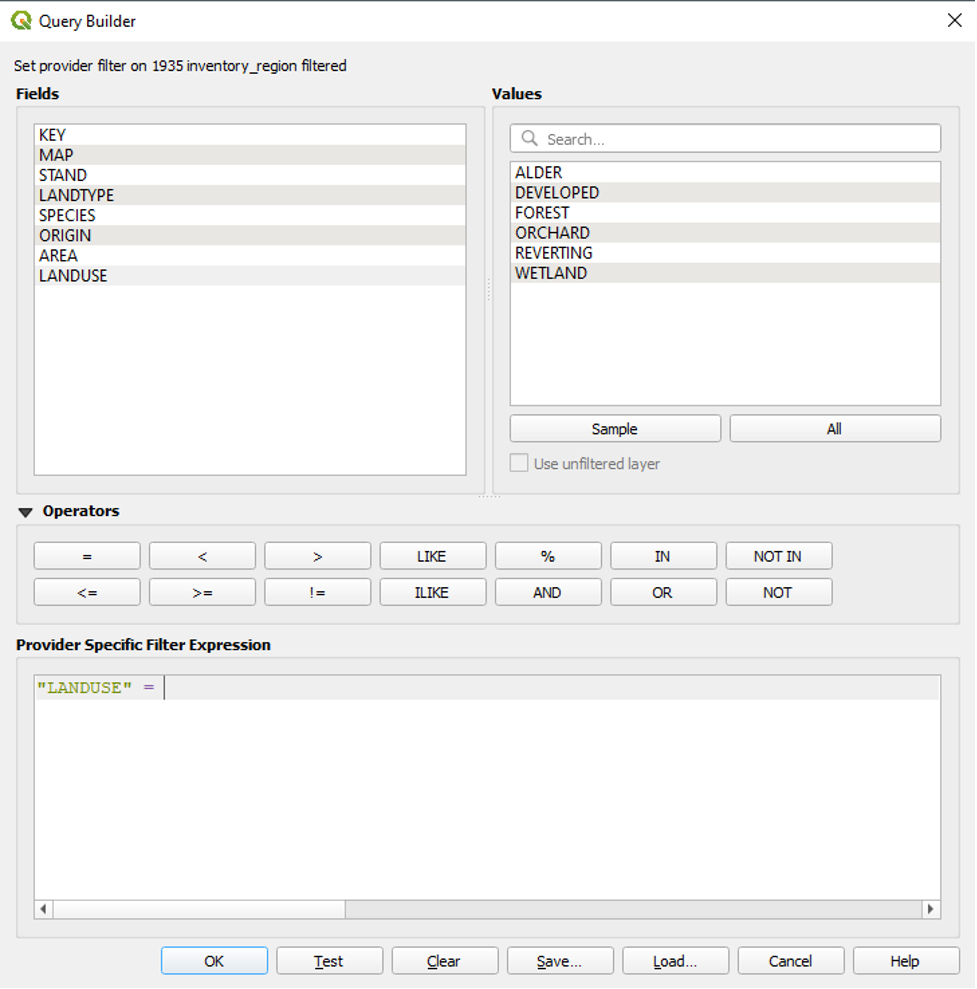
- Under Values, double-click FOREST to add it to our expression after the equals sign.
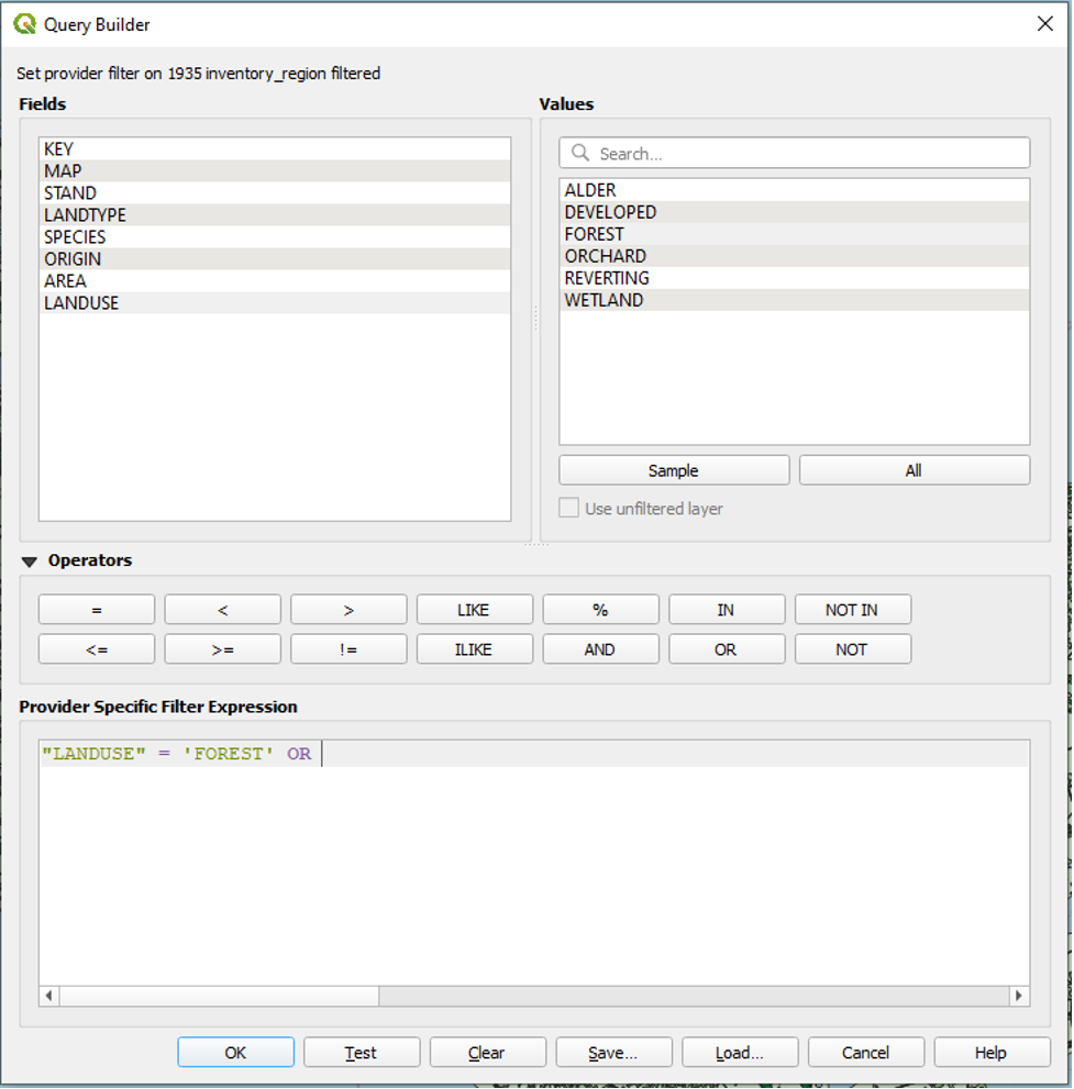
We will now use the OR operator to add the REVERTING value to our filter.
- Click the OR operator to add it to our expression after ‘FOREST’.
● Under Fields, double-click LANDUSE again to add it to our expression after OR.
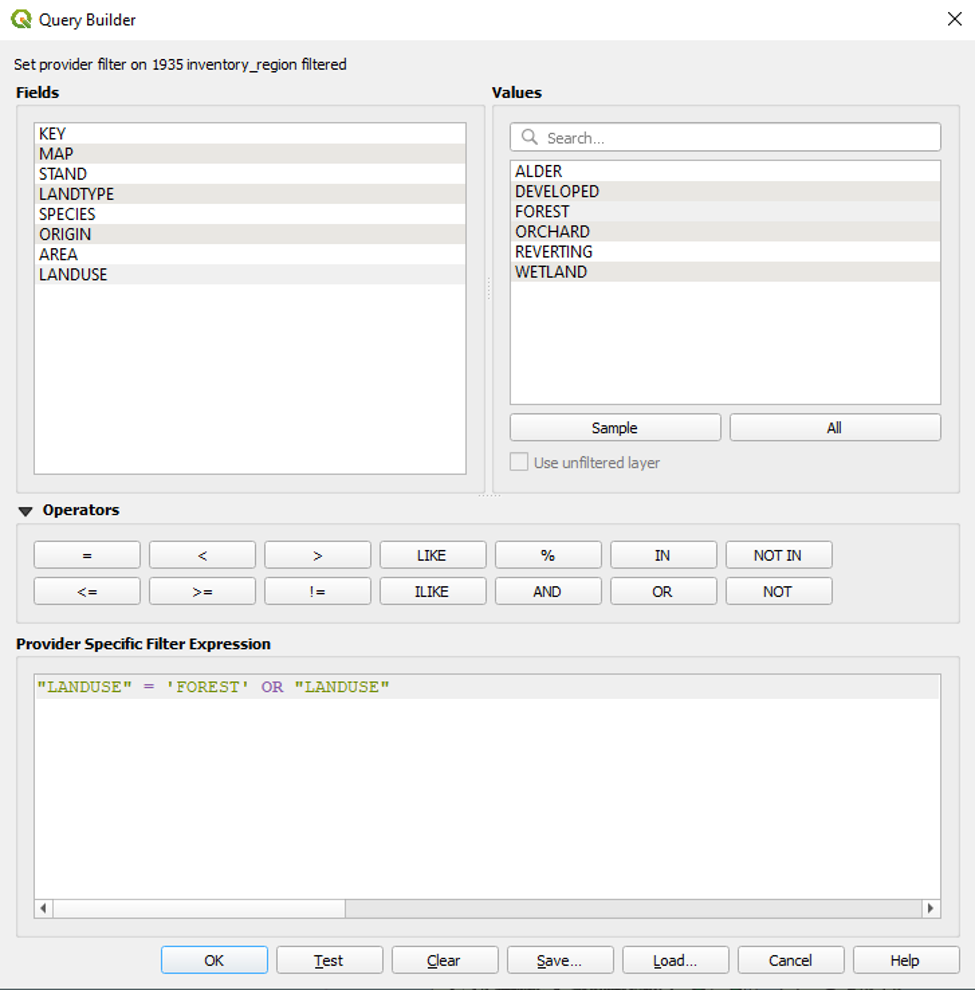
- Click the equals sign operator.
- Under Values, double-click REVERTING.
The final expression looks like this:
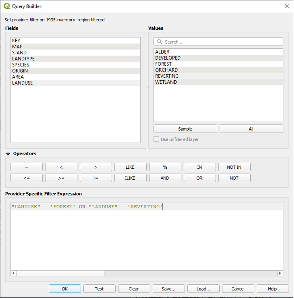
With this expression, we are telling QGIS to show only the parts of the 1935 inventory region shapefile whose LANDUSE attribute data is equal to FOREST or REVERTING. QGIS will not display any other parts of the 1935 inventory region shapefile.
- Click OK to close the Query Builder.
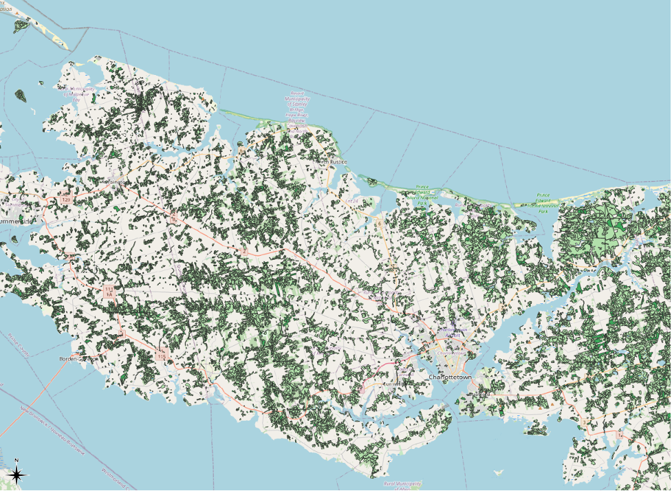
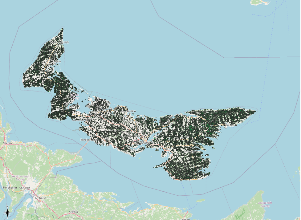
Our 1935 inventory region layer will go from looking like this…
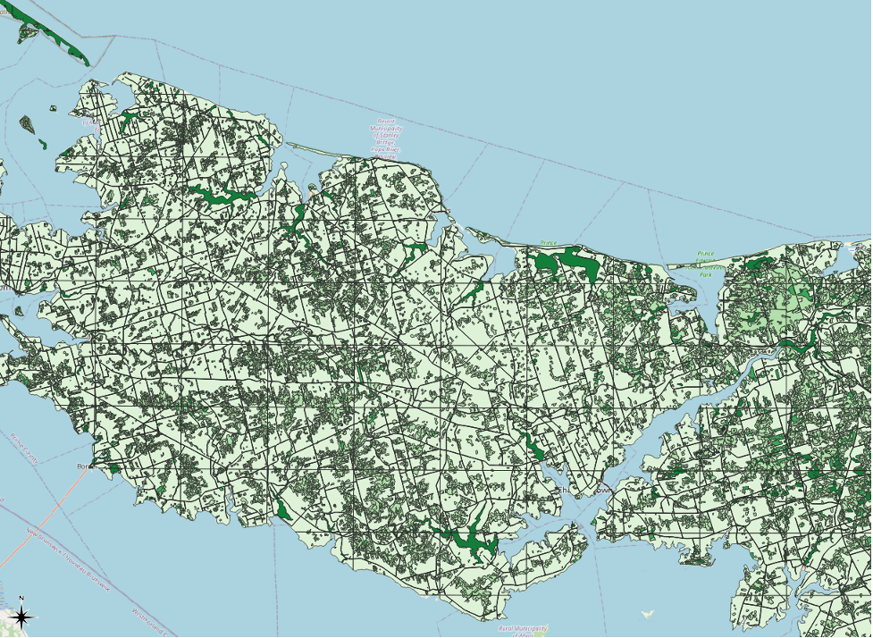
…to looking like this.
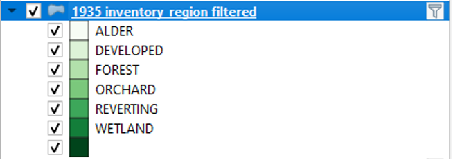
We can also tell that a layer is filtered by looking at the table of contents. There, the layer has a small image of a filter appear next to its name.
We can click on this image of a filter to quickly return to the Query Builder to adjust our filtering settings if needed.
If we save and close our QGIS project while the filter is turned on, the layer will remain filtered the next time we open the project.
Symbology: Applying Categorized Symbols to the LANDTYPE Field
We are now going to get even more specific in how we symbolize our 1935 inventory region layer. We are going to symbolize several types of forest, in particular. The types of forest are listed within the LANDTYPE field. The ones with which we are concerned are CC, HH, HS, MW, SH, SS, and RV. We can tell QGIS not to symbolize any other values in the LANDTYPE field.
- Right-click the 1935 inventory region filtered layer.
- Click Properties
- Click Symbology
- From the dropdown menu at the top of the Layer Properties window
- Click Categorized.

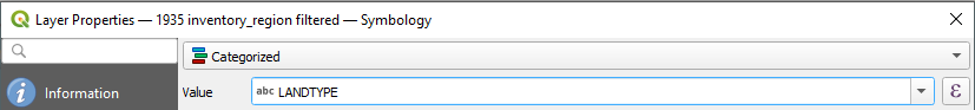
- In the dropdown menu next to Value, select LANDTYPE.
- In the dropdown menu next to Colour Ramp, choose Greens.
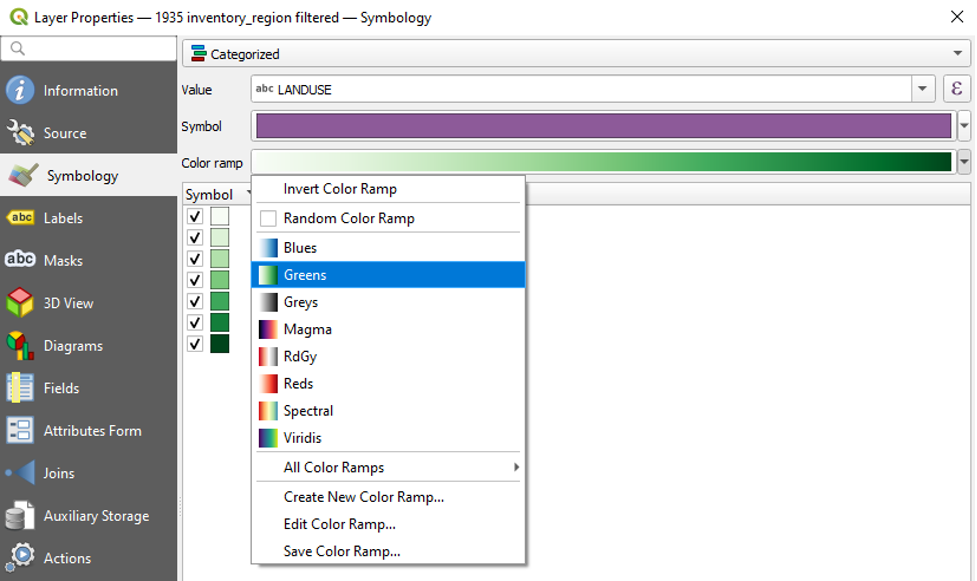
- At the bottom of the Layer Properties window, click Classify.
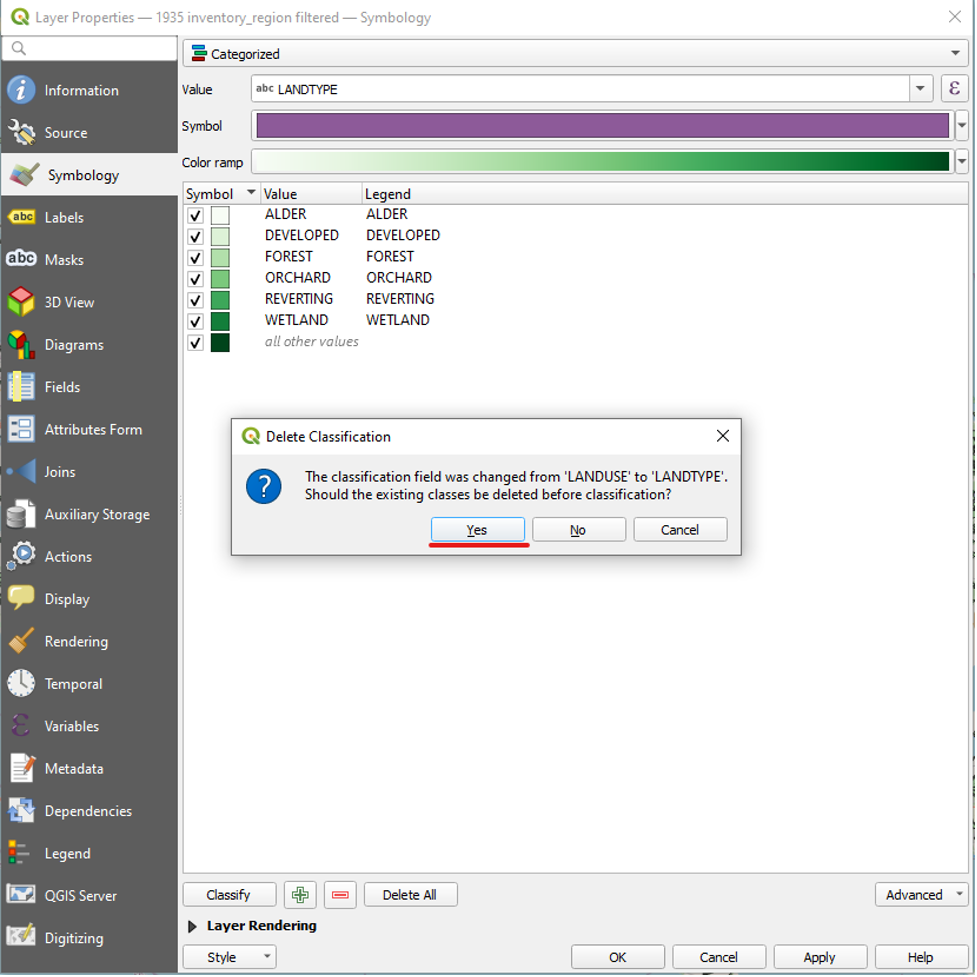
We have now symbolized all of the LANDTYPE values. To symbolize only the CC, HH, HS, MW, SH, SS, and RV values, we can select and delete the other values within the Layer Properties window.
- Select all of the values other than CC, HH, HS, MW, SH, SS, and RV. Also select “all other values.”
While these values are highlighted, click the red minus button to delete them.
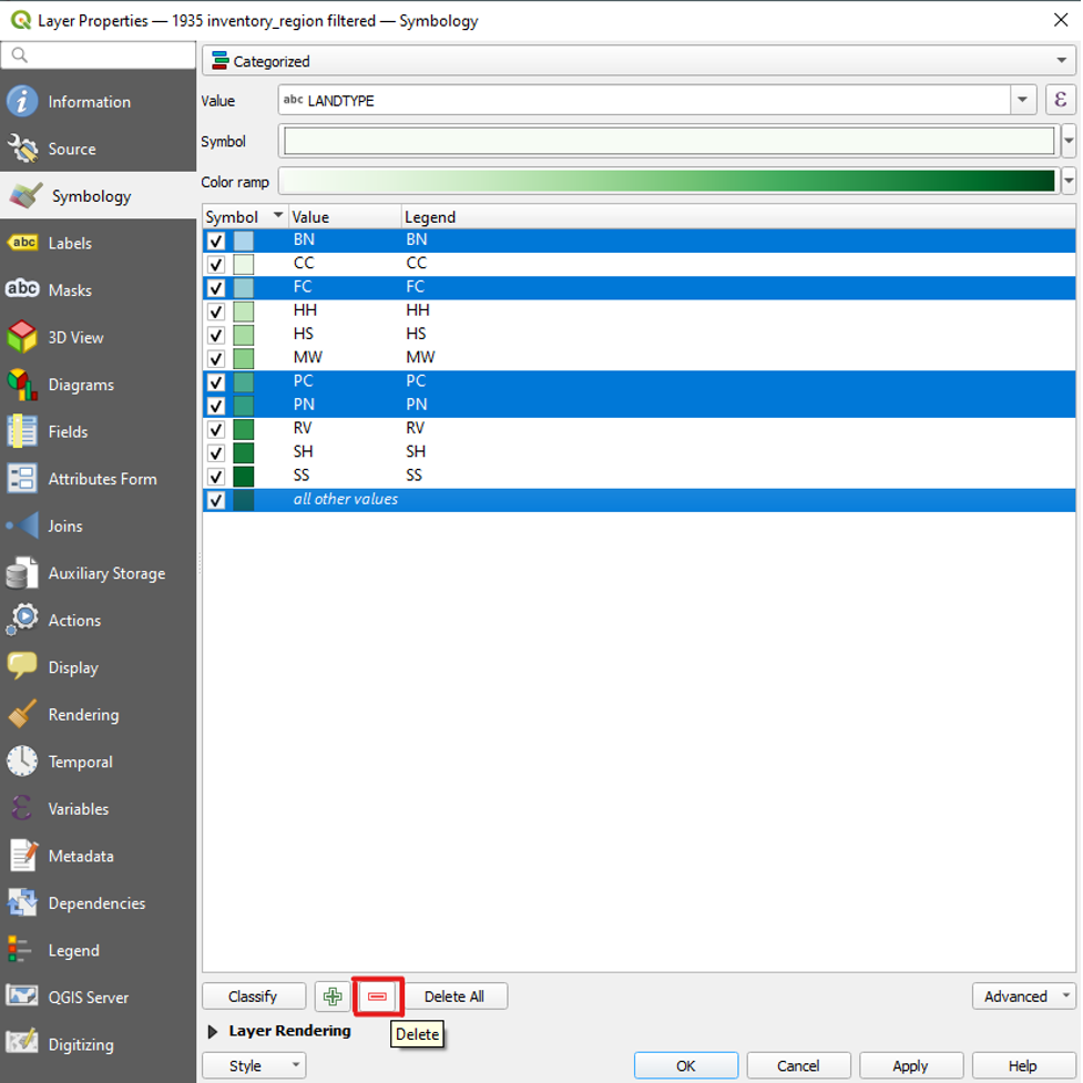
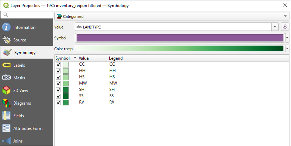
We are now left with the seven categories that we wish to map. Before we click OK, we will drag the RV value to the bottom of the list.
- Click and hold the RV value.
- Drag it to the bottom of the list, below SS.
- Release your click.
This is the result:
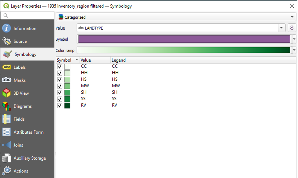
You will notice that the colour gradient is now out of order. To remedy this,
- Click the dropdown next to Colour Ramp.
- Click Greens again.
Here is the result:
- Click OK to close the Layer Properties window.
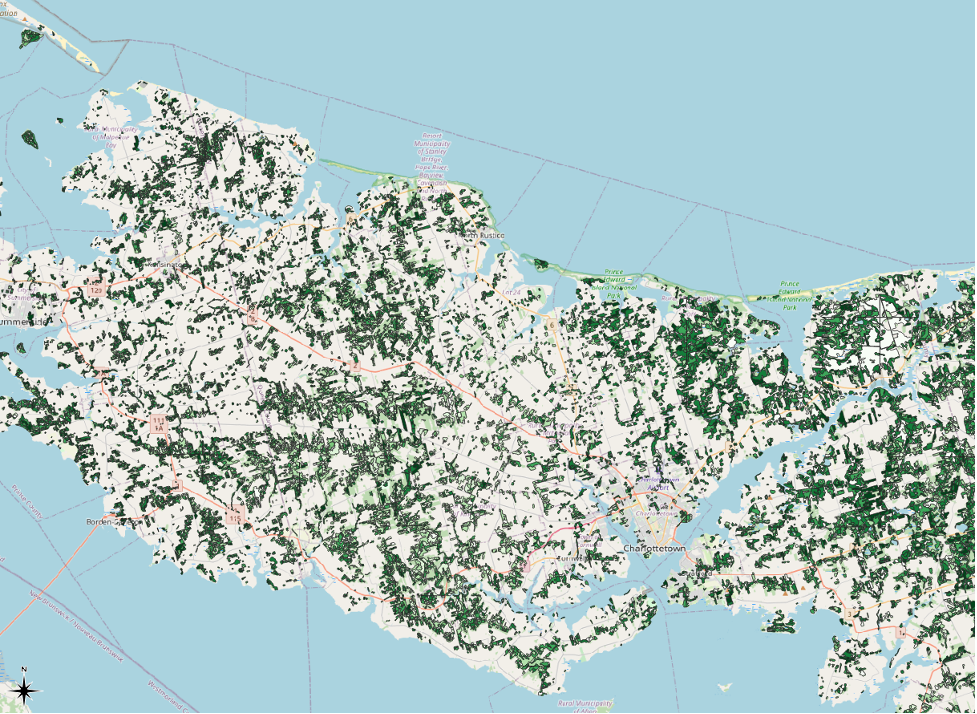
Our map now looks like this:
There are a few changes that we make to improve the visibility of our symbolization.
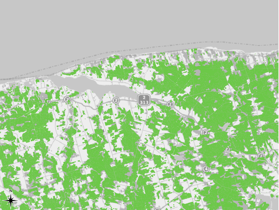
First, we will remove the black border that accompanies each polygon. This will allow us to zoom out to view the entire Island without the black border overpowering the green symbology that we set, which is what happens now:
To remove the black border from our polygons,
- Right-click the 1935 inventory region filtered layer in the table of contents.
- Click Properties.
- Click Symbology.
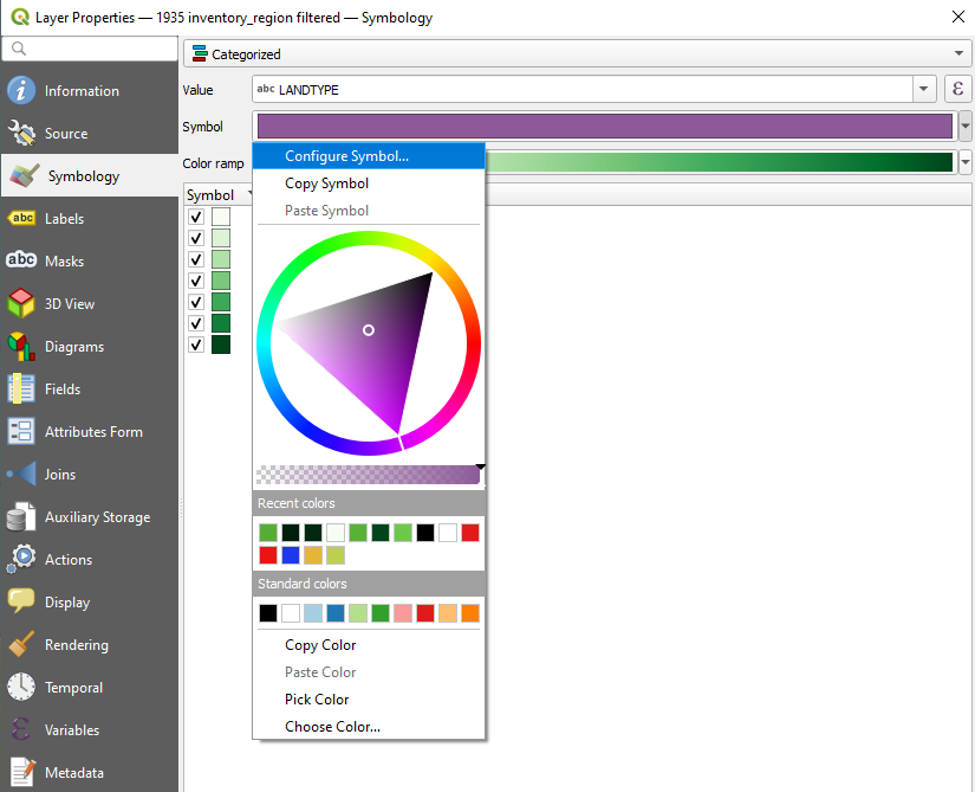
- In the dropdown menu next to Symbol,
- Click Configure Symbol.
- In the Symbol Settings window, click to select Simple Fill.
- In the dropdown menu next to Stroke Colour, choose Transparent Stroke.
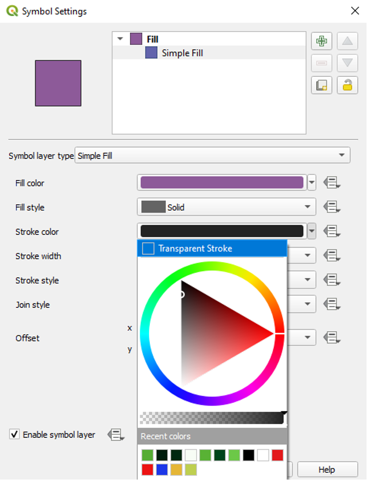
- Click OK to close the Symbol Settings window.
- Click OK to close the Layer Properties window.
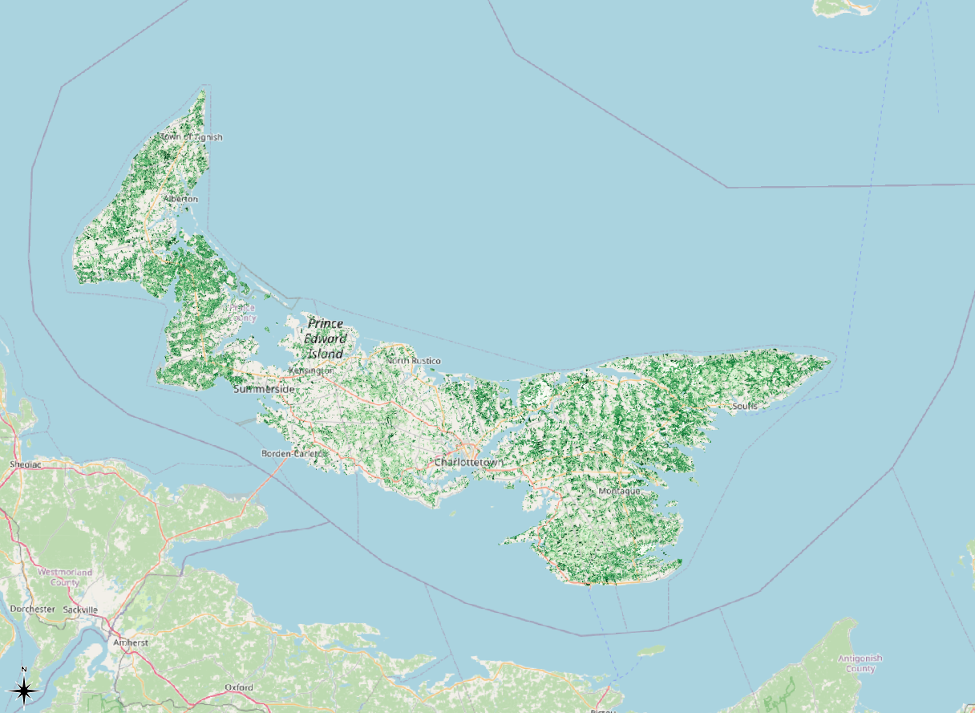
Here is the result. Without the black borders around the polygons, their green symbolization becomes much easier to see.
We can further augment the visibility of our symbolization.
- Right-click the 1935 region inventory filtered layer.
- Click Properties.
- Click Symbology.
- Click the dropdown arrow next to Colour Ramp and click Invert Colour Ramp.
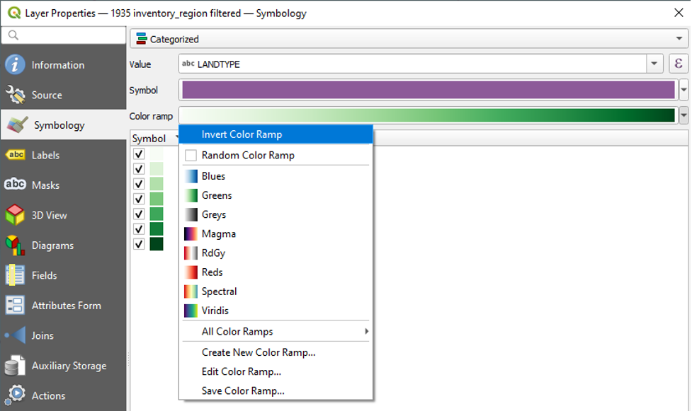
Doing this will retain the order of our LANDTYPE values but reverse the order of the green symbology gradient. Now the CC value has the darkest colour. Inverting the colours like this is a key part of knowing our data. In this case, the HH value stands for forested areas that mostly consist of hardwood species. Hardwood species normally take the longest to grow, while softwood species are usually the first type of tree to grow in an area when it is becoming a forest. So, by inverting the colour scheme and making the HH value a darker green, we are drawing more attention to the areas of hardwood tree species that still existed in 1935. In other words, these areas were most likely the ones that avoided deforestation.
While we are in the Layer Properties window, we will also change the colours in the Greens colour ramp so that the lightest shade of green is more visible.
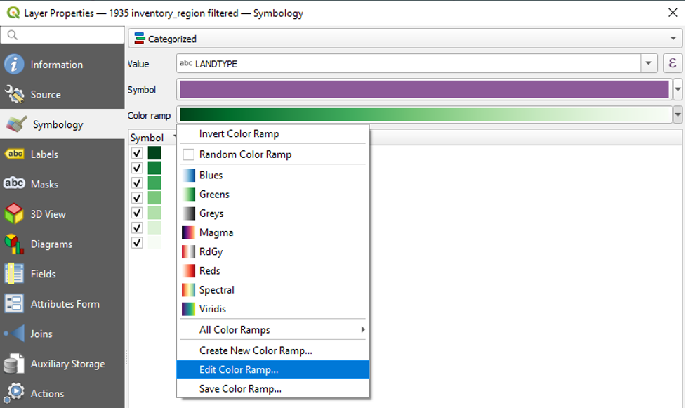
- Right-click the 1935 inventory region filtered layer in the table of contents.
- Click Properties.
- Click Symbology.
- Click the dropdown arrow next to Colour Ramp and click Edit Colour Ramp.
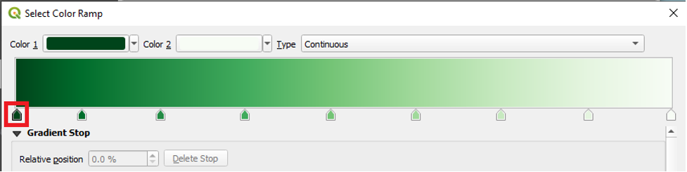
- The Select Colour Ramp window will appear.
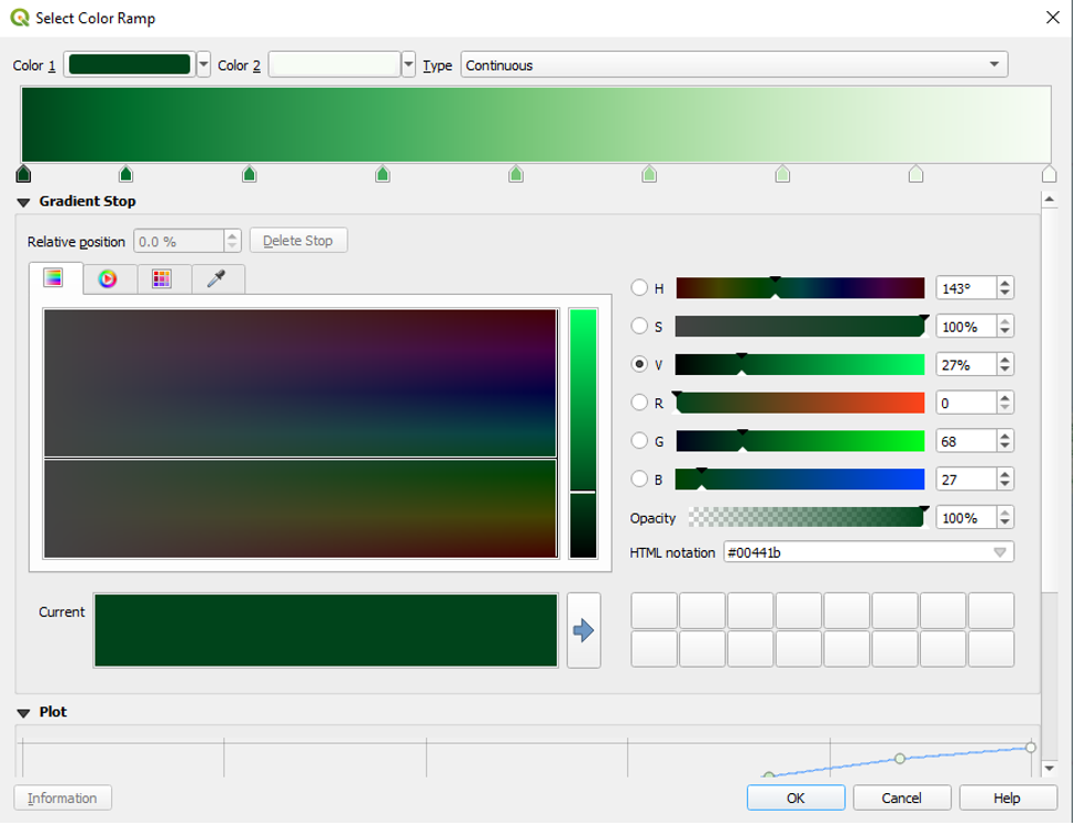
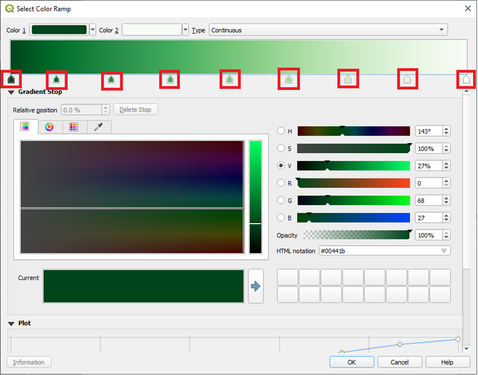
- We can see our nine Gradient Stops. We can click on one to open the options for editing it.
With a gradient stop selected, we can alter its colour using the tools found under the Gradient Stop heading.
We can also adjust the colours of the gradient stops under the Plot heading. In this area, we can check Lightness. Then, we can drag the circles (which represent gradient stops) to a higher or lower position on the plot. The higher the position on the plot, the lighter the colour.
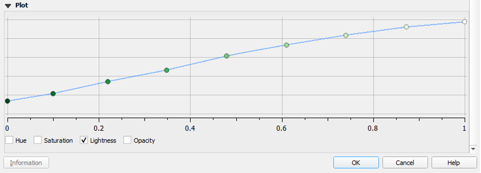
To make your gradient stops darker, you can move all of the circles on the plot to a lower location.
Or, if you wish that your colours match the ones created by the authors, you can do the following.
Navigate back to the top of the Select Colour Ramp window.
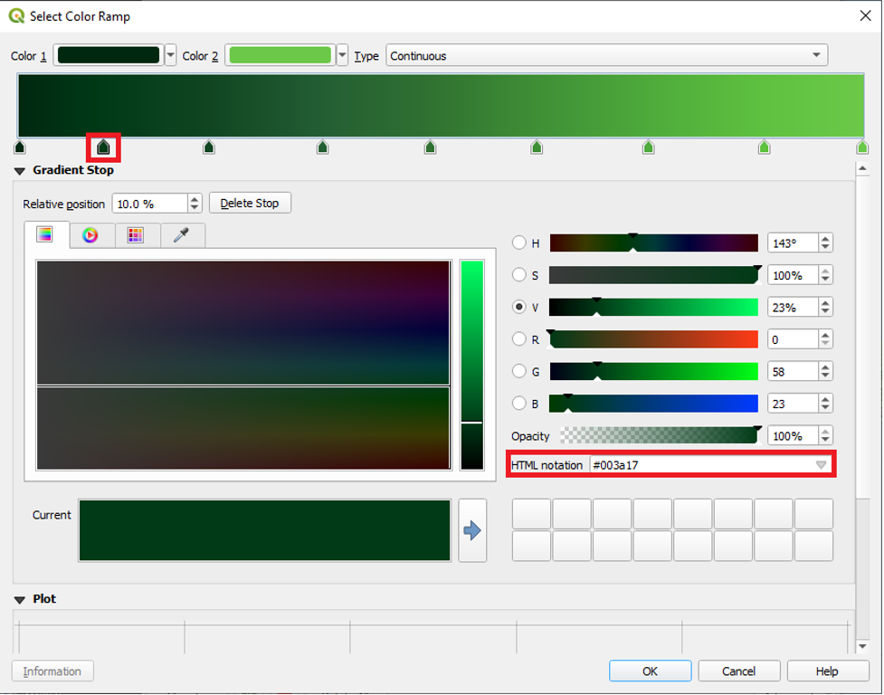
- Click to select the first gradient stop.
Under the Gradient Stop menu, enter the following HTML notation value: #002810

Select the second gradient stop and enter the following HTML notation value: #003a17
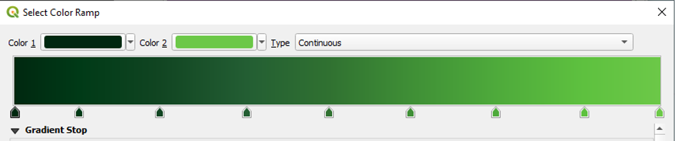
Continue this process, adding the following HTML notation values:
Gradient Stop 3: #114522
Gradient Stop 4: #235e33
Gradient Stop 5: #307131
Gradient Stop 6: #3f8f36
Gradient Stop 7: #4eaa3b
Gradient Stop 8: #5ec13f
Gradient Stop 9: #6cc848
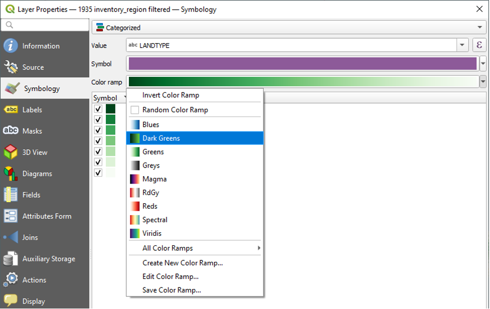
Your colour ramp will end up looking like this:
- Click OK to close the Select Colour Ramp window.
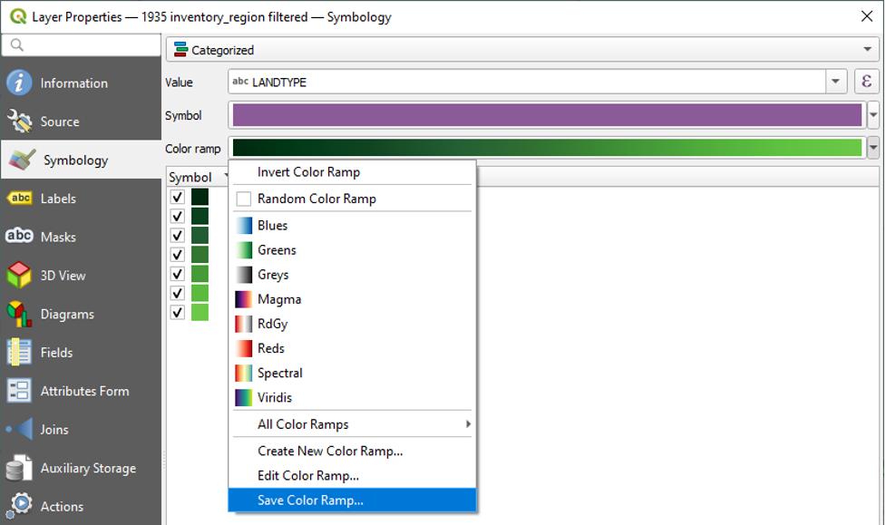
- Provide a name (e.g., Dark Greens), check “Add to favourites,” and click OK. You will now see your custom colour ramp when you click the dropdown next to Colour Ramp.
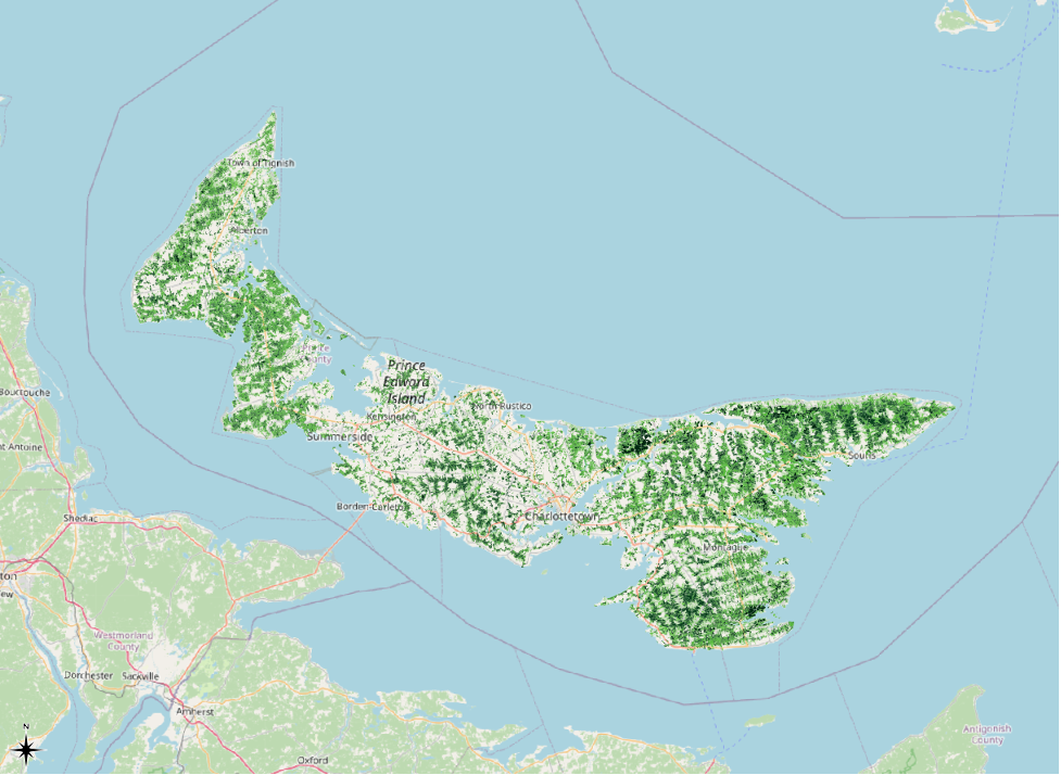
Here is the result of our customized symbology. With the customizations that we have made to the symbology, it is very easy for an audience to see the different shades of green, even when the map is zoomed out.
Base Maps: Creating a Contrast
A final step that we can take is to add a different base map, one that would contrast better with the green symbolization. There are plenty of open-source base maps available online. A site where we can find some is https://qms.nextgis.com/.
- Go to the above site.
- In the “Search map service” box, type in “gray.”
- Click on the result called “Wmflabs Gray.”
We can see that we are licensed to use this map.
Under TMS Info, copy the URL.
Note: if the Wmflabs Gray map does not appear in a search, search “Gray” instead and select “ESRI Gray (light).”
We will now go back to QGIS and add one of these grayscale base maps as an XYZ Tiles layer.
- In the Browser, right-click XYZ Tiles and click New Connection
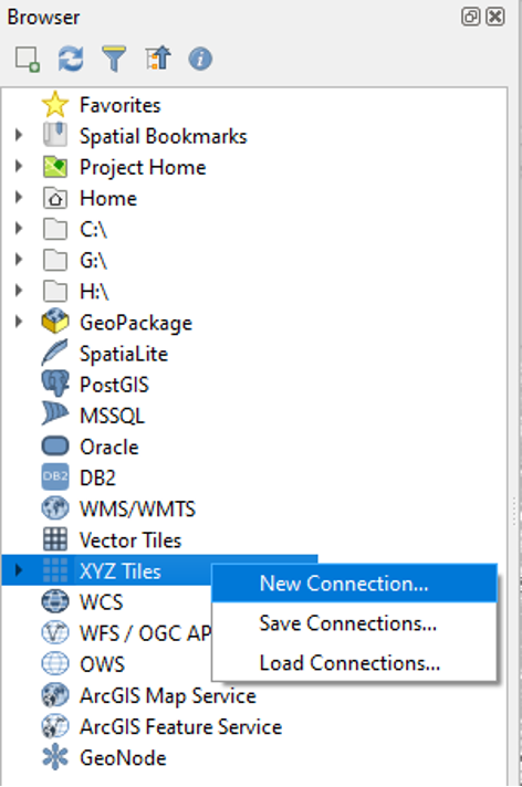
- In the Name field, type in “OSM Grayscale”
- In the URL field, paste the URL that we coped from https://qms.nextgis.com/.
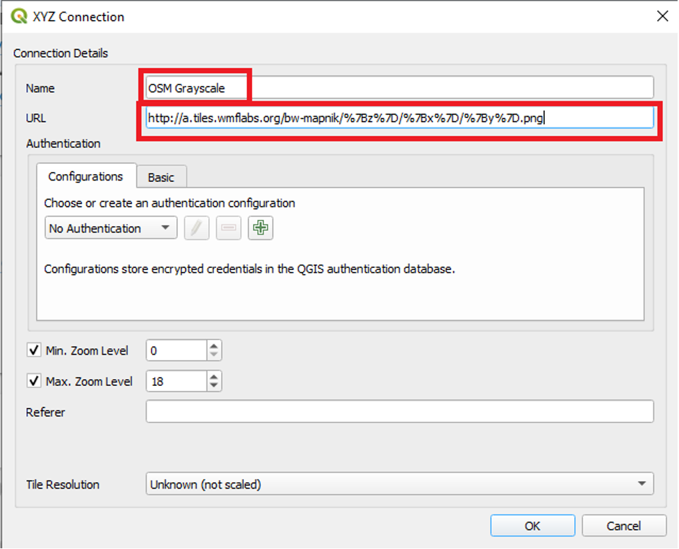
- Leave the other settings and click OK.
- In the Browser, under XYZ Tiles, double-click OSM Grayscale to add it to our project.
- In the table of contents, right-click the OSM Grayscale layer and click Move to Bottom.
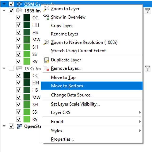
- Uncheck the regular OpenStreetMap layer.
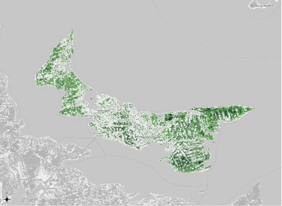
Here is the result. The grayscale base map makes the green symbology pop.
Graduated Symbology
What Is Graduated Symbology?
We just used Categorized symbology to show each of the selected LANDTYPE values in a unique colour. Here, we will use a somewhat similar type of symbology called Graduated.
We use the Categorized symbology to give each unique category of data in a field a unique colour on the map. The data that we use with the Categorized symbology can be text-based. It is also best to use the Categorized symbology when you have a limited number of categories. When we used the Categorized symbology earlier in this chapter, we had seven different values selected from the LANDTYPE field, and the field was text-based. Using the Categorized symbology helped us get a sense of the types of forest cover present on the Island in 1935.
Now that we know which types of forest cover were present on the Island in 1935, we are going to use Graduated symbology to assess the area of each type. We use the Graduated symbology with numeric data or, rather, integers. We use a colour ramp of increasingly intense colours to reflect increases in the numeric data. Maps created using the Graduated symbology are sometimes referred to as “choropleth maps” or “heatmaps.” In a similar process to that which we used with the Categorized symbology, we choose the value we want to symbolize from the “Value” dropdown menu. The value that we are selecting is a column header in the layer’s attribute table.
Tip: symbology depends in large part on the type of data you have and want to display. You should consider whether your data contain discrete variables or continuous variables (to put it in mathematical terms). Categorized symbology is for mapping discrete variables, whereas graduated symbology is for mapping continuous variables.
Identify Features: Exploring Our Data
When performing any sort of symbolization, including Categorized and Graduated, it is important to know the strengths and weaknesses of data with which we are working. It is important to know the purpose and methodology of the data’s creators.
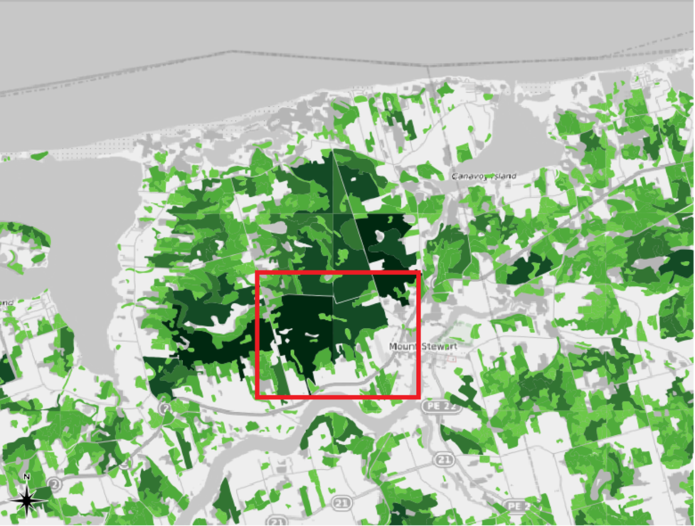
In our case, knowing the creators’ methodology helps us to see one of our dataset’s key flaws. That is, the team of mapmakers behind this project created the shapefile map by interpreting aerial photographs. Each member of the team was assigned an artificially delineated, square section of the Island to interpret. If you turn on the 1935 inventory region layer that we symbolized in Chapter 1, and if you zoom in to a scale of about 1:150000, you will be able to see the square delineations. Here is an example from the Mount Stewart area of PEI, in which one of the grids has been outlined in red:
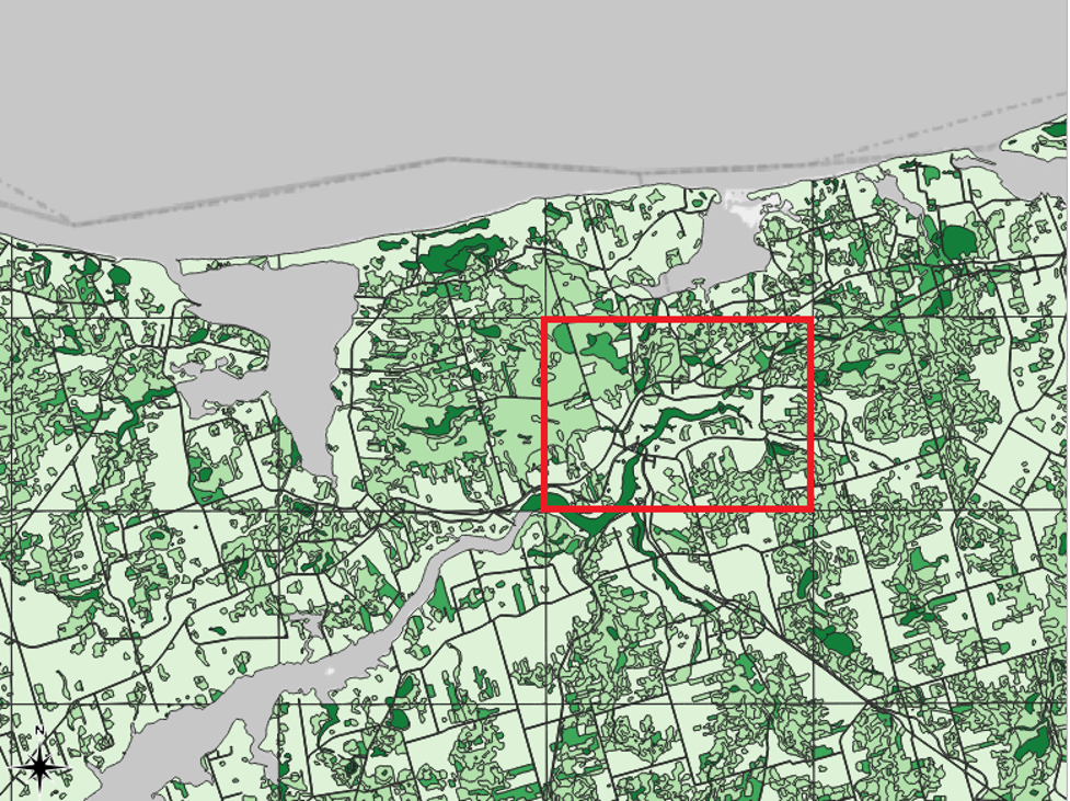
The problem with these delineations is that they sometimes separate neighbouring areas into separate shapefile features even though, in the real world, they were likely part of the same continuous land parcel. So, if we create a map that is symbolized based on the areas of the features, we may not be telling an accurate story of the actual sizes of the forested areas in PEI in 1935.
For example, the delineation highlighted in red in the screenshot above divides what was likely one continuous land parcel into two features within the shapefile layer. We can see that this land parcel was arbitrarily divided by using the Identify Features button.
- In one of the toolbars towards the top of your screen, click the Identify Features button.
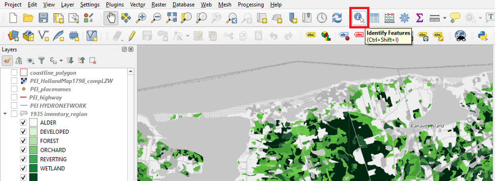
- Click on the feature that is selected in the following screenshot of the Mount Stewart area, which was taken at a scale of 1:95000.
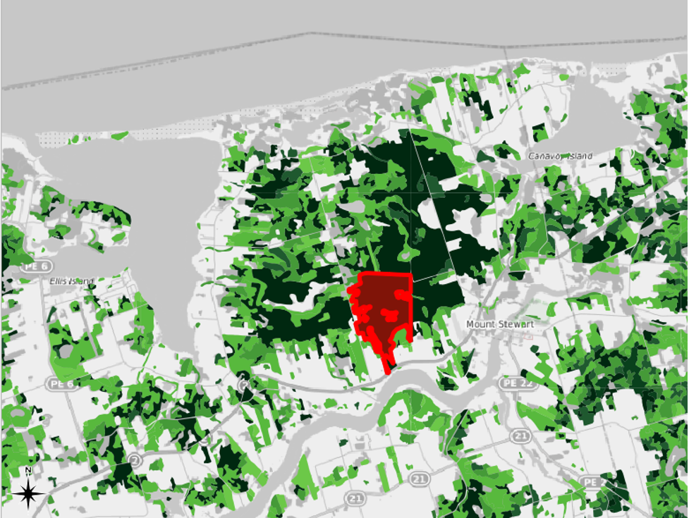
The eastern edge of this selected feature seems to have been arbitrarily cut off by one of the delineations that the mapmakers created. The neighbouring feature to the east, which is selected in the following screenshot, was likely part of the same parcel of land in the real world.
- Select the neighbouring feature to the east.
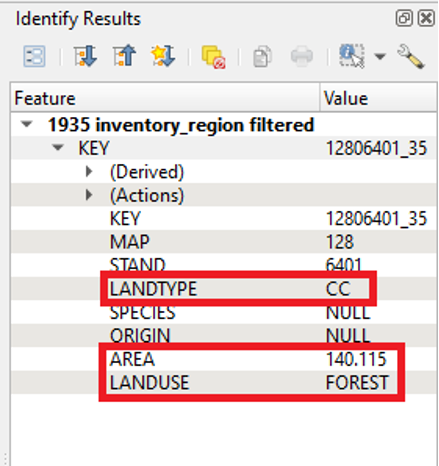
When we select an item, the Identify Results pane appears, often to the right of the QGIS window. This pane shows the attribute data associated with a selected feature. For the first selected feature, we can see that the LANDUSE value is FOREST and that the LANDTYPE value is CC. We can also see that the AREA value is 276.240 hectares.
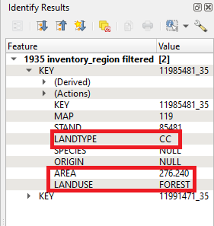
The second selected feature has a LANDTYPE value of CC and LANDUSE value of FOREST. So, it is likely that the two of them were part of the same, continuous land parcel in the real world in 1935. The second selected feature’s AREA value is 140.115 hectares.
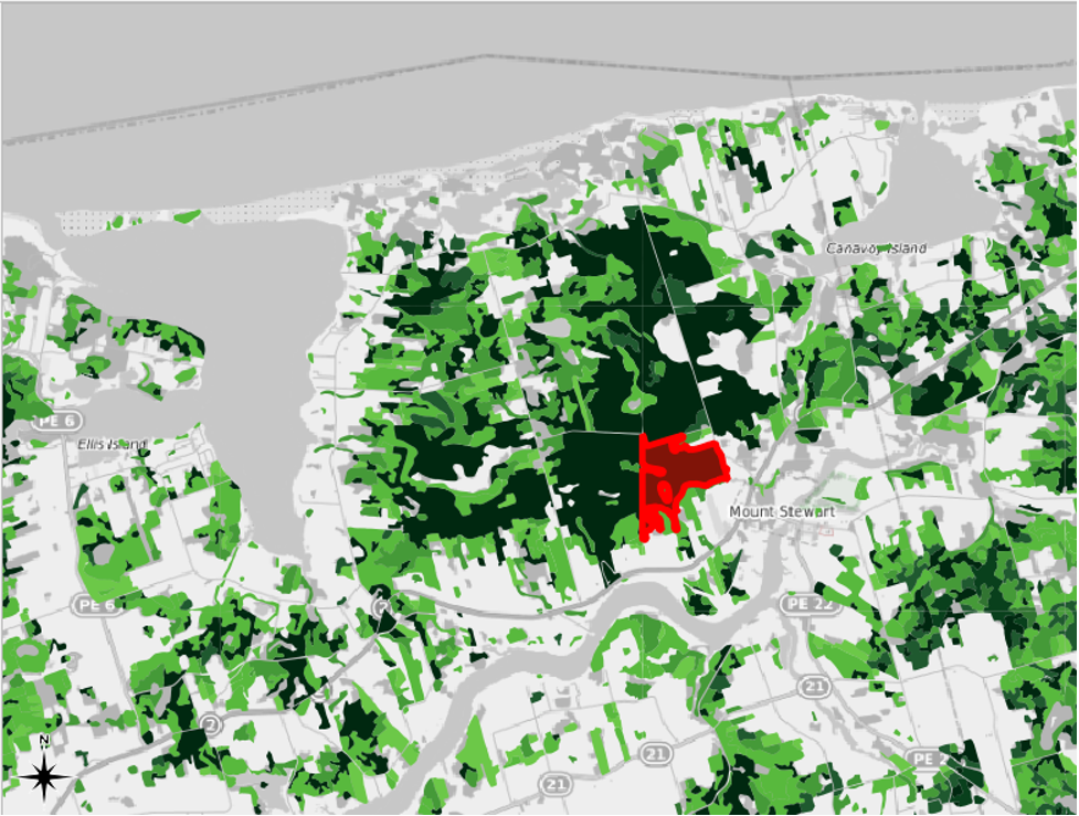
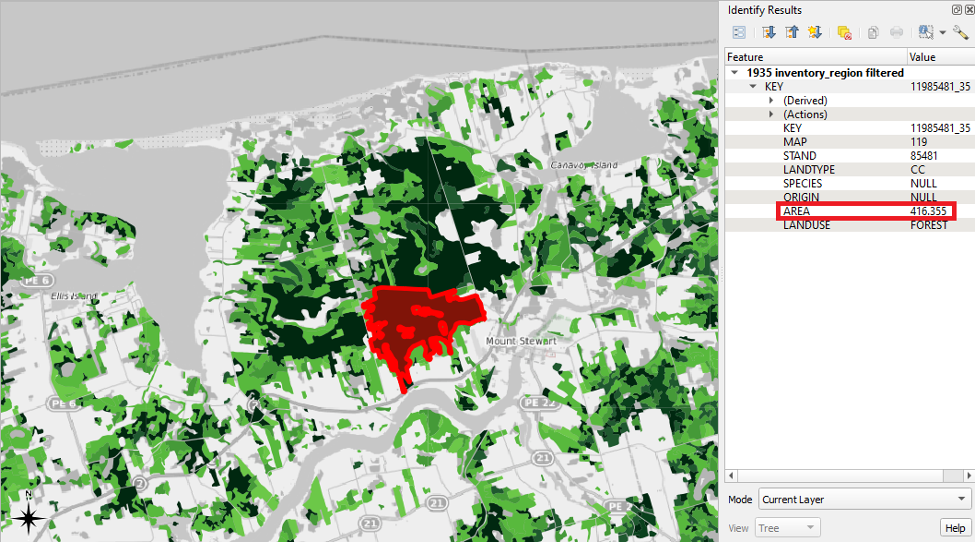
If we wished to create a dataset that was as accurate as possible, we could methodically go from grid to grid and merge the features that the mapmakers had arbitrarily divided in two. When merging the features, we would be able to add together the AREA fields of the merged features to get an AREA value for the larger, continuous land parcel. Such a process is a bit too complicated and tedious for right now, but have a look at the following screenshot for an example of what the result would be if we merged the land parcels in the Mount Stewart area that were discussed above. In this example, when the Identify Features button is used, the entire parcel of land can be selected. It is no longer arbitrarily divided into two. The respective AREA values of the two merged features have also been summed to create an area for the continuous land parcel.
This process would involve editing the shapefile itself, and, like some work done with GIS, it would be a bit tedious. However, we would be left with a more accurate map.
For now, we will proceed with applying a Graduated symbology to the features containing either the FOREST or REVERTING attributes as they stand. But we will keep in mind that our choropleth map may be slightly inaccurate in some areas due to the original mapmakers’ methodology.
Symbology: Applying Graduated Symbols to the AREA Field
We will first create a duplicate of the layer on which we performed a Categorized symbology earlier in this chapter.
- Right-click the “1935 inventory region filtered” layer and click Duplicate Layer.
Note: remember that the duplicated layer still references the same shapefile as its source data.
Note: since the layer from which we copied was filtered, the duplicate layer that we created from it is also filtered.
- Right-click the duplicated layer and click Rename Layer.
- Type in “1935 inventory region filtered and graduated” and press Enter.
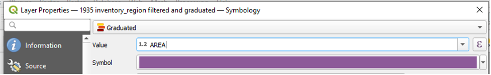
We will now symbolize the 1935 inventory region filtered and graduated layer by the AREA field.
- In the table of contents, right-click the 1935 inventory region filtered and graduated layer.
- Click Properties.
- Click Symbology.
- In the dropdown menu at the top of the Layer Properties window, click Graduated.
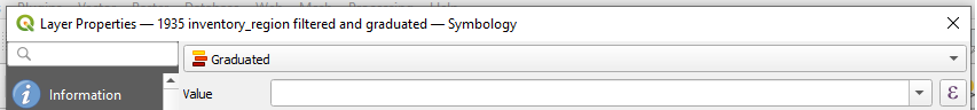
- In the Value dropdown menu, choose AREA.
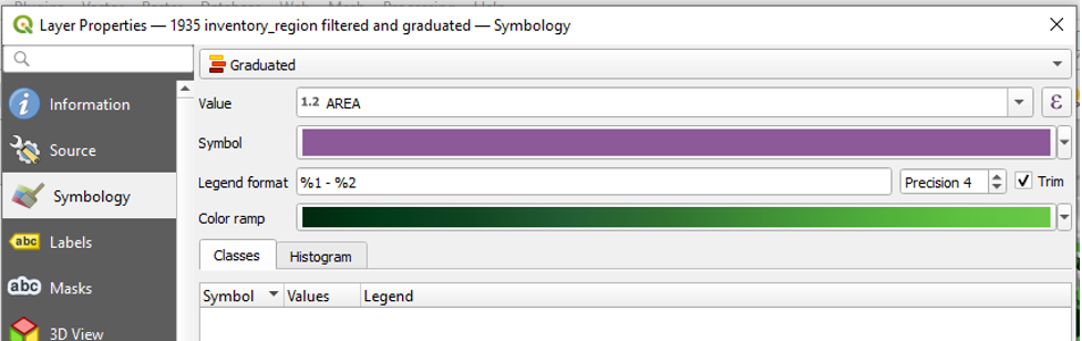
Since this layer is a copy of the one in which we created the customized Dark Greens colour ramp, this colour ramp is already in place for us.
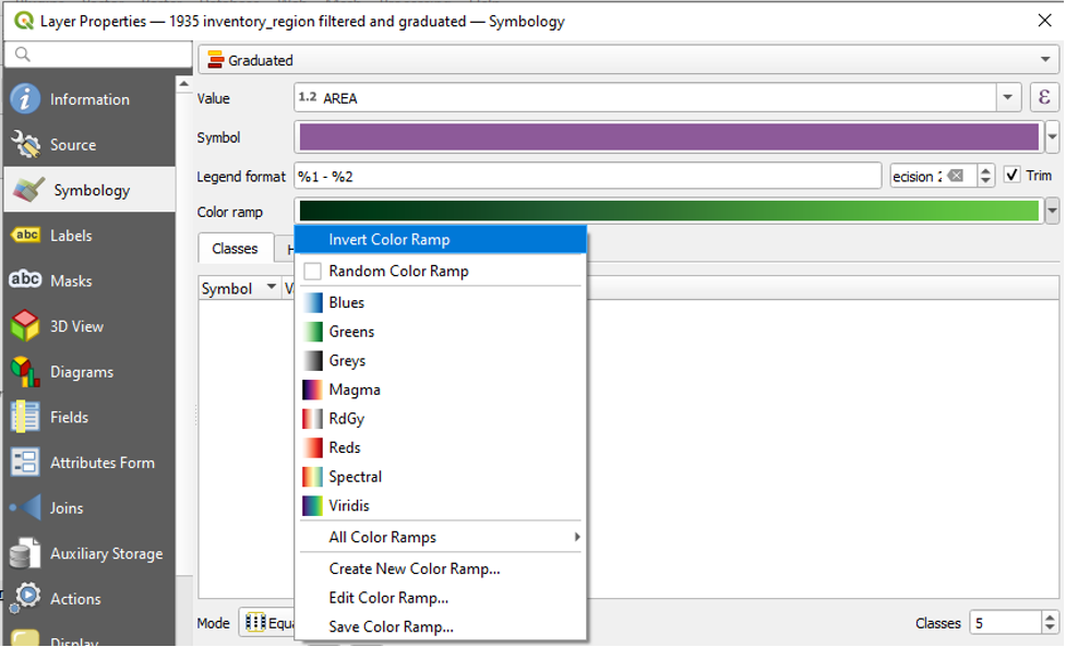
Since we are going to be mapping area values, it would perhaps make sense to represent the largest areas with the darkest colour. So, let’s invert our colour ramp.
- Click the dropdown arrow next to Colour Ramp.
- Click Invert Colour Ramp.
We are now able to Classify our data into classes. However, we must first choose which Mode we would like to use to classify our data.
Choosing the Best Graduated Mode to Symbolize Our Dataset
When using the Graduated symbology, we break down our data into classes. We assign each class a different colour. So, for example, the class with the lowest values would have the lightest shade of green, while the class with the highest values would have the darkest shade of green.
We choose the mode that QGIS uses to divide our data into these classes.
To see the list of modes:
- Under the the Classes tab, next to Mode, click the dropdown arrow.
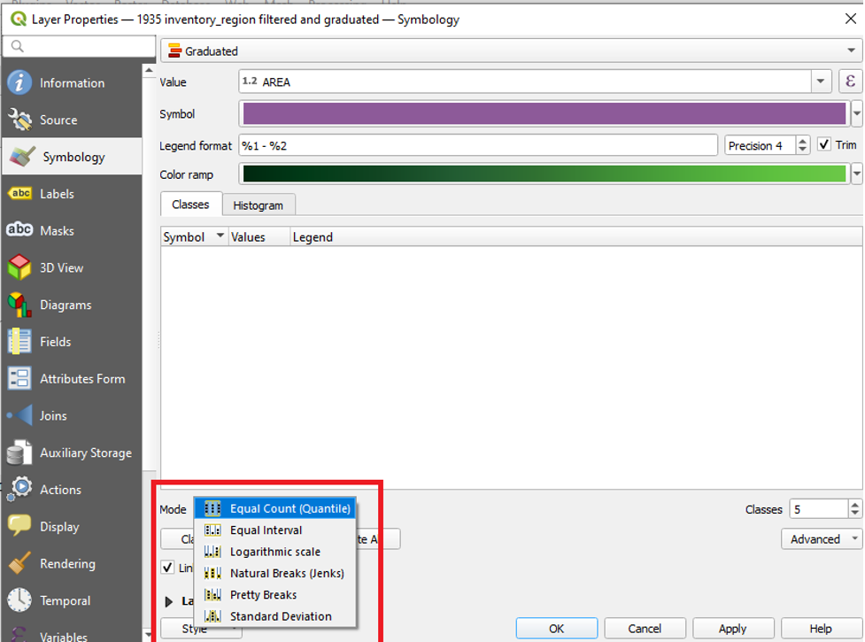
The modes available in QGIS are:
- Equal Count (Quantile)
- Equal Interval
- Logarithmic scale
- Natural Breaks (Jenks)
- Pretty Breaks
- Standard Deviation
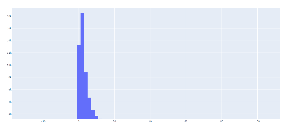
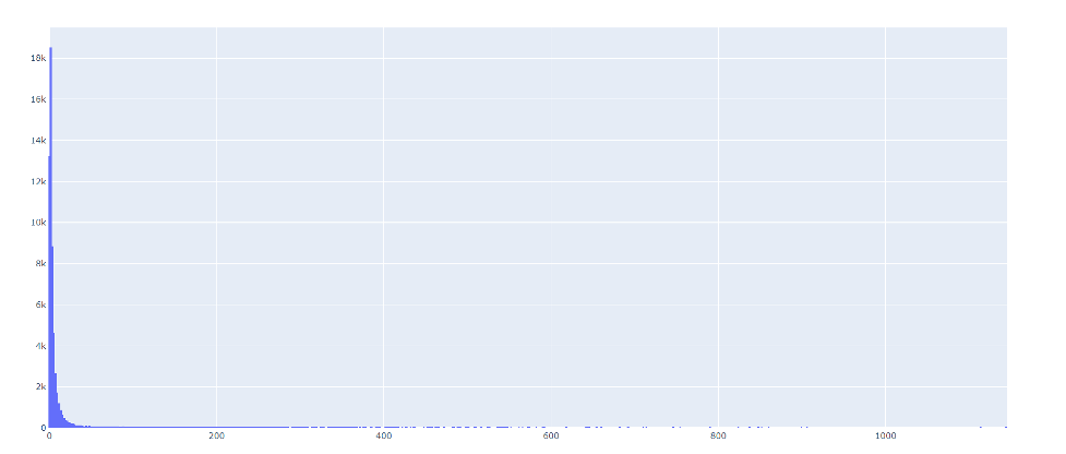
But how do we decide which mode to select? We try to choose the mode that best suits the data that we are mapping. One way to decide which mode to choose is to first look at a histogram of your dataset.
Viewing a Histogram
From a histogram, you can tell how your data is distributed. A histogram’s x-axis will show you a range of values. In our case, it will show us a range of area sizes. A histogram’s y-axis will show you a count of the number of data points that have a particular size. Viewing a histogram may help you figure out where to place class breaks so that they best capture the distribution of your data.
There are at least two ways in which to view a histogram of our data in QGIS.
Option 1: Within the Symbology Menu
To view a histogram,
- In the Symbology menu, click on the Histogram tab.
- Click Load Values
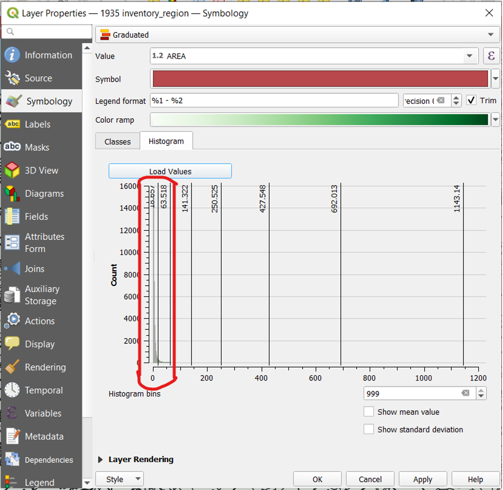
The screenshot above is a view of the histogram option within the Symbology menu with the Natural Breaks mode selected. The benefit of this view is that we can see our data alongside the class breaks of the mode we have selected. (Note how the Natural Breaks mode groups most of the data points into the first class break.) The downside is that the histogram itself is difficult to see.
Option 2: Within the Plots Tool
Another way to view a histogram of our data is through the Plots tool.
- Click Processing and then Toolbox
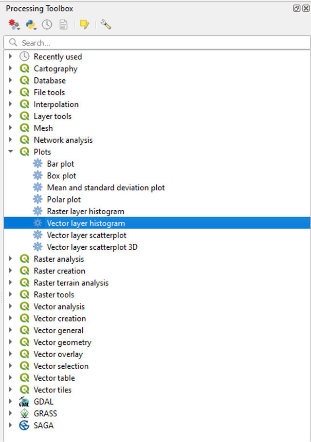
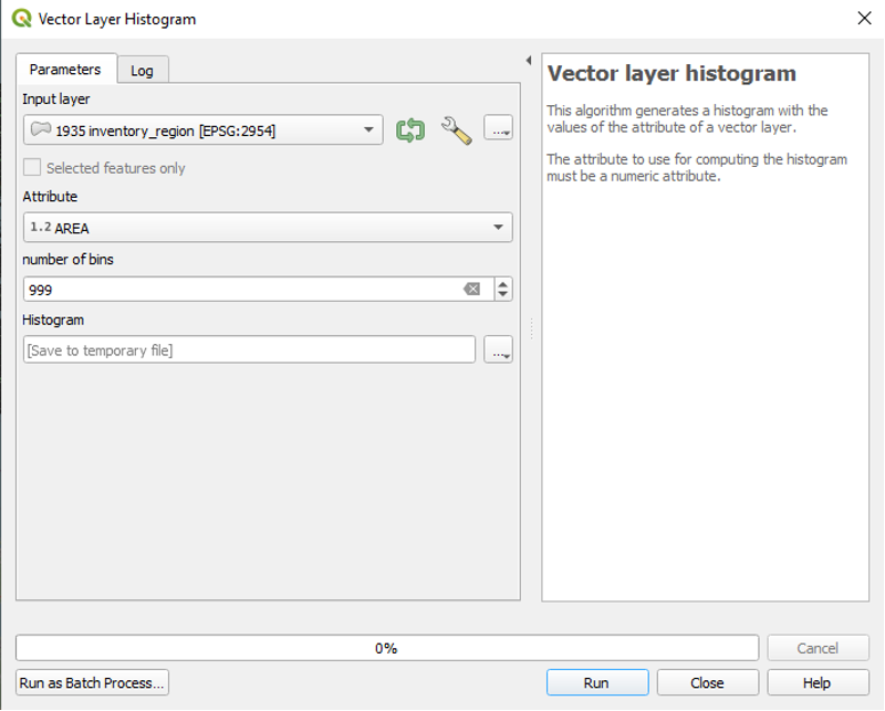
- In the Processing Toolbox panel to the right, click Plots and then Vector layer histogram
- In the Input Layer field, enter “1935 inventory region”
- In the Attribute field, select “Area.”
- Change the number of bins to 999.
- Click Run.
A temporary file will be produced.
- At the bottom of the Processing Toolbox, the produced histogram files will appear in the Results Viewer. Double-click the file to open it in your browser.

Although you cannot see your class breaks in this view, this view is perhaps the best way to analyze your histogram. It is easier to see, and you can pan and zoom in to any area of the histogram to view it in detail.
Selecting a Mode
After we have viewed a histogram of our data, we can try several different modes to see which one best captures the distribution of our data.
Here are the modes available in QGIS along with a brief description of how they work.
Equal Count (Quantile)
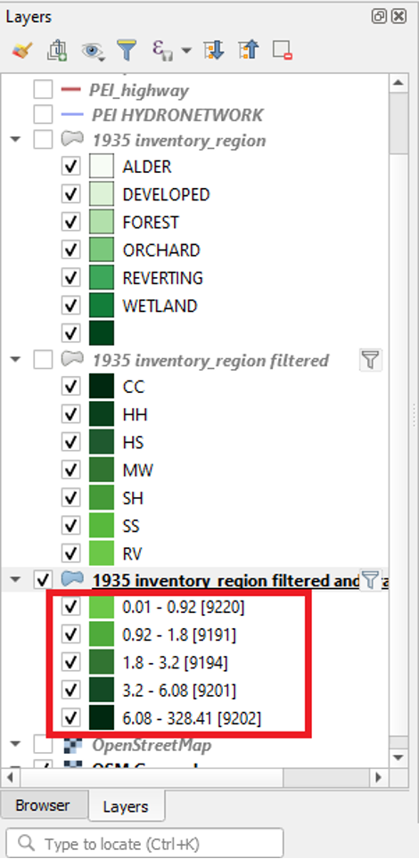
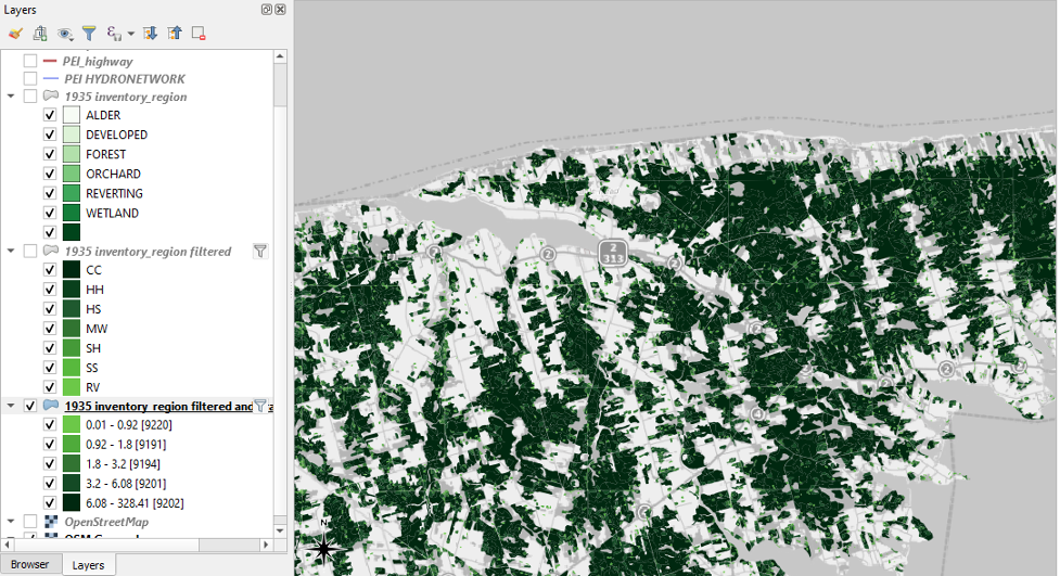
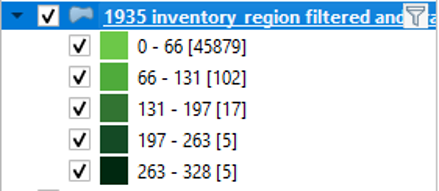
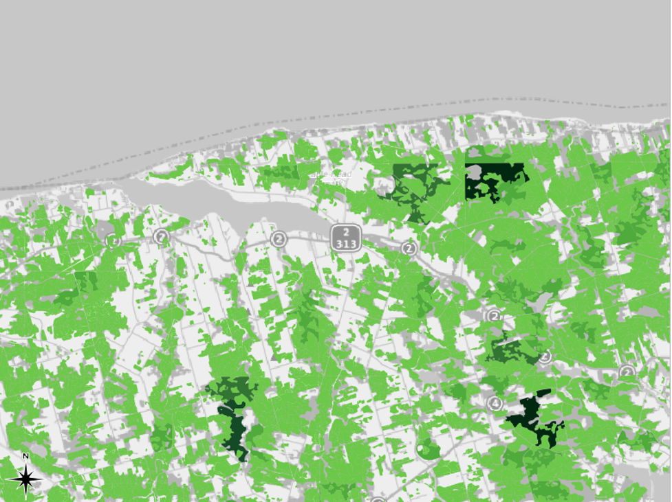
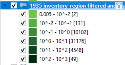
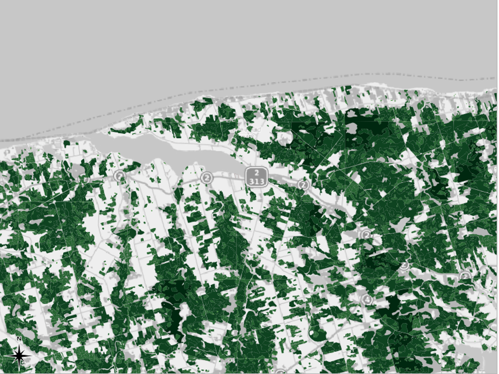
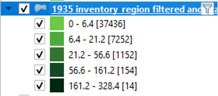
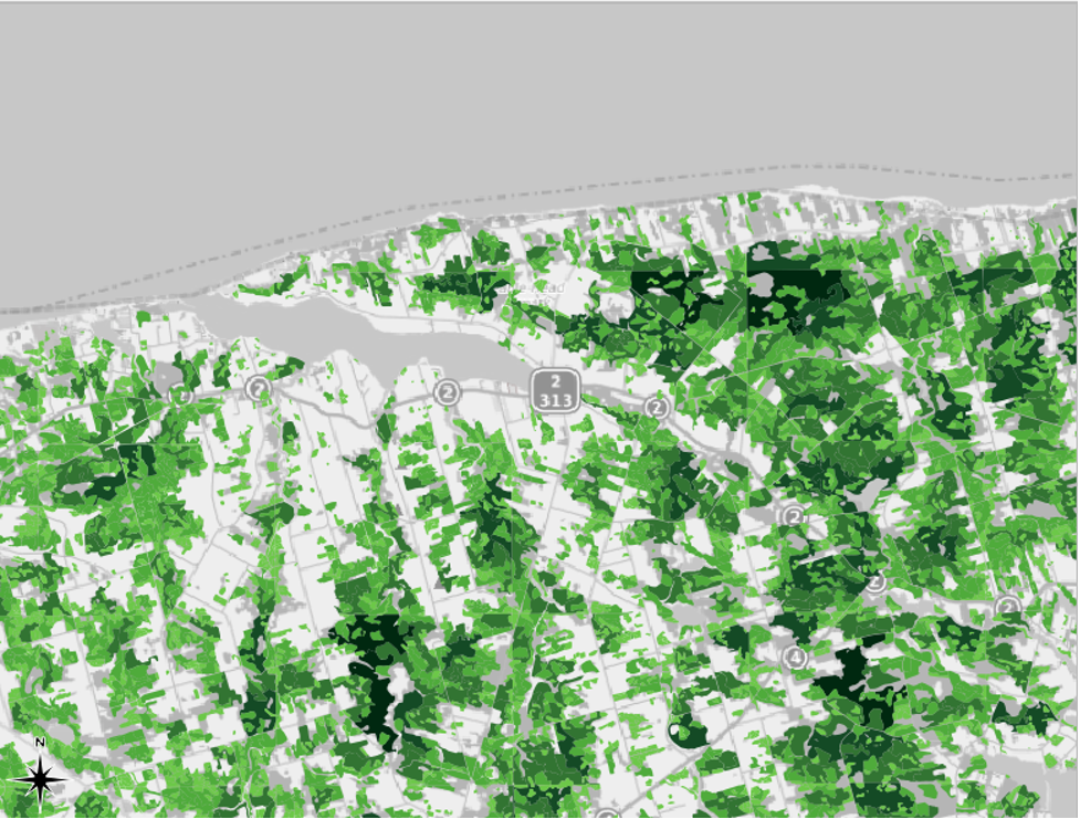
This mode will divide the data so that each class contains the same number of whatever you are mapping (features). For example, if we had 100 features with four variables in our attribute, the Equal Count mode would place 25 features into each class. In our case, each class would contain the same number of land plots. We can see this in action by right-clicking the 1935 inventory region in the table of contents and clicking “Show Feature Count.” In the first screenshot, we can see that the number of features, i.e., the number of pieces of data, in each class is roughly the same. This number is shown between square brackets. In the second screenshot, we can see that this mode is not very effective for conveying the differences in the data: most of the map appears in dark green.
The advantage of this approach is it ensures that all colors in your gradient are used evenly, which helps patterns to stand out. The disadvantage is that this approach struggles in maps that contain large clusters of values that are very close to one another. Since the map wants to separate things as evenly as possible, it will sometimes represent similar values with different colors rather than creating its categories around natural breaks in the data.
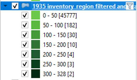
Equal Interval
This mode will break up the features so that each class covers an equal range. For example, each of the five classes of land use data would cover about 66 hectares. However, note that the number of features within each class differs greatly, unlike in the Equal Count mode. The second screenshot shows that selecting Equal Interval gives us sort of the opposite problem than the one we had with Equal Count. In this case, most of the map is light green, so it is difficult to discern the differences in the data.
Logarithmic Scale
It may be most effective to use this mode when you have data containing a wide range of values. If you select the logarithmic scale in QGIS, each class will grow by a factor of 10. This mode may be a good option for our example, for the “Area” values in our Attribute Table are quite varied. The lowest value is 0.001 and the highest value is 1143.142, and there are many values that lie somewhere in between. We can confirm this by checking our histogram again. We see values spread out along its x-axis.
The screenshot from QGIS, below, shows that the Logarithmic Scale varies the colours of the map so that it is not a near-solid green, as it was when we selected the Equal Count mode. However, it is still somewhat difficult to discern the different shades of green.
Natural Breaks (Jenks)
This mode will group the features into “natural” groupings. That is, this mode will create classes that group features that are most similar. As a result, the features within each class will be very similar to other features in the same class, while the differences among classes will be more pronounced. The following screenshot shows the results for our example.
There are benefits and drawbacks to using Natural Breaks. The map produced using this mode is perhaps the easiest to read. The map is neither too green nor too white, and there is better contrast than in the map produced using the Logarithmic Scale. However, the Natural Breaks option places the vast majority of our data in the first class, that is, the first one. The map presents this data as though it is all the same, yet, really, there are differences in the data within this class. We lose the ability to discern any differences in the data in this first class.
Pretty Breaks
The Pretty Breaks mode is complicated, but the “pretty” adjective in its name means that it will create classes with round numbers. In our example, it seems to augment the tendencies of Natural Breaks by placing even more data points in the first class.

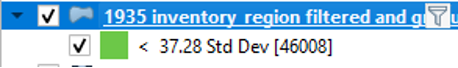
Standard Deviation
If you view your histogram and see that your data tends to conform to a bell curve, your best option may be to select the Standard Deviation classification mode. Here is our example with the Standard Deviation mode selected. Since our dataset looks nothing like a bell curve, this mode is not very useful to us.
It is ultimately up to you to decide which mode of Graduated symbols to use. The logarithmic and Natural Breaks (Jenks) are perhaps the best options in this case. We recommend Natural Breaks. It allows us to put aside what one might call “insignificant” forested areas (i.e., those 6.4 hectares in size or less) in order to focus on the larger forested areas. This is especially important for readability, for there are seemingly countless small polygons representing forested areas of 6.4 hectares or less. Using Natural Breaks allows us to quickly see the largest continuous stands of uniform forest types that remained on the Island in 1935.
Since we started Part II by filtering our layer to include only features with either the FOREST or REVERTING land use attributes, we know that these are all different types of forest parcels. The graduated symology now allows us to identify the largest forest parcels with a quick glance at the chloropleth map.
As we had anticipated, the methodology of those who made the shapefile has resulted in a few inaccuracies with our symbolization. If we return to our example near Mount Stewart with the Natural Breaks symbology enabled, we can see that the western portion of the arbitrarily divided land parcel is large enough to belong within the fifth class, while the eastern portion belongs in the fourth class. In reality, both of them would have been part of the same continuous land parcel, which would have been over 400 hectares in size.
Without editing our shapefile to fix up these areas in which continuous land parcels were arbitrarily divided during the original mapmaking process, we can account for this map’s limitations by adding an explanatory note in any publication in which this map appears.