
Chapter 1: An Introduction to QGIS
Part III A: Opening and Symbolizing Vector Data
Vectors are points, lines, and polygons representing data. Vectors can represent borders, roads, and towns along with many other types of data. The key characteristic of GIS is that it assigns geographic coordinates to pieces of vector data. By contrast, a graphics software program can also create points, lines, and polygons, but it will not assign them a geographic location.
All of the data that we just downloaded is vector data. See Chapter 4: Digitization for instructions on how to create your own points, lines, and polygons.
The PEI Coastline Layer
Adding the Layer
Let’s start by adding PEI’s coastline to our base map.
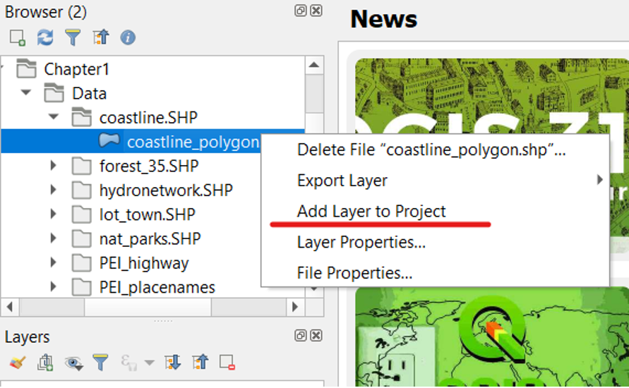
- On the left-hand side of your screen, in the Browser, navigate to the Chapter1 folder that we created earlier.
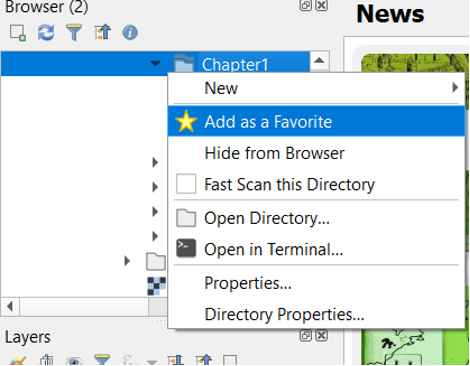
- Within the Chapter1 folder, navigate to the Data folder.
- Expand the folder called coastline.SHP.
- The .shp file extension indicates that it is a shapefile.
- Right-click the layer called coastline_polygon.shp and click Add Layer to Project.
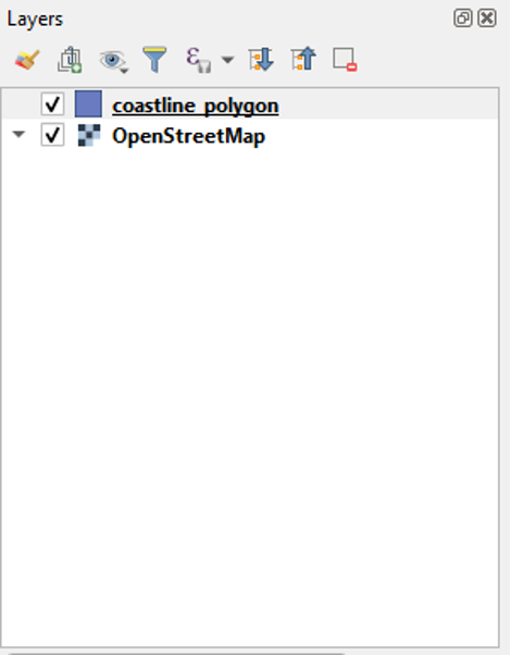
- You will now see the coastline_polygon layer in your Layers table of contents.
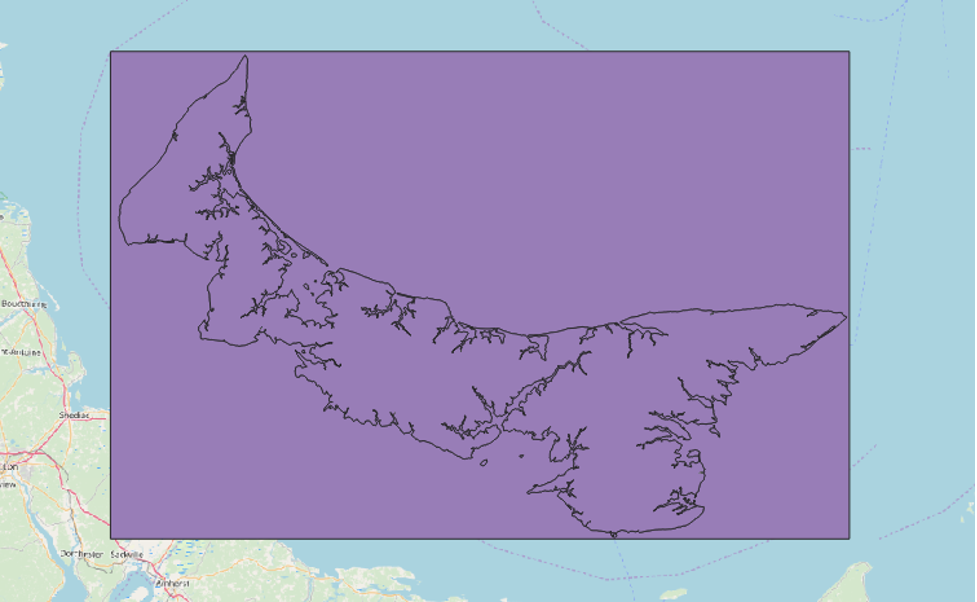
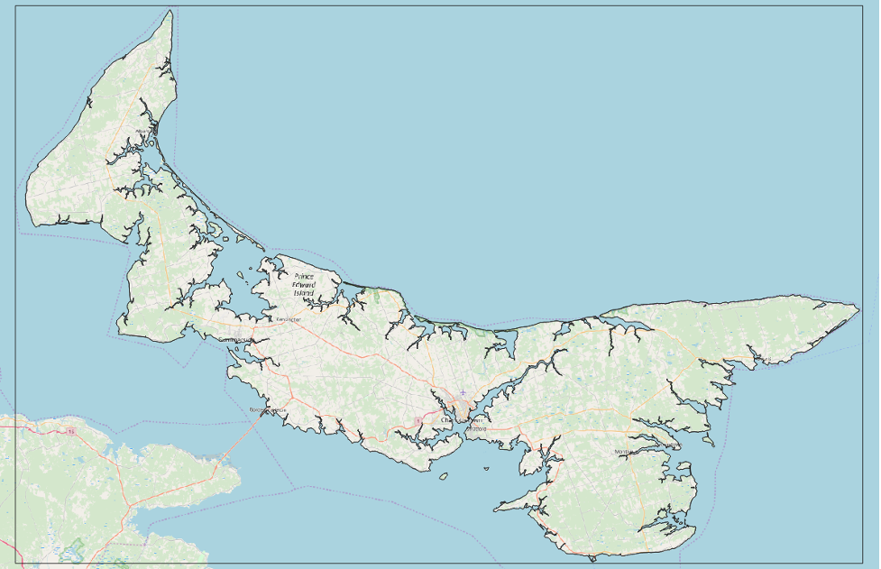
Your map will look similar to this now. The coastline file has a fill layer by default, and we can remove this in order to see our base map with the highlighted coastline.
Symbolizing the Layer
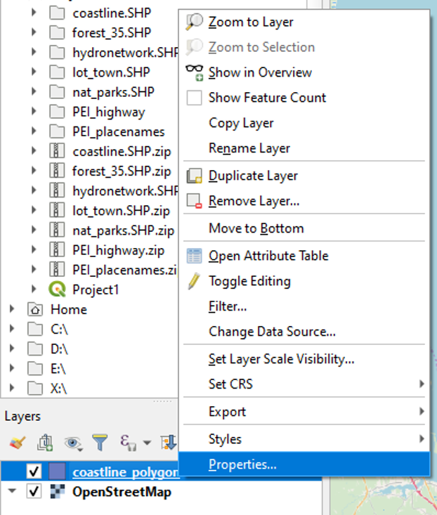
- Right-click on the coastline_polygon layer and click Properties.
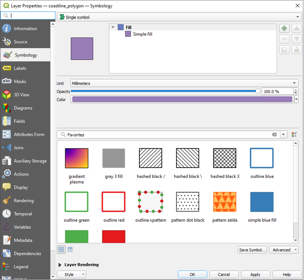
- Click Symbology.
- Under Fill, click to select Simple Fill.
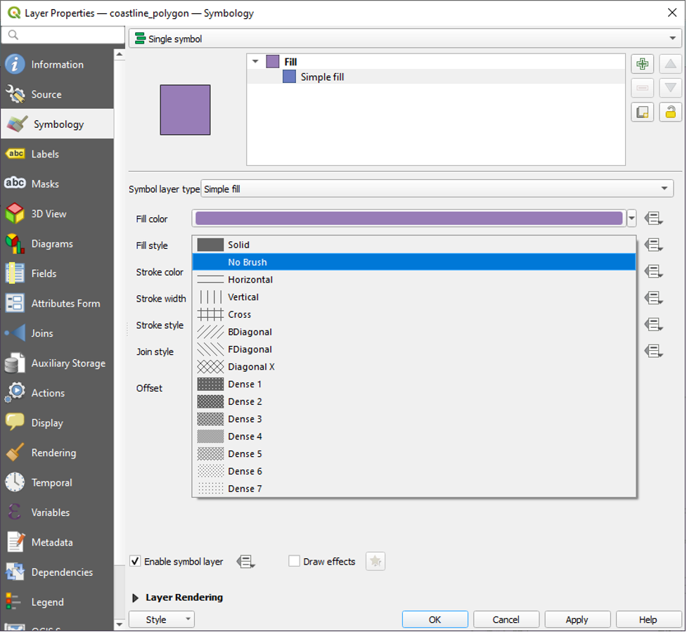
- Click Fill style, and select No Brush option. Then click OK.
Your map will look something like this now.
The PEI Hydronetwork Layer
Repeat the above steps to add and symbolize the “PEI HYDRONETWORK.shp” layer.
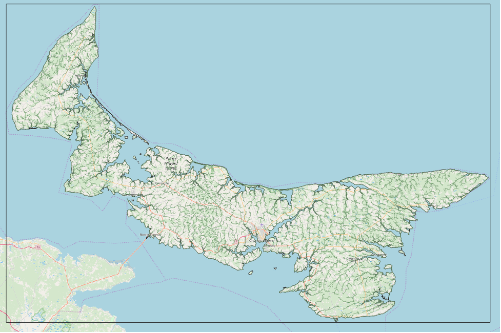
Once added, your layers will look like this.
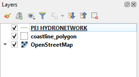
And your map will now look something like this.
Further Symbolizing the Layer
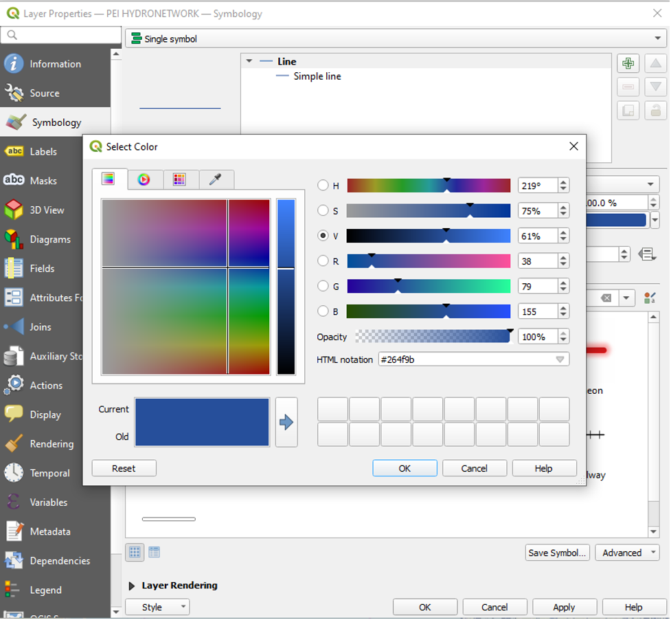
We want the hydro layer to stand out, so we will change its line colour to blue.
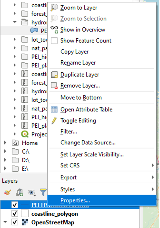
- Right-click the PEI HYDRONETWORK layer, and click Properties.
- Click Symbology.
- Click to select Simple Line.
- Click Colour and set it to blue. You can use the sliders to change the colour or set an HTML notation for colour in Hexadecimal.
- Click OK.
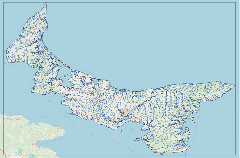
Your map will now look something like this.
The 1935 Forestry Layer
Adding the Layer
- Use the Browser to add “1935 inventory_region.shp” to your layers.
Viewing an Attribute Table
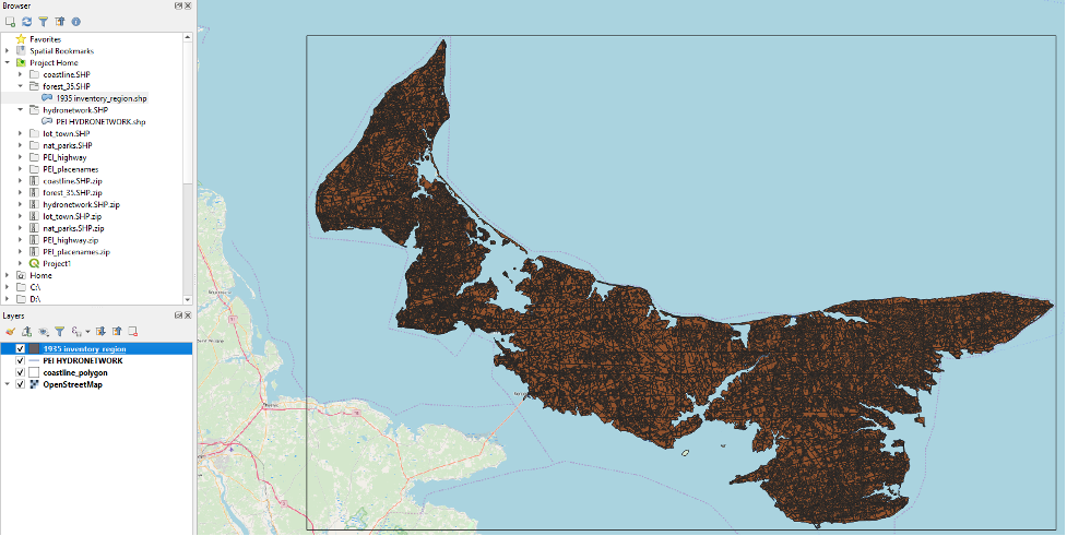
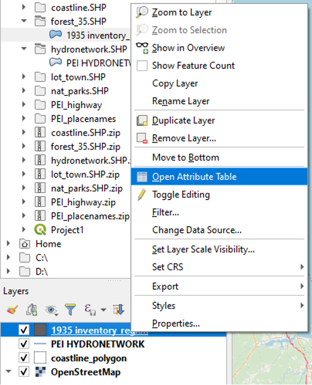
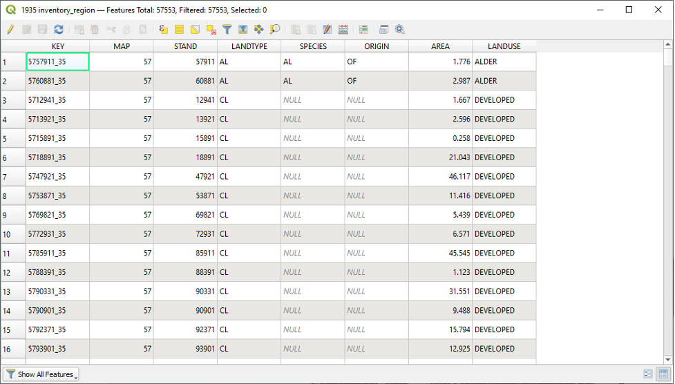
Your map will now reflect all four layers. However, the 1935 inventory_region layer is dense and covers the entire island. As mentioned at the start of this section, vectors are made of data. In our case, the data that we are concerned with is the way that the land was used. Canadian censuses recorded this data for many decades. But the important thing about GIS is that it can take this quantitative data and map it as vectors. If we want either to see or edit the data behind the vectors, we can do so by clicking Open Attribute Table.
- Right-click on the 1935 inventory region layer and click Open Attribute Table.
Here is the attribute data attached to the 1935 inventory_region. We want to reference the different categories in the LANDUSE column. This is the column that tells us how the land was used in 1935 and whether it was still forested or not.
Symbolizing the Layer
We do not want to edit this data; we want to analyze this data visually. So, we can close the Attribute Table window. We want to categorize the layer to see the forestation more clearly, so we will open the properties of the layer.
- Right-click the layer and click Properties.
- Click Symbology.

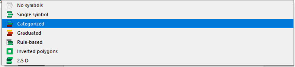
- At the very top of the Symbology window, click the dropdown menu where it currently says Single symbol.
- Click Categorized.
Once Categorized has been selected, the Symbology window will change.
- Set the Value to LANDUSE by using the dropdown menu.
- Click the Classify button towards the bottom of the window.
- Click the dropdown arrow next to Color ramp to set it to Greens.
- Click OK.
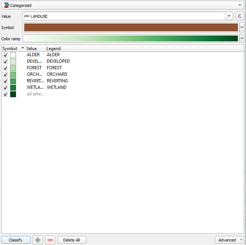
This will generate the Symbols, Value and Legend.
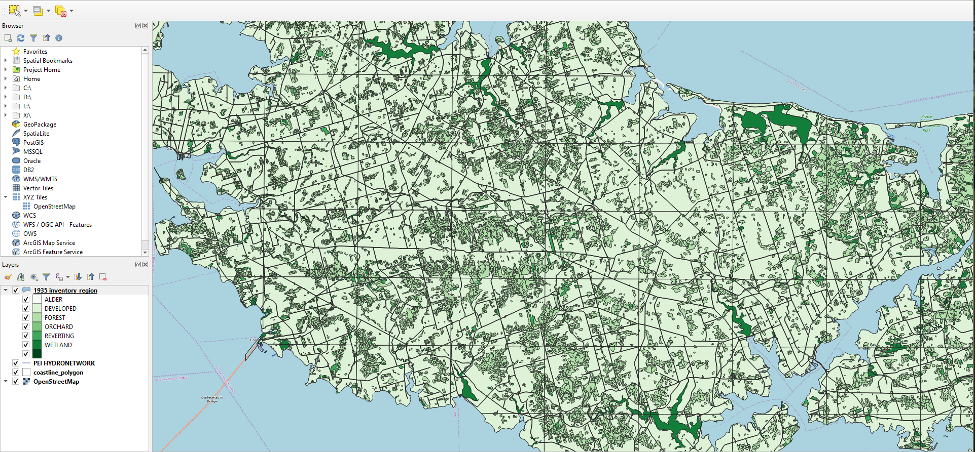
The layer will update with sub-layers matching each of the Categories of the LANDUSE column.
If you zoom in on the map now, you will see the various categories of Forests.
- To return to an overall view of Prince Edward Island, right-click the coastline_polygon layer in the Layers pane and click Zoom to Layer.
The PEI Highway Layer
Adding the Layer
- Use the browser to add the PEI_highway.shp file.
During the process of adding PEI_highway.shp file, we encounter the following error:
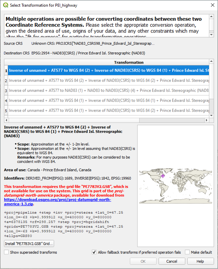
We can ignore this by clicking Cancel. QGIS will still render the layer onto our map in accordance with our project’s CRS.
Symbolizing the Layer
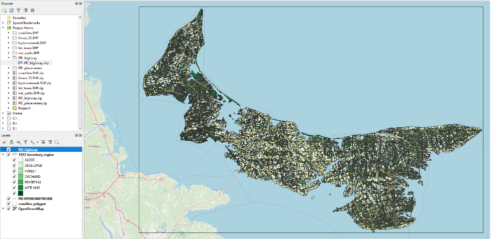
The roads are a little hard to see among the rest of the data. To remedy this, we will make the roads layer the uppermost layer on the map by moving it above the 1935 inventory in the Layers pane.
- Click and drag the roads layer to the top of the list in the Layers pane.
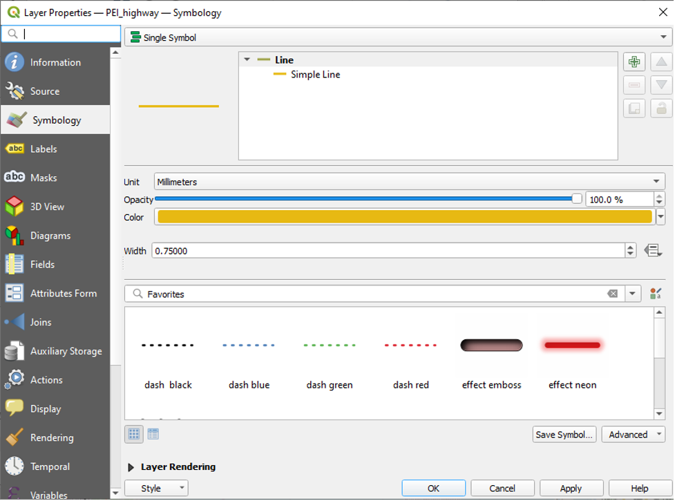
- Right-click on the PEI_highway layer, and click Properties.
- Note: if the aforementioned error reappears, click Cancel once more.
- Click Symbology.
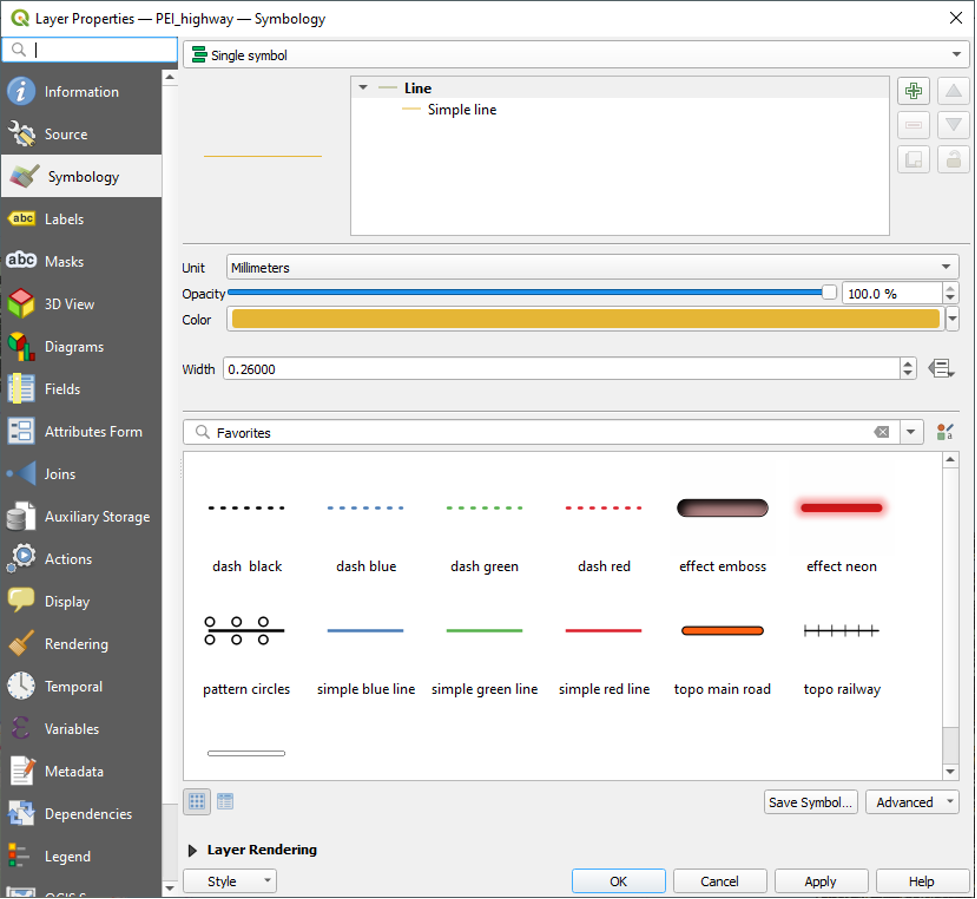
- Change the Width from 0.26000 to 0.75, and click OK.
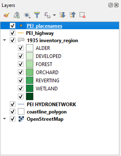
The PEI Placenames Layer
Adding the PEI Placenames Layer
- Add the PEI_placenames.shp to our Project and drag this layer to the top of the list in the layers pane.
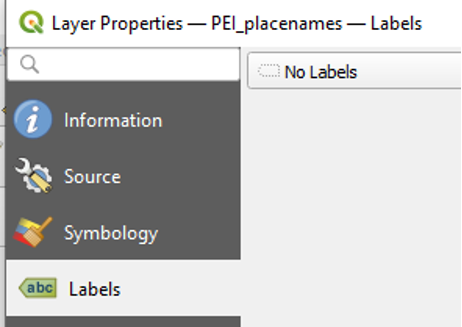
Turning on Labels
- Open the properties of the PEI_placenames layer and click Labels.
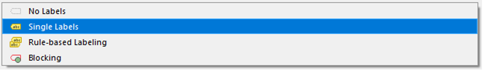
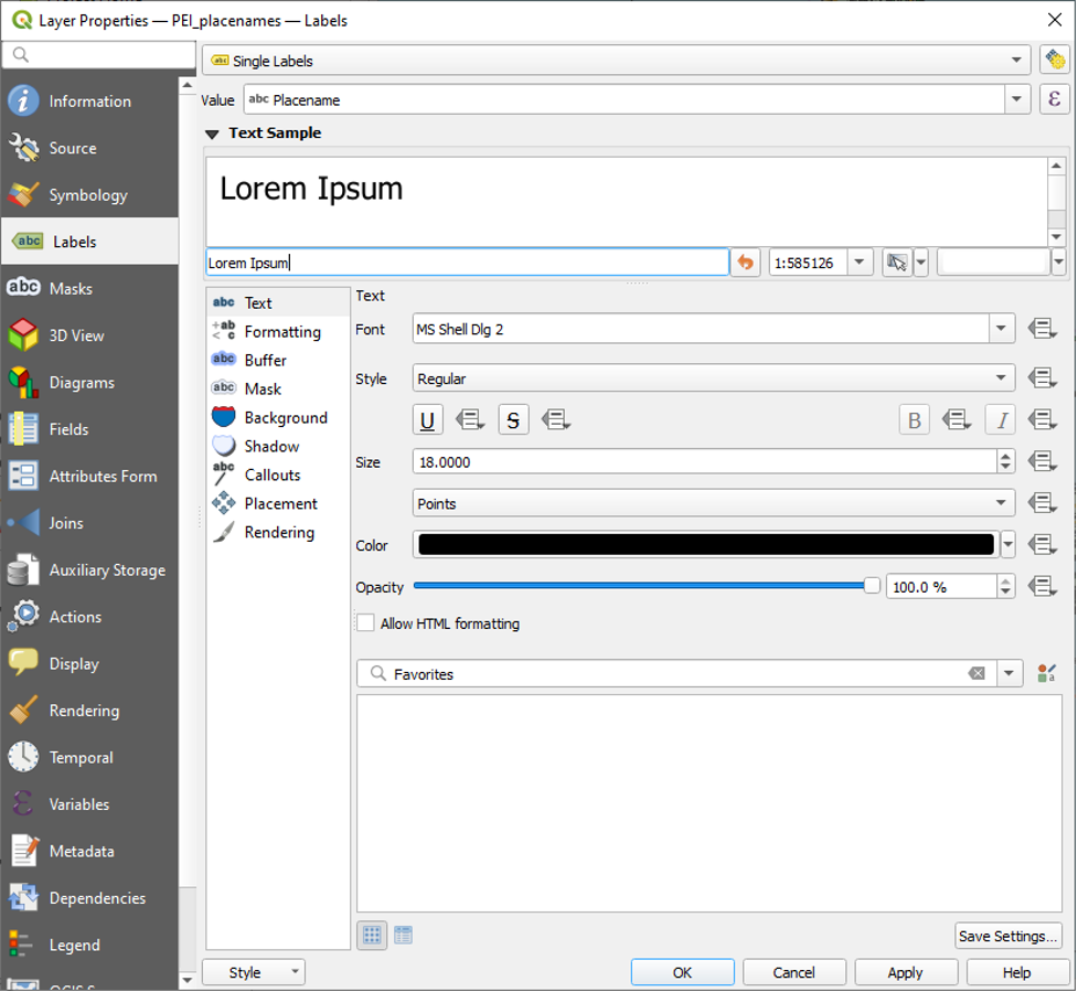
- From the dropdown that initially says No Labels, select Single Labels.
You can adjust the visual aspect of the labels using the various options under the Labels menu, including Text, Formatting, Buffer (Outline), Mask, Background, Shadows, and various other features.
- Under the Text tab, change the Colour to white.
- Under the Buffer tab, click the checkbox beside Draw text buffer and then select black as the buffer colour.
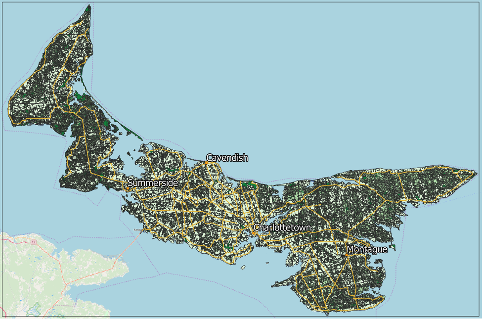
Here is the result:
Applications of This Vector Data
Historian Douglas Sobey calculated that the number of trees in PEI decreased by two-thirds between the start of the settlement era and 1935, and he used the forest inventory and other historical GIS data to show where exactly this deforestation happened. If you are interested, you can check out his work in chapter four of Time and a Place: An Environmental History of Prince Edward Island.[1]
A GIS such as the one that we set up can also help test whether routinely generated sources such as the census are accurate records of historical land use. Historian Joshua MacFadyen and forester William Glen used a GIS to demonstrate that the census was an incomplete record of land clearing. They compared the census of agriculture with inventories created from historical aerial photographs to show the extent of this discrepancy and test the rate at which farmers underreported the amount of cleared land. In the mid- and late-twentieth century, the amount of improved land reported in the census of agriculture was much lower than the amount shown in forest inventories—over 30 percent lower in Kings County in the 1960s and 1970s. This was of course because agriculture represented a decreasing share of land use. However, even in earlier decades, when most rural land use was agricultural, farmers in Kings County reported between 10 and 16 percent less cleared land than the amounts shown by the inventories. MacFadyen and Glen used a historical GIS to determine more accurate estimates of land clearance rates across the twentieth century. [2]
- Douglas Sobey, “The Forests of Prince Edward Island, 1720–1900,” in Time and a Place: An Environmental History of Prince Edward Island, ed. Edward MacDonald, Joshua MacFadyen, and Irené Novaczek (Montreal: McGill-Queen's University Press, 2016). ↵
- Joshua MacFadyen and William Glen, “Top-down history: Delimiting forests, farms, and the census of agriculture on Prince Edward Island using aerial photography, ca.1900-2000,” in Historical GIS Research in Canada, ed. J. Bonnell & M. Fortin (Calgary: University of Calgary Press, 2014). ↵