Main Body
Part 4: Basic Applied Statistics using Minitab 21
Part 4: Basic Applied Statistics using Minitab 21
A note about statistical significance:
|
All statistical tests are designed to test whether a pattern you see in your data is “statistically significant”. We say something is statistically significant if our test confirms that the pattern is unlikely to have occurred by chance. To test this we look at the “p-value” |
The p-value is related to the hypotheses about the data:
- H0 (Null Hypothesis) is that there is no difference between groups, or no relationship between variables. This is a “no effect” hypothesis
- HA (Alternate Hypothesis) is that there is a difference or a relationship. This is sometimes called the “active” hypothesis, since it indicates some sort of effect
Therefore, to interpret your data, you need to examine the graph of the data and clearly state an hypothesis, or you won’t know what the p-value means!
|
If p<0.05, reject your Null Hypothesis If p>0.05, accept your Null Hypothesis |
For each of the tests detailed in the next pages, note what the Null Hypothesis is, so that you can determine how to interpret the p-value from the test.
Getting started
DATA ENTRY
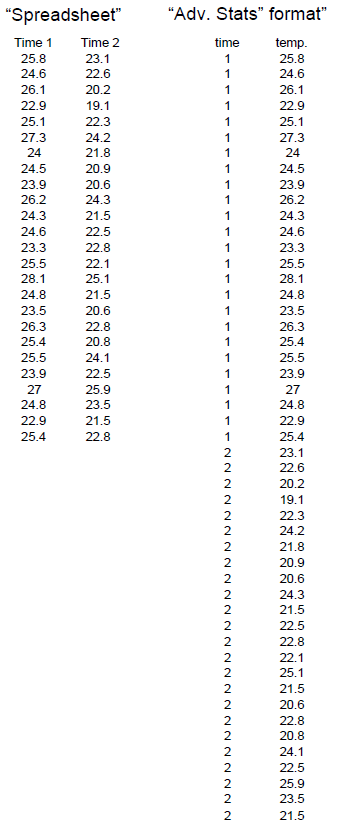
When working in a spreadsheet, the common method of entering your data is in adjoining columns. For example, if you have data such as we looked at in class on the crab temperatures, you would put your crab data for time 1 in one column, and your crab data for time 2 in the next column. However, for advanced stats, you must enter your data so that all the responses for a single variable (in this case, temperature) are in a single column, with another column giving the key for the variable.
Note that data in the “advanced stats” format are set up so that the responses are given in the columns, and the variables (e.g. whether they ran or not, what their sex was/is given as a category number in another column. This method of data entry is necessary for most statistical packages.
|
Notes about the data examples For this manual, most of the examples will be from a dataset on an imaginary group of students that were asked to take a bunch of measurements on themselves before and after running in place for one minute. One group of students was asked to run in place for a minute, and another group (the control) did not run. Students (in both groups) were asked to take their pulses (in heartbeats per minute) before and after the running exercise, then were asked to indicate whether they were male or female, whether they smoked or not, whether they thought of themselves as active or not, and so on. This data set allows us to illustrate a wide variety of statistical analyses. The dataset is at the back of this manual, and will be placed on your Moodle site, so that you can practice the exercises in this manual, and see what the answers should look like.
|
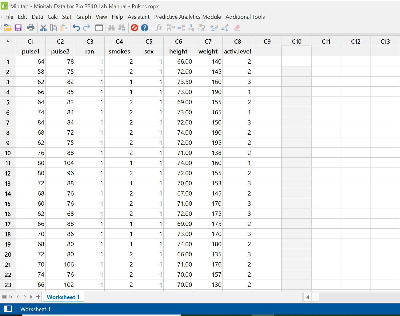
To start in Minitab:
- Open Minitab 21
- You will see a “session” window on top where you’ll find the record of what you’ve done, as well as the text results of statistical tests.
- The worksheet on the bottom will contain your data.
Navigate in Minitab through the menus on the upper property toolbar.
Entering data:
Data can be entered (typed in) directly, or copied from a spreadsheet
- From spreadsheet: open your spreadsheet to the desired database and select and copy the data. Only copy the numbers… do not copy column headers (that will designate your columns as text columns, and cause problems when doing the statistical analyses)
- Reenter Minitab, paste the data into the worksheet.
- Name your columns by clicking on the blank space below the column number, and typing in the name
- Save your worksheet onto your data disk or personal drive. It will save as a .mpx file
Simple Column Statistics
Descriptive statistics:
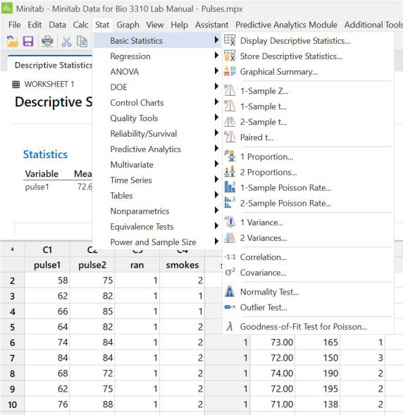
- Select Stat from the property bar, and click on “basic statistics”.
- Select “display descriptive statistics” to see the Display window
- Click on the box labelled “Statistics” to see the range of statistics available.
- The list of variables is on the left and an empty box for the variable(s) to test is on the right.
Highlight the variable you want to test, and click select
There is a long list of potential statistics you can have the computer calculate, all in one operation. Check the boxes of all you would like.
- Click ok to return to the display descriptive stats window
- Click ok again to obtain the data.
Your results will appear in the upper Minitab Session Window. You can copy and paste the results into your word processor spreadsheet if you want to.
Variables to choose: Variables must be ordinal (such as Pulse 1, Pulse 2, Weight, Height in this example; Note that your categorical variables won’t work here.
This section also allows you to see some basic graphs for your variables, by clicking on “graphs” rather than“statistics”
- Click on all of these options to see how these graphs can help you get a feel for what your data looks like.
Descriptive statistics for sub-groups within each column of data (e.g. males and females in your group; age groups, etc.)
Options:
a) cut and paste in your spreadsheet, then copy into Minitab and run analysis twice
b) Split the data in Minitab (see page 46 for method) and run analysis twice
c) use the “By variables” option and run the analyses simultaneously.
e.g. In the pulses dataset, each of the two pulse columns (Pulse 1, Pulse 2) include groups (runners & non-runners, males and females, smokers and non-smokers). If you want to compare one subgroup to the other within a single column of data, you will need descriptive statistics and normality testing on each subgroup.
Example: calculate the descriptive statistics for the runners and the non-runners separately, in the pulses2 column (the second pulse rate, measured after running).
- Go into stat on the property bar, and click on “basic statistics”, then “display descriptive statistics”. Select the Pulse2 column, and click select. Then place your cursor in the By variables window, and select the group variable, Ran
Your output (in the Session box) will have information for both subgroups in your variable (i.e. Ran 1 & 2), and your graphs will also show both subgroups.
You can see how this lets you look at multiple subgroups separately without having to do a lot of cutting and pasting. you can choose this option in your “store descriptive statistics” section as well.

Normality Testing
Many statistical tests depend on data being parametric (one part of which is normality). Normality testing is a first step for most statistical testing.
|
The normal distribution is a type of frequency distribution which has a characteristic bell curve shape with a particular height and width for its mean (average) and Standard Deviation. We can assess normality (by eye) by plotting the frequency distribution of the data, and comparing it to the normal curve that is calculated for a data set with this mean and standard deviation. However, it can be hard to see from the frequency plot so there are other methods to assess normality. |
Several methods to test normality: Generally use at least two, since not all work well for all data
a. frequency histogram: important to see what data look like, but not very accurate for assessing whether they fit the normal distribution
b. normal probability plot: This modifies the frequency scale, so that if data are normal, they fall on a straight line. **This is usually the best method to assess normality
c. determining whether the shape of the curve fits a mathematical range (based on “skew” (tails) and “kurtosis” (height of curve)). This is a great method to do as a check on the other methods, in case you just aren’t sure of the interpretation.
d. Statistical methods: These give some comfort because they seem quantitative, but in fact, they are not accurate in many cases so should be used with caution. Several do not work well with small sample sizes, and several don’t work well if there are many “tied values” (the same number repeated frequently in the dataset)
Frequency Distributions
First, assess the frequency distribution as a first step to see what the data look like.
- Plot the histogram through the Column Statistics menu as described on p. 83, or through Graph, Histogram, as described on pp. 73-75.
- In the graphing menu, choose “with fit” for the histogram with the normal curve.
- Select your variables as before, then click on “dataview”. Choose the “distribution tab, and make sure your distribution says “normal” and click ok
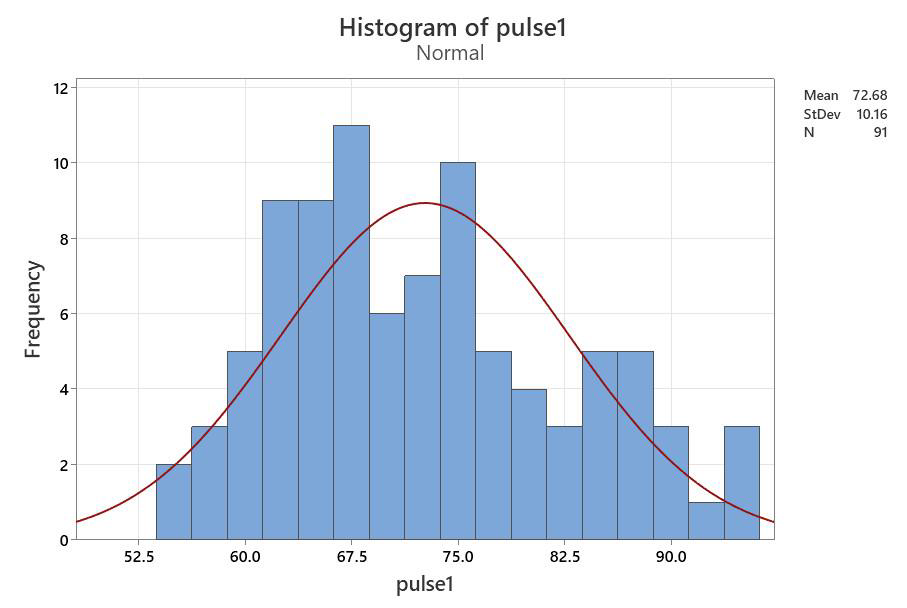
Does your graph match the bell?
The normal probability plot
- Select Graph from the property bar, and then choose Probability plot from the drop-down menu. When prompted, choose the “single” graph, and click okay
- Choose your variable as before. The normal probability plot is the default, but if you want to test another distribution (e.g. random), you can click on “distribution”.
This is produces a plot of your frequency histogram on a special probability scale, so that if the data are normal, your points should fall on a straight line. (Remember that this is for the entire column of data; if you need a subset of the data, such as males vs females, you’ll need to separate them)
You can check this by eye, or you can do a statistical normality test on the data.
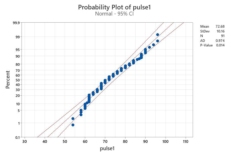
This plot includes the 95% confidence limit for the line. If the points generally fall along the line and are within the confidence limits lines, then you can assume normality
The conclusion from this graph is that the data are normal. The dots deviate from the line very slightly, but not by much, and most fall within the confidence limits. We can run through other methods to see if they confirm our impression from the graph.
Using skew and kurtosis calculations
 Data are normally distributed if the standard error of the skew (SEskew) and the standard error of the kurtosis (SEkurtosis) fall between -1.96 and +1.96.
Method: Determine the Standard Error (SE) of the kurtosis and skew from the skew and kurtosis values in the Descriptive stats analysis (see p. 84) (note that some statistical packages do this calculation for you). The equations below provide an approximation of the SE values.

- SEskew = Skew ÷ √ (6/n)
- SEkurtosis = kurtosis ÷ √ (24/n)
- n=no. of obs.
For the Pulse 1 column:
- SEskew = skew ÷ √(6/n) = .43 ÷ √ (6/91) = 1.67
- SEkurt = kurtosis ÷ √ (24/n = -.58 ÷ √ (24/91) = -1.13
These both fall between 1.96 and -1.96, so data are statistically normal
Note: the SE skew value is close to non-normal, as you can see by the bars in the figure looking a bit crowded towards the left side, but it still falls in the statistical range.
This test confirms that the Pulse 1 data are normally distributed
- Note: “Data is” ?? “Data are” ?? The word “data” is plural (the singular version is “datum”) so should always be given with the plural form of the verb when written.
|
Using Statistical Normality tests: One big problem with statistical normality tests is that they are adversely affected by both small sample sizes and large numbers of “tied values”, i.e. when we have a number of duplicate values in our list of numbers. Tied values often occur if we have a large data set. Therefore the normality test must always be treated with caution, and results should ALWAYS be checked against the normal probability curve. |
Using statistical normality tests
- Minitab provides 3 statistical normality tests. All three will plot the “normal probability curve” as part of the analysis so you can compare the test result to the graph.
- The purpose of the tests is to see whether the dots are significantly different from the line.
Method:
- Choose Stat, Basic Statistics, then Normality Test (near the bottom of the drop down menu).
- In the Normality Test window, select your variable, choose your test, and click ok.
Which test to choose?
- Anderson Darling: quite strongly affected by tied values, which are often encountered in large sample sizes. If you pick the AD test, then make sure you view the probability plot to see if there are tied values.
- Ryan Joiner (Shapiro Wilk): this test is useful for large sample sizes (>) as it doesn’t react as strongly to tied values
- The Kolmogorov-Smirnov test: Avoid this test unless it is /illefors corrected: It is not very powerful and will often say data are normal when they are not. If you use it, use a p-value cut-off of 0.10 rather than 0.05
The null hypothesis is that data are normal, so:
- p > 0.05, data are normal.
- p < 0.05, data are signif. diff. from normal.
The output is a probability graph (but without the confidence lines to help interpret) and the results of the statistical test in the small box at top right.
Look for the P-Value to determine if data are normal. If p<0.05, it is non-normal.
Other information provided: mean and SD values as well as the total ‘N’ and the test value from the statistical test (in this case, AD for the Anderson Darling). Do not confuse the test statistic with the P-Value. (If you pick the Ryan Joiner test, it will give the RJ value, and KS for Kolgomorov-Smirnov)
Interpreting P-Value Results from all three statistical normality tests:
| Anderson Darling | Ryan- Joiner | Kolmogorov
-Smirnov |
Note the differences in result here. Recall that the AD test is badly affected by tied values, and it will usually say data are non-normal when they are actually normal if tied values are present. The Ryan Joiner test is better for tied values, and indicates that data are right on the edge of normal (which is similar to what we saw with the skew/kurtosis calculation). The K-S test can be used as long as the cut-off is 0.10 rather than 0.05, however these data appear non-normal. |
| p = 0.014 | >0.100 | 0.016 |
To assess normality, always use more than one method:
For data to be normal, the histogram should look like a bell curve, the normal probability plot should have points falling close to the line, the SE of the skew and kurtosis should fall between -1.96 and +1.96, and the statistical tests should have a p value greater than 0.05 (or 0.10 for the K-S test). How did we do?
Interpretation:
|
|
Conclusion |
|
| Histogram: looks a bit skewed, but not too far off | Normal | |
| Normal Prob.Plot: the dots fall within the 95% conf. | Normal | |
| Skew & Kurtosis: fall within the range | Normal | |
| Anderson-Darling: p = 0.014 | Non-normal | |
| Ryan-Joiner: p > 0.100 | Normal | |
| Kolmogorov-Smironov: p = 0.016 | Non-normal |
The Anderson Darling and K-S tests give a different result than the others, but since we know it is affected by tied values, we don’t use that one since there are lot of tied values in the plot. The other two indicate that data are normal or very close. Conclusion: Data are normal
Example using non-normal data
For comparison, lets look at some obviously non-normal data: The pulses 2 column:
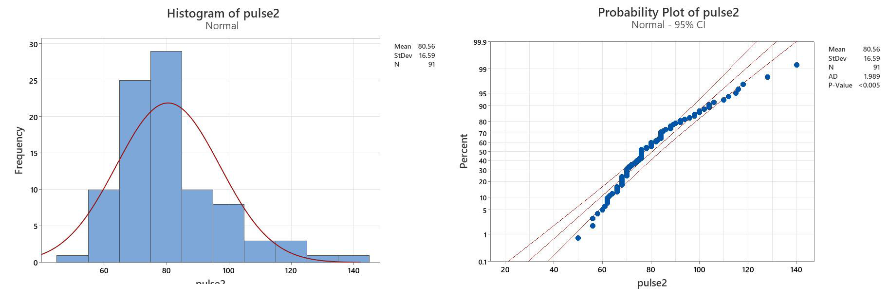
Interpretation of the statistical Normality tests:
| Anderson Darling | Ryan Joiner | Kolmogorov- Smironov | This time, all statistical tests indicate that data are non-normal, since the p-values are <0.05 in all cases. Even though there are tied values (so we don’t trust the AD test), the RJ and KS tests are clearly non-normal. |
| p <0.005 | p<0.01 | P<0.01 |
Evaluating the SE of the Skew and Kurtosis:
| Skewness1 | Kurtosis1 | SEskew = skew ÷ /(6/n) | SEkurt = kurtosis ÷ /(24/n) |
| 1.11 | 1.49 | =1.11 ÷ √ (6/91) = 4.32 | =1.49 ÷ √ (24/91) = 27.67 |
Interpretation:
Conclusion
Histogram: quite skewed Non-normal
Normal Prob.Plot: the dots are well off the line Non-normal
Skew & Kurtosis: fall outside the range Non-normal
Anderson-Darling: p << 0.05 Non-normal
Ryan-Joiner: p << 0.05 Non-normal
Kolmogorov-Smironov: p << 0.05 Non-normal
These data (Pulses 2) are clearly non-normal, as all normality tests confirm this.
Comments on interpreting normality testing:
|
Parametric vs Non-parametric testing:
- Parametric tests are better at picking up statistical differences than non- parametric tests, so we prefer to use them when we can
Assumptions for parametric testing:
- Data are normally distributed (or close to normal) – test normality
- The variances of the groups are similar to each other – test “equal variances”
- Data are independent of each other – study design point
- Data were collected in a random fashion – study design point
Statistical Tests
Which do you use? Here is a key to the basic tests
Dichotomous key to statistical tests
1a. Are you comparing the averages from groups of data?……………………………………………………………………………………………………………………………………………………………………. 2
1b. Are you looking for a relationship between two variables………………………………………………………………………………………………………………………………………………………………. 11
2a. Are you comparing the average from one group of numbers to a single predicted value?…………………………………………………………………………………………………………. 3
2b. Are you comparing the average from more than one group to averages?…………………………………………………………………………………………………………………………………….. 4
3a. Are your data normally distributed……………………………………………………………………………………………………………………..……………………………………………One Sample t-test
3b. Are your data non-normal? ………………………………………………………………………………………………………………………………………………………………..One Sample Wilcoxin test
4a. Are you comparing the averages of two groups?…………………………………………………………………………………………………………………………………………………………………………………5
4b. Are you comparing the averages of three or more groups?……………………………………………………………………………………………………………………………………………………………….8
5a. Are your data paired? (i.e. are you measuring something at time a and b on the same individuals?………………Paired t-test or non-parametric paired test
5b. Are your data unpaired (i.e. are you just comparing the average values for your groups?…………………………………………………………………………………………………………….6
6a. Are your data non-normal?…………………………………………………..…………………………………………………………………………………………………………………………Mann-Whitney U-test
6b. Are your data normally distributed…………………………………………………………………………………………………………………………………………………………………………………………………………7
7a. Are your data normal with equal variance…………………………………………………………………………………………………………………………………………………………..Student’s t-test
7b. Are your data normally distributed with unequal variance?…………………………………………………………………………………..Students t-test, with variance correction
8a. Are you comparing averages of three or more groups without subgroups?…………………………………………………………………………………………………………………………………….9
8b. Do your data have a subgroup or factor you want to compare (e.g. response of males and females within different treatment groups)?…………………………..10
9a. Are your data normally distributed with equal variance…………………………………………………………………………………………………………………………………….One Way ANOVA
9b. Are your data QRQ normal or have unequal variance?………………………………………………………………………………………………………………………………………Kruskall-Wallis Test
10a. Are your data normally distributed …………………………………………………………………………………………………………………………………………………Two-Way (factorial) ANOVA
10b. Are your data QRQ normal or have unequal variance?……………………………………………………………………………………………………………..No simple non-parametric test
11a. Are your data normally distributed, with error distribution normal and heterogeneous?……………………………………………….Pearson Correlation and Regression
11b. Are your data non-normal?…………………………………………………………………………………………………………………………………………………………………………Spearman Correlation
What are the stats telling us? Comparing Groups or Relationships
We could be comparing groups or looking for relationships among variables.
|
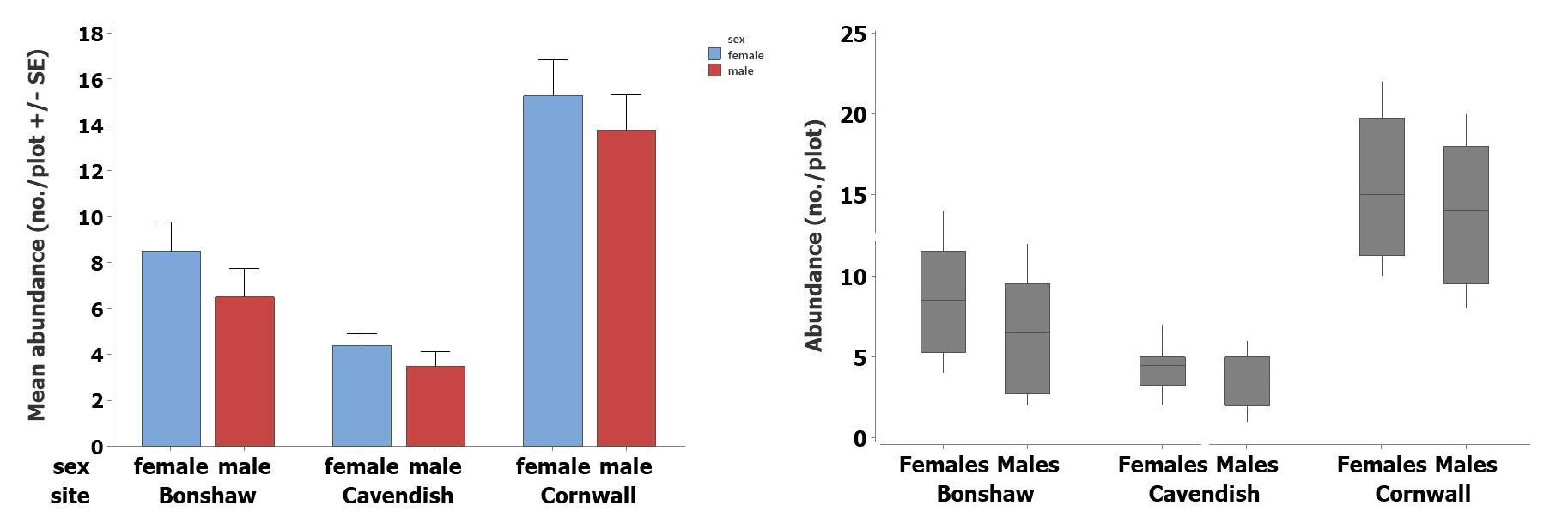
Our first step in doing statistical comparisons should be to plot the data with error bars, to get a visual image of what we are comparing. |
Comparing groups
One of the main types of statistical analyses we do is to compare groups of data. When we do this, we’re really taking the average of the group, and comparing those averages, taking into consideration how variable the data are, and how many samples we have.
The type of graph we plot depends on the shape of the data (see “Frequency Distributions”, p. 73-75).
- If data are normally distributed, use a bar graph with error bars
- If data are non-normal, use a box and whisker plot
Looking at the relationship between two variables (plot x against y):
- Again, plot the data first, to see what the actual pattern looks like. Then use statistical analysis to see whether the relationship you see with your eye is statistically significant.
|
Remember to test data for normality before deciding which test to use. Since you only have one data set here, you do not also need to test equal variance. |
Using statistics to compare groups:
We use different tests depending on the number of groups, and whether data are parametric.
Comparing one group to a predicted value:
- Parametric: one-sample t-test (compares the mean)
- Non-parametric: one-sample Wilcoxin Test (compares the median)
One sample tests allow us to compare the average and variation in data from an observed group to a predicted value.
- The Null Hypothesis is that the mean of your observed data is equal to the predicted value
- If P<0.05, then the means are significantly different.
Parametric Example: One sample t-test
Study Question: Is the average resting pulse equal to 70 beats per minute?
- H0: Resting pulse (Pulse 1) = 70 beats per minute
- HA: Resting pulse (Pulse 1) … 70 beats per minute
- Choose Stat from the property bar, and then Basic Statistics, and then 1 sample t
- Select your variable (e.g., pulse 1)
Note; if your variable list is blank, just click on the white space in the “samples in columns
- check the box for “perform hypothesis test”, and type in the value you’re comparing (i.e. 70). Click OK
- Note that we have a simple alternate hypothesis here, of “equal” vs “not equal”. If you want to be more specific and test if it is greater than or less than your hypothesized mean, click on “Options” and change it
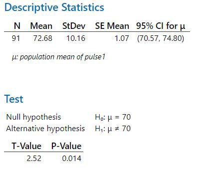
|
Interpretation: p < 0.05, therefore the mean of the observed resting pulses is significantly different from 70. Trend: Since the mean (from the output) is 73.14, we can say that pulses are significantly higher than 70 beats/min. |
Non parametric Example:
One sample Wilcoxin
Use this test if data are non-normal.
- Select Stat, Nonparametrics, then1-sample Wilcoxin
Set it up the same way as for the 1-sample t-test, but test a median rather than a mean.

Note that this non-parametric test also showed a significant p-value (p=0.028), but that this one is much closer to the 0.05 cutoff than the parametric test, reminding us that this is generally a less powerful test.
|
Always choose the parametric test if your data are normal. |
Comparing 2 Groups:
Study Question: is Pulse 1 different from Pulse 2?
Testing Parametric Assumptions: Before doing this test, remember to test each group of data for normality (p. 87-92). The other assumption for the parametric test is that variances in the groups are similar, so you will also have to do an “equal variance” test. We already know that data for Pulses 1 were normal, but the Pulses 2 data were not. Therefore, parametric test will give an invalid result and the correct test to do here is the non-parametric test. We will test for equal variance on p. 98. Examples with both tests are shown here so you can see how to do them.
Parametric test: Student’s t-test (AKA 2-sample t-test)
Step 1: Look at plot of data to see pattern
Step 2: Setting up the data table
Minitab has two methods:
- The t-test allows us to put the data into adjoining columns(spreadsheet fashion) or to have them in one column. For this example, our Pulse 1 and Pulse 2 data are already in adjoining columns so we’ll pick this option.
Step 3: do the test: Choose 2 sample t-test from the Stat/Basic Statistics drop-down menu.
Note the box here where it says “assume equal variance” … if you have tested equal variance and they are statistically equal, then check this box.
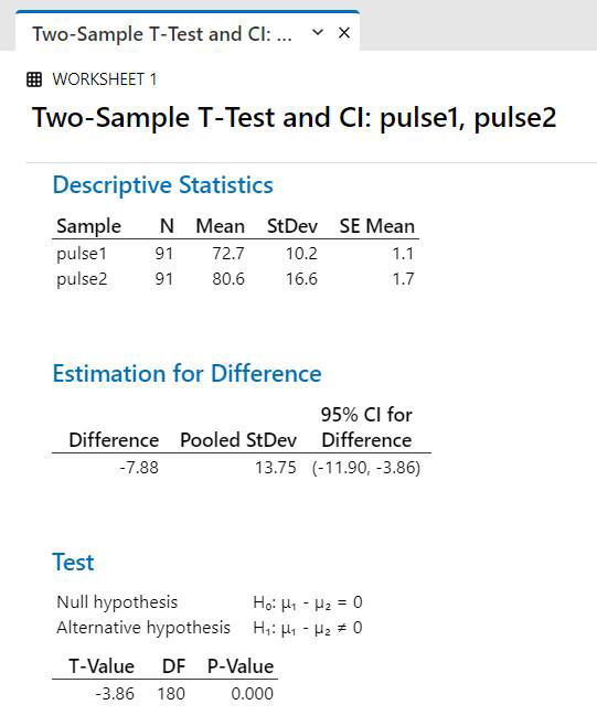
Output for t-test:
|
Interpretation: p < 0.05. Therefore, If assumptions are verified (normal + equal variance), then we would conclude that Pulse 1 is OHVV WKDQ Pulse 2. |
Assumptions:
1. Test Normality: Pulse 2 was not normal (see p. 92)(this means the t-test result was not valid)
2. Test Equal Variance: do variance test as described below
Test for equal variance for t-test:
- Choose “2 Variances” from the Stat/Basic Statistics drop-down menu.
- Select your variables that you are comparing (in this case, I chose the samples in dif. columns, but if your data were set up in a single column the result would be the same; see p. 100 for example). Click ok
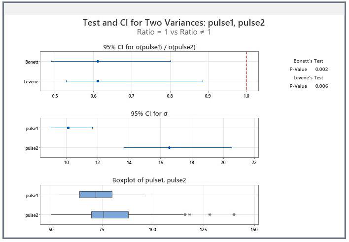
Minitab 21 uses Bonnett and Levene Tests and produces some companion graphs. The boxplot shows the range of the data,so we can see that the variation is Pulse 2 is much higher than that for Pulse 1
The interval plot shows us the difference in the standard deviation for the two groups, with confidence limits, so we can see that they don’t overlap.
Note the outputs for the Equal Variance test in the top right corner.
- Both show that p < 0.05, so we reject the null hypothesis that variances are equal
|
Important:
|
Therefore, we conclude that variances are different
Interpretation:
The data did not pass the assumption tests, therefore any result from the t-test is not valid and cannot be trusted
Therefore, we would discard our t-test result, and carry out a Mann-Whitney U-test.
Nonparametric test: Mann-Whitney U-test (Use this test if data are not normal)
Setting up the data:
- You must have your data in separate columns for this test.
- No assumption testing is needed for this test.
Carry out the test: Choose the Mann-Whitney test from the Nonparametrics drop down menu (from Basic Statistics)
- Select your variables, and click ok
This test compares medians (middle values in a list that is ranked from smallest to largest) rather than means. Minitab Output:
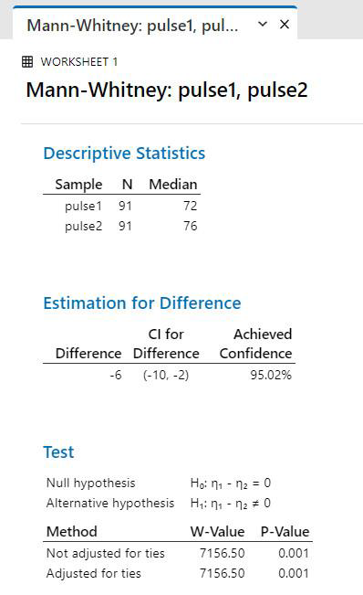
Conclusion: no assumptions are required, and there is a signifcant difference among groups, since p < 0.05
Trend statement: The pulse rate of students after running (Pulse 2) was significantly higher than the pulse rate before running (Mann-Whitney U-test, P=0.0048).
This is the correct test, so we can trust our result.
|
Since the non-parametric test doesn’t need us to test assumptions, why not just use it all the time?
|
A second two-sample example, t-test with data in a single column.
Study question: Do males and females have the same average resting pulse?
- Choose the 2-sample t-test following the instructions on p. 97 (Stat, Basic Stats, 2-sample t)
- When selecting your variable, you’ll be able to choose the “samples in the same column option” in the t- test menu, but you’ll still have to separate them to check for normality. You can do this manually, by splitting the worksheet (see p. 46), or by “unstacking” the column.
“Unstacking” a column to test subgroups separately:
- Choose Data from the upper property bar, then Unstack columns from the drop-down menu:
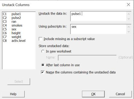
“Superscripts” refer to your grouping variable, so if you want to separate out the two sexes (male and female), then choose “sex” as your subscript.
- Check the boxes for “after last column in use” and “name the columns” so that the data will appear in your worksheet.
Test normality
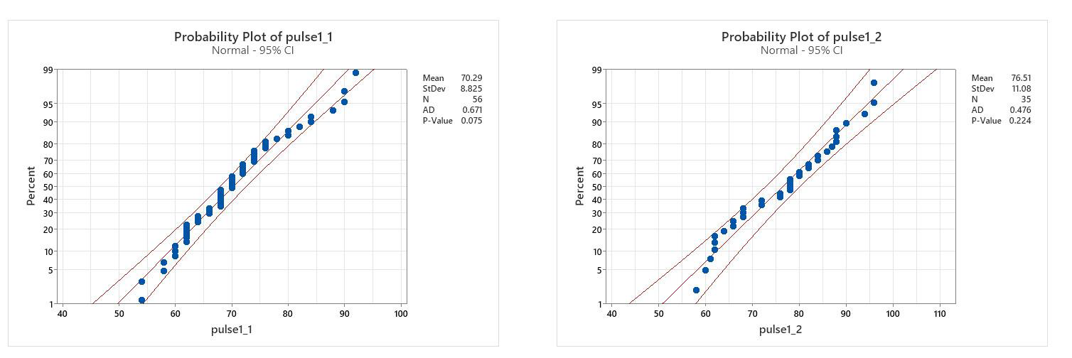
Pulse 1 males: The probability plot has most values in the 95% confidence bands, and the p- Value for the Ryan Joiner statistical test is >0.05 (too many tied values for AD)
Conclusion: Normal
Pulse 1 females: The probability plot has all values in the 95% confidence bands, and the p-Value for the Ryan Joiner statistical test is >0.05
Conclusion: Normal
Test equal variance
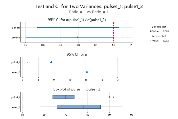
Conclusion: variance is equal since p>0.05 for both tests
Important: do not stop here… these tests only assessed assumptions. Now you must do the test to test your study question.
Carry out the 2-sample t-test, this time with data in one column.
Since variances are equal, check box for “Assume equal variances”.
Two-sample T for pulse1
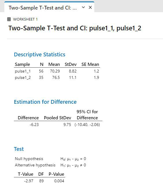
Conclusion: Assumptions are satisfied, so test is valid and groups are significantly different since p<0.05.
Trend statement: Average pulse rate is significantly higher for females (group 2) than for males (group 1) (t-test, p=0.008)
- Remember to always write a trend statement giving the clear trend in the data, with the name of the statistical test and the p-value in brackets.
|
How should you report p-values?
|
|
Interesting side note: These questions illustrate how many questions can come out of a single dataset, if the sample size is large enough, and the study design incorporated many variables. In the previous example, we tested whether two different groups of students were different from each other. In this example, we are testing to see whether an individual group of students can show significant differences from one time to another. For this to work, the data must be “paired”… i.e. we must identify each individual and be sure we know his/her before and after result. |
Two sample testing when values are “Paired” Study question Did the pulse rates of the individual students go up after running?
Note the importance of how the question is worded:
If we want to know if the average pulse rate goes up after running, we would do a regular t-test or Mann-Whitney U-test (if non-normal). But because we have data on each individual person, we can see if the individual rates go up by using a test that focuses on individual responses, called a “paired” test. This is particularly useful if high variability in individuals makes it difficult to see a pattern in the average response, and the paired test will have more power to see the differences than the regular one.
How Paired tests work: In paired tests, we look at a measured value for known individuals at two (or more) times.
The example below is for the pulses in the group who ran in place for one minute, so you can see that their pulse rates all went up, though not by the same amount.

We can test this using a one-sample test, to see if the group of numbers in the difference column is significantly different from zero.
For parametric data, there is a t-test that calculates the differences and does the one sample test automatically in a single step. For non-parametric data, we have to do the extra step ourselves.
Step 1: separate out the runners from the non- runners in both our resting pulse and our after running pulse columns (pulse 1 and pulse 2). This will give us four groups of data as you can see from the graph at right.
Remember to plot your data so you can see what you are comparing!
- We can do this manually (by copying and pasting into additional columns, “splitting” the worksheet into multiple smaller worksheets to work on using Minitab or “unstacking” the columns.

Figure 1. Comparison of pulse rates for a group of students before and after one group ran for 1 Min.
Step 2: Compare pulse 1 and pulse 2 for the non-runners (control) and then the runners (test)
First: Test assumptions:
1. Normality testing: test normality of all four groups, using Ryan Joiner (since many tied values)
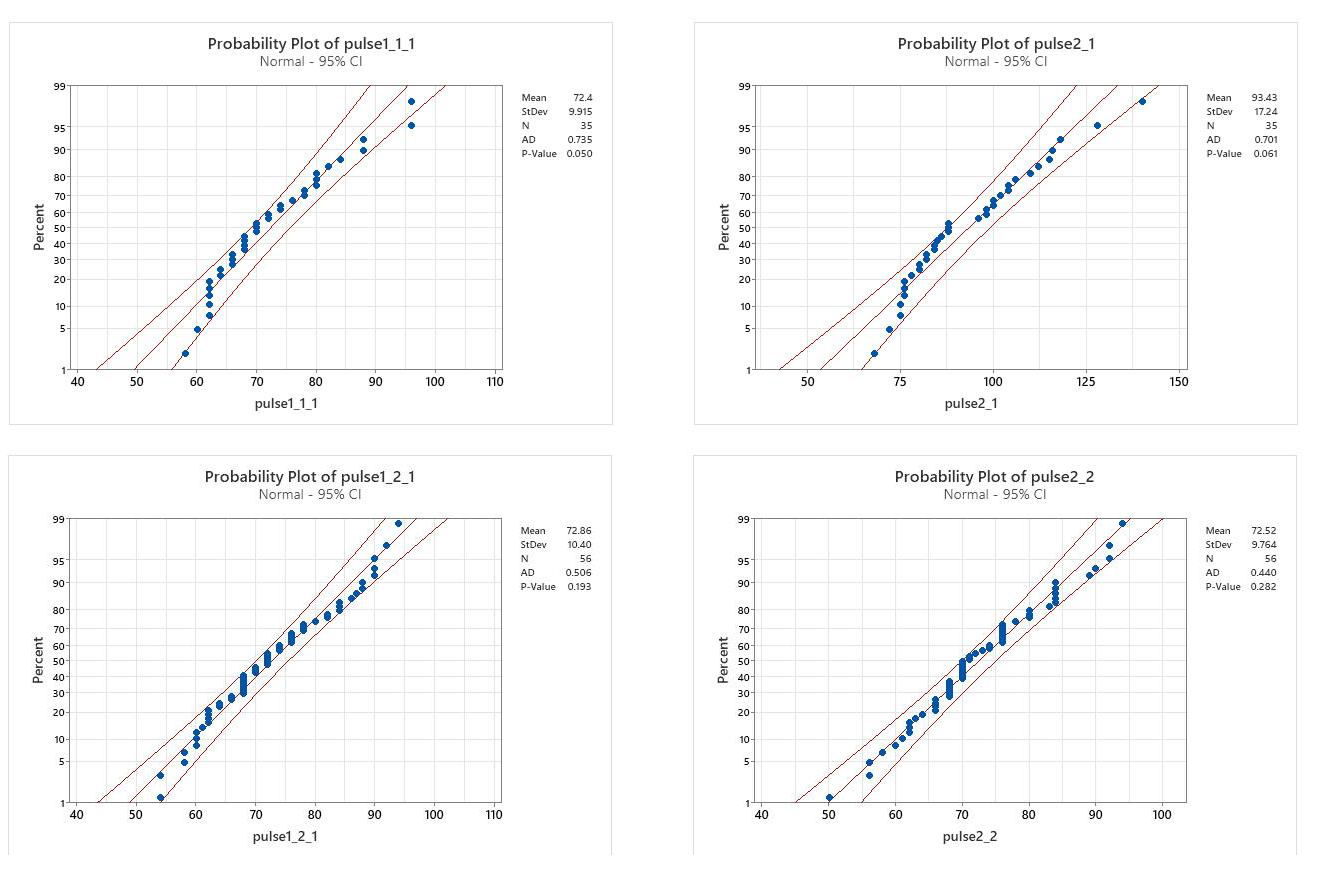
2. Equal variance: Running group p=0.004 Non-running group: p=0.624
(Variances between before & after running: non-equal for runners, equal for non-runners)
Conclusion from assumptions:
- Runners: one group was normal the other non normal; variances were not equal
- Non-runners: data were normal, and variances were equal
Therefore, both the parametric and non-parametric paired tests are needed to assess whether there are differences between the individuals pulse rates at the two different times.
Parametric data – use the Paired t-test
Run this test using the Non-runners’ pulse rate data, since these data were normal and had equal variance.
Make sure the data to be tested are in separate columns, e.g. non-runners at time 1 and non-runners at time 2.
- Select Stat from the property bar, and Basic Statistics.
- Choose the paired t test from the drop down menu.
- Choose variables so that your data for the non-runners from time 1 is being compared to non-runners in time 2.
Minitab Output:
Paired T-Test and CI: pulse1nonran, pulse2nonran
|
Since p>0.05, we accept the null hypothesis, and say there is no difference in the groups. Notice the difference here in what is being tested: instead of comparing one mean to another, it tests whether the mean difference is equal to zero |
Non-parametric paired two sample test:
- If data are non-normal, then you must use a non-parametric test. There is no one-step non-parametric paired test, but you can carry it out in two steps.
Step one: Subtract your time 1 column from your time 2 column (as in the table on p. 103). You can do this in Excel, and copy and paste the values into Minitab.
Step two: Carry out a one-sample Wilcoxin test to test whether your median is different from zero (as shown on p. 96).
Choose your column with the runner differences, and check the box for testing that the median is zero:
Minitab Output:
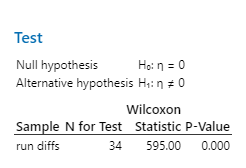
Wilcoxon Signed Rank Test: run difs
Since p<0.001, then we reject the Null hypothesis; i.e. the pulse rates are significantly different between time 1 and time 2.
Comparing >2 groups of data
|
Balanced Designs Some packages (e.g. Excel) assume a “balanced design”; that means that there have to be the same number of observations in each group being studied. In Minitab, a balanced design is not necessary for simple ANOVA (although it is in 2-way ANOVA), but note that if your groups have too few observations, you have very little “power” to pick out differences. |
Analysis of Variance (ANOVA) or the non- parametric equivalent (Kruskall-Wallis) allows us to compare more than 2 groups of data. As with the t-test, we are comparing means, and the null hypothesis is that the means are equal.
- If p<0.05, the means are statistically different (assuming the assumptions of ANOVA are met).
Setting up your data:
Your dataset can be set up in the worksheet so that the responses being measured are all in one column, and the groups that you are comparing are given as categories in a separate column (See our pulses dataset on p. 83 as an example). Alternatively, the data can be set up so your groups are in adjoining columns. For the ANOVA, these have special names: If data are in one column, Minitab refers to this as “stacked”. If data are in adjoining columns, Minitab refers to this set-up as “unstacked”.
Parametric Data: Analysis of Variance (ANOVA)
One-Way Design (comparing groups without subgroups)
Example of comparing three or more groups of data; “stacked” data. Study Question: Are resting pulse rates different depending on normal activity level?
- This will give three groups to compare, with three activity levels.
|
Important design note: The design of this study is highly unbalanced, and the group reporting low activity level was very small in number; it may be too small to give random and independent data. Therefore, ANOVA result should be treated with caution. |
Assumptions:
ANOVA assumes that data are parametric, which means:
- Normally distributed
- Variances are equal
- Design should be set up so data are independent and random.
1. Test for normality for each group of data as explained in the earlier section
- When this was done, all groups were normal (p>0.05)
2. Equal Variance Test: Do not use the equal variance test you used for t-tests!
- To test equal variance on three or more groups of data, we need to use the equal variance test found in the ANOVA menu. The one in the t-test menu only tests variance for two groups of data, not for three or more.
Select Stat from the property bar, then ANOVA. Look part way down the drop-down menu, and select Test for Equal Variances
Choose your response variable (in this case, pulses 1 to assess the resting pulse rates) and your factor variable (in this case, activity level), and click okay.
Equal variances result:
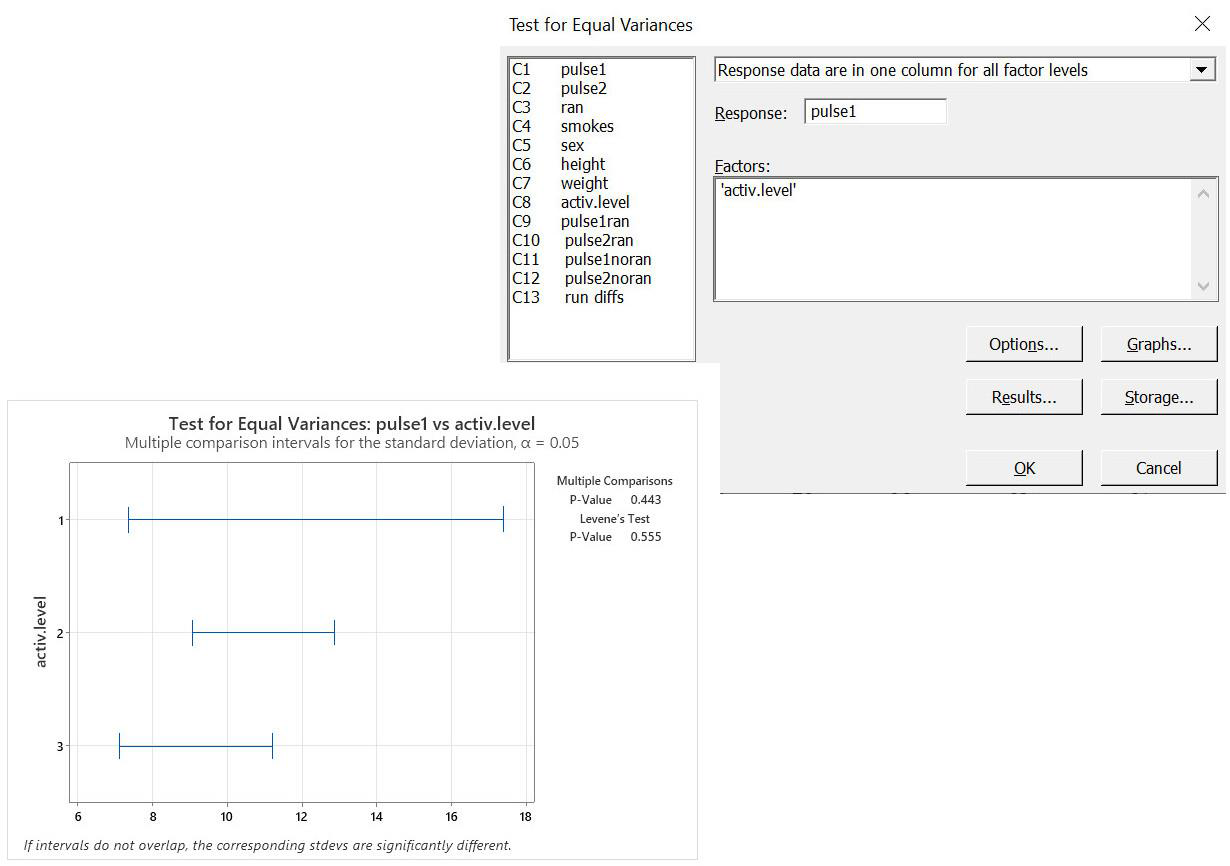
p>0.05 so variances are equal
Notice in the graph how the variances are all very similar with a lot of overlap… that shows that the variances are very similar.
Conclusion: Although we need to be cautious about interpreting patterns about the low activity level due to the small and unbalanced sample size, our data meet the assumptions of the ANOVA, so we can run the test.
Method for One-Way ANOVA:
- Choose “stat” from the property bar, then choose “ANOVA”, then choose “one-way”. One way analysis of variance means that you are simply comparing 3 or more groups of data, without any subgroups in them.
This puts you into the menu for the ANOVA with data set up in one column
The Null hypothesis is that
X1 = X2 = X3
therefore, a significant p-value (p<0.05) means that at least one group is different from the others.
- Select your variables
- The “response” variable is the one where your measurements are, for example one of the columns of pulse rates.
- The “factor” is the column where the different groupings or levels are shown.
In our pulses dataset, we have 3 levels of activity, so we could choose activity level as our factor.
Click on “okay”, and the output will look like:
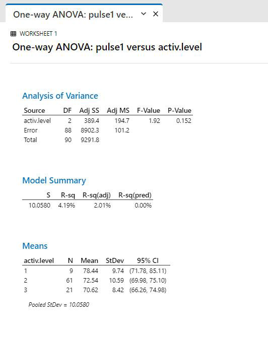
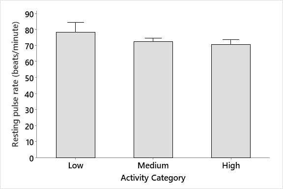
Interpretation: p>0.05, so the means are not significantly different between the groups. We conclude that activity level does not have an effect on resting pulse in these students.
Remember to always plot your data to see the patterns. This helps you to determine what you actually want to test, and can help you interpret your data patterns. You can see from the graph at right that although it looks like the people with low activity level had a higher resting pulse rate, the variability in the data means that there is no significant difference
Conclusion: we have done the appropriate test, so we can trust our result.
Trend Statement: There is no significant difference among resting pulses in the three groups (ANOVA, p = 0.155).
Non-parametric data: Kruskall-Wallis Test
If data were not normal [and could not be made normal through transformation], we would use the Kruskal-Wallis test, which compares medians.
Data Setup:
- Data must be set up so that the response variable (in this case, Pulse rate) is in one column, and the grouping variable is in another column.
- Select “non-parametrics” from the “stats” menu, and choose the Kruskal-Wallis.
- Select your variables:
|
Transforming:
|
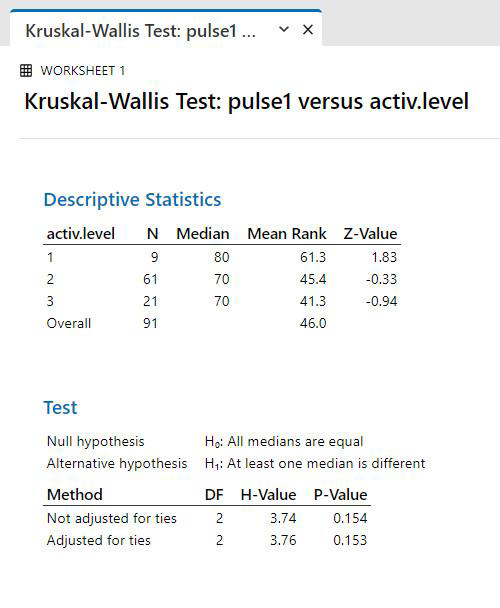
Trend statement: There is no significant difference among the pulse rates for the students who have the different activity levels (Kruskal-Wallis test, p=0.153)
Example of comparing three or more groups of data; “un-stacked” data
Study Question: Is there a difference among the runners and non-runners, before and after running?
Running Group
Data Setup: For this method, put the data into 4 separate columns, and run a One-Way ANOVA, unstacked.
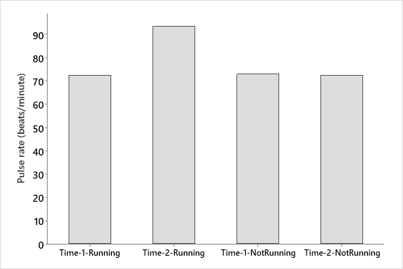
A quick plot of the data shows no dif. in pulse between time 1 and 2 for the non-runners, but there seems to be a big difference for the runners. What we would like to know is whether that difference is significant.
The null hypothesis is that there is no difference among groups.
Assumptions:
- Normality: some groups were normal, and others were not. The non-normal groups were relatively close to normal.
- Variances: were not equal
Conclusion from Assumptions:
Data are non-parametric (if even one group you are comparing don’t fit assumptions, then your data are nonparametric), so should either be transformed or a non-parametric test should be chosen. However, ANOVA is “robust” to minor violations of assumptions, so since data are close to normal, it may be okay to do the parametric test. To be sure, do both the parametric and non-parametric test and compare.
ONE-WAY ANOVA, “unstacked”
- Select Stat from the property bar, then choose ANOVA from the drop down menu.
- Choose One-Way (Unstacked)
- Select variables (these must be in adjoining columns in your dataset)
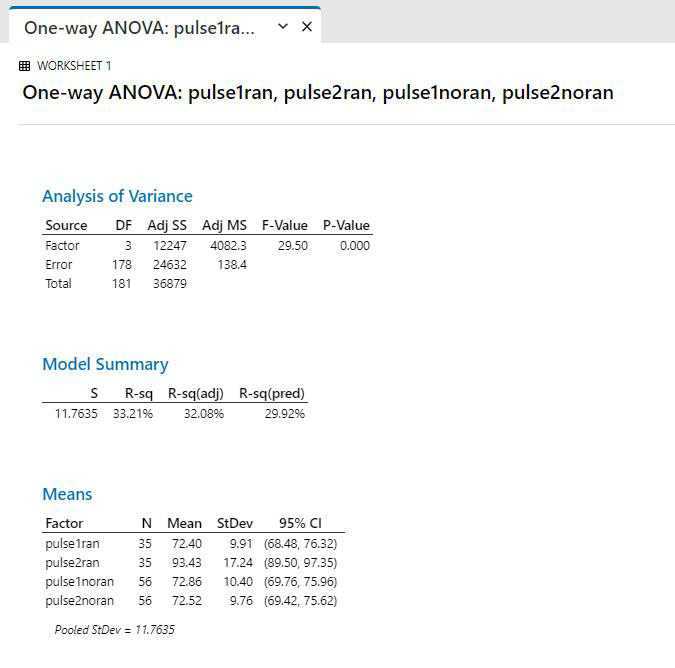
Output (ANOVA table)
|
Interpretation: p<0.05, so there is a significant difference in the groups. However, we don’t know which groups are different. |
Important note:
p<0.05, so groups are significantly different. However, there is no way to know from the simple One-Way ANOVA which group is different from which other(s). We need to do further testing to figure this out.
Multiple Comparison Tests:
ANOVA is designed to tell us if there are any differences, but not which groups are different. For this: do Multiple Comparison Tests
|
Type I Error Inflation:
Recall that if we do multiple comparisons on the same data set (e.g. group 1 vs group 2, group 1 vs group 3 and group 2 vs group 3) then our probability of getting an incorrect interpretation goes up. If you have three groups, that probability goes up from 0.05 to 0.14 for all the comparisons taken together.
This means that if we want to compare the individual groups, we need to use a special test that calculates a “family error rate” (the error rate for all the groups considered together) rather than individual error rates. These are called “post-hoc” or “multiple comparison” tests.
If you find a significant result with your ANOVA (i.e. if you run ANOVA and your p<0.05), then you should run a multiple comparison test to see which of the groups are significantly different from each other. |
The most commonly used multiple comparison test is Tukey’s Test. To do a Multiple Comparison test, click on “comparisons” in the initial ANOVA menu
- Check the box for Tukey’s test, and click OK
- Then run the ANOVA as before. (You will see the ANOVA output, and some additional information that lets you compare each group)
Output:
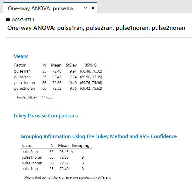
|
Interpretation: Look for groupings that have a different letter under the “Grouping” heading. In the example above, the pulse 1 and pulse 2 groups for the non-runners, and the pulse 1 group for the runners all have the same letter, so they are not significantly different. However, the pulse 2 data for the runners has a different letter, so that means it is significantly different than all the other groups. To find out how it is different, look at the column with the means: Pulse2ran clearly has a higher mean value than the other ones.
|
Therefore, to report this trend, you’d write something like:
There was a significant difference in pulse rates in the groups of students (ANOVA, p <0.001). There was no difference in resting pulses of the two groups of students (runners vs non runners) prior to running, but there was a significant increase in pulse rate in the running group after running (Tukeys test, p<0.05).
Comparing >2 groups of data with subgroups
Factorial Analysis of Variance (This can be a 2-way ANOVA, 3-Way, etc.)
If your data contain distinct subgroups, you can run an ANOVA that lets you test the effects of those subgroups, or factors, on your response at the same time as testing your main grouping factor. This is called a factorial analysis.
|
Important note: Minitab requires a “balanced design” for 2-way ANOVA |
Consider an example where a researcher would like to know whether a particular feed supplement would increase growth in chickens, and whether the sex of the chicken would affect how it worked. This is a standard “two-way” design, where we are looking at two factors at the same time.
|
Data Set-up Set up the data in Minitab so that the response data (weight) are in one column, and the grouping factors are in other columns: |
|
This is known as a factorial table. If your data can be set up in this way to show groupings, then it is a good candidate for a two-way ANOVA. |
Table 1. Weight (grams) after two weeks in a group of bantam chicks on two different diets; the standard diet, and one supplemented by blueberry extract.
|
males |
supplement
590 |
control
440 |
| 530 | 570 | |
| 550 | 509 | |
| 570 | 510 | |
| 650 | 589 | |
| females | 530 | 550 |
| 580 | 420 | |
| 520 | 440 | |
| 520 | 520 | |
| 560 | 370 |
Assumption Testing:
- Normality (A-D):
- control, female, p=0.64
- control, male, p=0.52
- supplement, female, p=0.21
- supplement, male, p=0.59
All data are normally distributed
Equal Variance:
- Use the “Test for equal variances” in the ANOVA menu.
- Set it up as shown below:
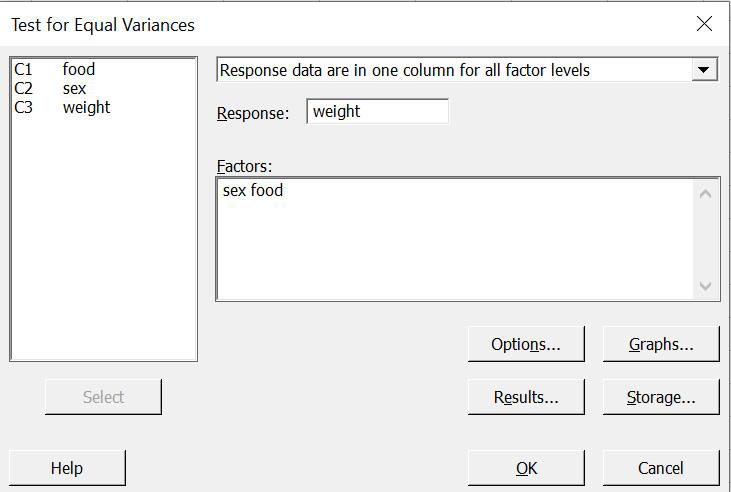
Equal Variance Output:
p>0.05, therefore accept the null that variances are equal.
Now run the test:
- Select Stat from the property bar, then choose ANOVA, then Two-Way
- Select your variables:
- Response = the data column, so, weight Row and column factors:
- Before doing a 2-way ANOVA, you should set up a table to assess your factors
- Use that to decide which is a row factor and which is a column factor.
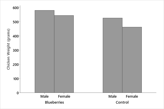
First, plot the data to see the patterns you want to test:
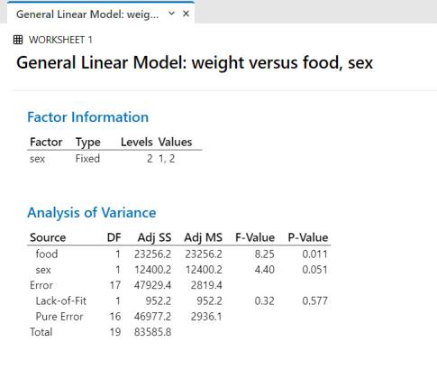
Two Way ANOVA Output:
Interpretation:
Step 1: look at p-values for individual factors
Sex: p=0.051
- Since p>0.05, we accept the null and conclude there is no difference Food: p = 0.011 since p<0.05, we reject the null and conclude there is a difference
Step 2: look at the p-value for interaction
Interaction: p=0.577,
- Since p>0.05, there is no interaction with respect to the weight response among the factors (i.e. weight acted the same way for both sexes (was lower) regardless of the food type).
Interaction refers to whether the response acts the same way for the different levels of the factors.
- e.g. If the growth was higher on blueberries for males, and lower for blueberries for females, that would be an example of a different response for the two sexes… This would give a significant interaction.
- Since growth was lower for females than males for both food types, it means there was no interaction.
To see the actual trend, we look at the graph:
Chickens that were fed a diet supplemented by blueberry extract grew significantly larger than those on a standard diet (Two-Way ANOVA, p=0.012), and there was no significant difference in response between male and female chicks (Two-Way ANOVA, p=0.057). There was no significant interaction between food type and sex of chicks (Two-Way ANOVA, p=0.58), indicating that the food supplement affected weight in the same way for male and female chicks.
|
Remember to always say which is higher/lower than the other, if you can To report the interaction, be sure you explain it in English – do not just say there is a significant interaction or not. |
Relationships between variables: Regression and Correlation
Correlation analysis tests whether there is a correlation between two continuous variables Regression analysis takes it a step further to give us the equation of the line and give information on how much of the variation in the points can be statistically related to the other variable.
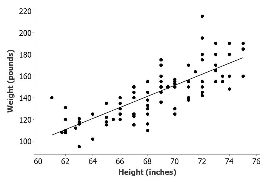
Step 1: Plot the data to see if there is a relationship between the variables e.g. Is Weight related to Height of the students in the pulses study? If so, what is the equation of the line.
The graph suggests that the weight of the students increases as their heights increase.
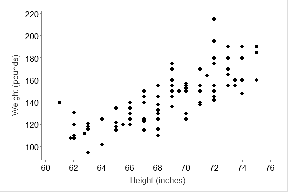
We can run correlation analysis to see how strongly related (correlated) the variables are, and we can run regression analysis to get the equation of the “best” line that describes the relationship.
We can use regression to describe relationships, or to generate an equation (usually called a “model” that can be used to predict for values
Assumptions: Correlation
- Each variable must be normally distributed
- The relationship must be linear
- The residuals (errors) must be normally distributed
Assumptions: Regression
- Each variable must be normally distributed
- The relationship must be linear (for linear regression)
- The residuals must be evenly distributed along the line
Some important definitions:
- Independent variable: the variable that is fixed for our analysis… what we are comparing the other variable to plot this variable on the x-axis
- Dependent variable: the variable that “depends on” the x-axis variable; the one we expect to change or vary with our fixed variable. Plot this variable on the y-axis
- Residual: the amount of vertical (y-axis) variation of the observed points from the regression line (i.e. the ‘y’ value of your point minus the ‘y’ value on your line)
- Standardized residual: (residual) ÷ (standard deviation of residual). Standardized residuals have been standardized to have a variance of 1. Standardized residuals over 2 are usually considered large, and points with that large a residual are often considered to be outliers outside of our observed range.
Method:
- Test normality as described before
- Test linearity by looking at the graph and deciding if the points form a straight line
- Test the normality and linearity of the residuals through specialized menus in the Regression menu.
Correlation

The graph above shows a relationship between height and weight of the student participants.
- How related are they?
- Is the relationship significant?
To test these questions, we run a correlation analysis.
The correlation analysis gives us two statistics, the correlation coefficient, and the p-value
Correlation Coeffient ( r ) tells you how related the two variables are on a scale of zero to one
- A negative ‘r’ means the relationship is negative (slopes downward)
- A positive ‘r’ means the relationship is positive (slopes upwards)
- A value of 1 or -1 means 100% related
- General rule of thumb is that a “good” correlation is 0.7 to 1.0 or -0.7 to -1.0
P-value: Tells you whether the slope of your line is significantly different from zero (i.e do you have a significant relationship. If p<0.05, the variables are significantly correlated
Carry out the test:
- Select Stat from the property bar, then choose correlation from the Basic statistics drop down menu.
[Note: do correlation analysis only if you don’t need the equation of the line, or the coefficient of determination (r2)]
With correlation, it doesn’t matter what order you put the variables in, since we’re just looking at a simple relationship.
Output from Minitab:
|
Correlations: height, weight Pearson correlation of height and weight = 0.786 P-Value = 0.000 remember to write as p<0.001 |
Interpretation:
- The r-value = 0.786, which tells us that we have a positive correlation, and it is a “good” correlation (since the value is above 0.7) tells us how strong it is.
- The p-value tells us if it is a significant correlation, while the r-value
Assumptions were satisfied:
Both sets of data are normal (based on prob. plots) and the relationship is linear (based on the graph)
Regression:
Regression analysis lets us determine the “model” (line) that best describes the data.
The regression analysis gives us three statistics:
- r2 =“coefficient of determination”
- The p-value, and
- The equation of the line.
The p-value is the same as for correlation
The Coefficient of determination, r2, tells us the proportion of the variation in the ‘y’ vaues that can be directly related(“statistically”) to the x-value. It is often referred to as the amount of variation “explained” by the variation in ‘x’, but note that that is meant in the statistical sense.
In regression, we assume that one variable is fixed or independent, and that the other variable depends on the first. The independent variable goes on the x-axis and the dependent one goes on the y-axis.
The assumptions of linear regression are:
- Linearity: data on the graph form a reasonable line, so we say they are linear
- Data normality: Normality plots of the two variable showed that both were normally distributed
- Error normality (normality of residuals) – test this after running the regression
- Equal distribution of residuals along the line – test after running the regression
|
A note on regression assumptions: Unlike the assumptions for the group comparisons (e.g. ANOVA or t-test), many of the Regression are there to guide your interpretation, not to be an absolute guide to whether you can do the test or not. “Must have” asummptions:
Assumptions that guide interpretation:
– i.e. Even if these assumptions are violoated slightly, you can still do the regression, but have to use caution if predicting ‘y’ from ‘x’ |
Run the Regression analysis:
- Select Statfrom the property bar, then choose Regression and Regression and fit regression model
- In the regression menu, put the dependent variable in the response box, and the independent variable in the predictor box
To test the assumptions while doing the test, click on the “Graphs” box.
- In the graphs window, check the box beside Regular
- This gives the actual values for the residuals
[‘Standardized’ will convert the values based on their standard deviations so you can see them as a function of their variability. This can be useful in identifying outliers, but otherwise, the graph will look very similar]
- For “residual plots”, check the boxes beside normal probability plot, and the residuals vs the “fits” (the independent var).
- If you think that there may be a bias in the order the data are collected, then also plot the residuals vs the order (e.g. if you collect data over a period of time, so you might get a different response later in the day than earlier, that could be a bias)
Interpretation of Regression Assumptions:
Distribution of residuals along the line:
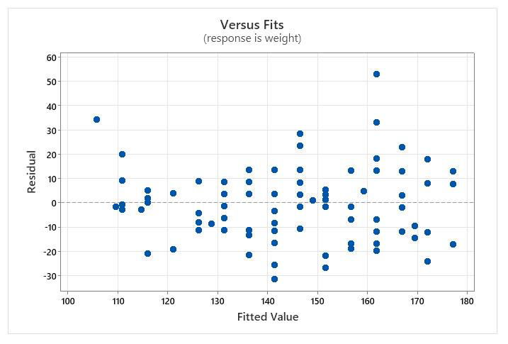
- Here, you are looking for evidence that points are scattered fairly evenly along the horizontal line. This means your “variance” (variability in the observed values compared to the predicted line) is spread equally along the line… analogous to the “equal variance” assumption in ANOVA.
- The distribution of points above and below the line isn’t perfect, but is fairly uniform if you don’t count the outlier point in the upper right corner.
- This distribution is close enough to pass the assumption test.
Normality of residuals:
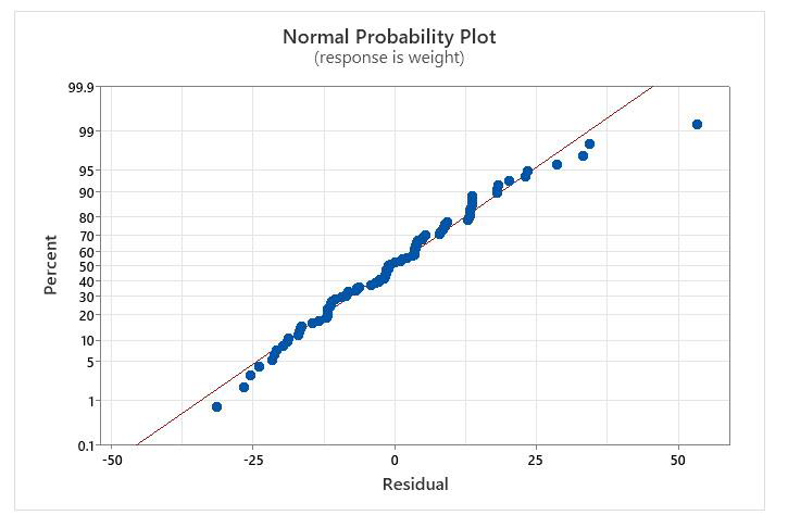
This graph is just like the other normality plots we look at to see if data are normal. The computer will automatically determine the residuals for you, and plot them on the normality plot.
Interpretation:
- The values are mostly on the line, again with one outlier, so conclude that they are normal
- [Just to be sure, I did a normality test on the data, and it confirm that they are normal (p>0.05).]
The output from the Regression analysis:
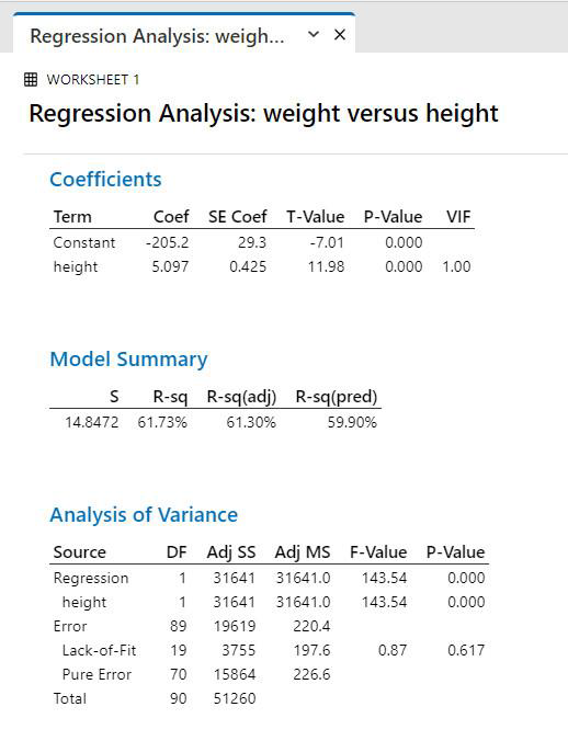
Regression Analysis Interpretation:
- Equation of the line. This is in the form of a straight line, y = mx + b
- The r2 value tells us the proportion of the variability in weight that can be “explained” (or is statistically related to) by height, so 62% of the weight variation is mathematically related to height. 38% is related to other, unmeasured factors.
- The p-value tests whether the slope of the line is significantly different from zero (if there is too much variability in the points, you can’t be sure that you have a relationship).
The assumptions were satisfied, so we can generally trust our result:
- There is a significant positive relationship between height and weight.
- The assumption testing tells us we have one outlier value (we could investigate that more closely if we wanted), and that there is a bit more variation at higher levels of ‘x’ (height) than at lower levels. Therefore, we know that our line does not predict as well for tall people as for short people.
- Although there is a significant relationship, there is still quite a bit of unexplained variation, so height is not the only factor that affects weight of the students.
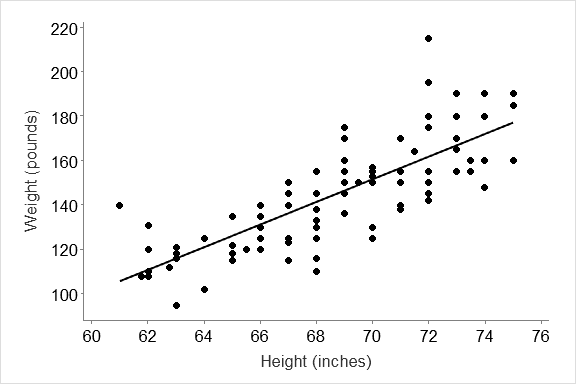
Figure 1. Relationship between height and weight for a group of university students taking part in an exercise on how running affects pulse rates.
|
How do you report results of your regression analysis? Your trend statement must give the pattern from your graph, then summarize the statistical results (remember to always plot your data before doing analysis, and include a figure legend). An example from the figure above might read: There was a strong positive relationship between height and weight for the university students taking part in the running exercise, so that as height increased, so did weight (Figure 1, Regression analysis, r2 = 0.617). About 62% of the variation in weight was statistically explained by the variation in height, but the calculated regression line had better predictive ability at lower levels of height than for higher levels of height (Figure 1). |
Pulses Dataset used for analyses in this manual.
A group of students were separated into 2 groups. One group ran on the spot for one minute, and the other group did not. Following the trial, information was gathered on whether they smoked, what their sex was, what their height and weight were, and what their normal activity levels were.
- Pulse1 = resting pulse for all.
- Pulse2 = pulse following the running. (Beats per minute)
- Weight is in pounds, Height is in inches
- ran = 1 means they ran,
- ran = 2 means they did not.
- smokes = 1 means they smoked.
- sex = 1 is male
- sex = 2 is female
- activlev is their normal activity level; 1 is slight, 2 is moderate, and 3 is high.
| pulse1 | pulse2 | ran | smokes | sex | height | weight | activ.level |
|
64 |
78 |
1 |
2 |
1 |
66 |
140 |
2 |
| 58 | 75 | 1 | 2 | 1 | 72 | 145 | 2 |
| 62 | 82 | 1 | 1 | 1 | 73.5 | 160 | 3 |
| 66 | 85 | 1 | 1 | 1 | 73 | 190 | 1 |
| 64 | 82 | 1 | 2 | 1 | 69 | 155 | 2 |
| 74 | 84 | 1 | 2 | 1 | 73 | 165 | 1 |
| 84 | 84 | 1 | 2 | 1 | 72 | 150 | 3 |
| 68 | 72 | 1 | 2 | 1 | 74 | 190 | 2 |
| 62 | 75 | 1 | 2 | 1 | 72 | 195 | 2 |
| 76 | 88 | 1 | 2 | 1 | 71 | 138 | 2 |
| 80 | 104 | 1 | 1 | 1 | 74 | 160 | 1 |
| 80 | 96 | 1 | 2 | 1 | 72 | 155 | 2 |
| 72 | 88 | 1 | 1 | 1 | 70 | 153 | 3 |
| 68 | 76 | 1 | 2 | 1 | 67 | 145 | 2 |
| 60 | 76 | 1 | 2 | 1 | 71 | 170 | 3 |
| 62 | 68 | 1 | 2 | 1 | 72 | 175 | 3 |
| 66 | 88 | 1 | 1 | 1 | 69 | 175 | 2 |
| 70 | 86 | 1 | 1 | 1 | 73 | 170 | 3 |
| 68 | 80 | 1 | 1 | 1 | 74 | 180 | 2 |
| 72 | 80 | 1 | 2 | 1 | 66 | 135 | 3 |
| 70 | 106 | 1 | 2 | 1 | 71 | 170 | 2 |
| 74 | 76 | 1 | 2 | 1 | 70 | 157 | 2 |
| 66 | 102 | 1 | 2 | 1 | 70 | 130 | 2 |
| 70 | 98 | 1 | 1 | 1 | 75 | 185 | 2 |
| 96 | 140 | 1 | 2 | 2 | 61 | 140 | 2 |
| 62 | 100 | 1 | 2 | 2 | 66 | 120 | 2 |
| 78 | 104 | 1 | 1 | 2 | 68 | 130 | 2 |
| 82 | 100 | 1 | 2 | 2 | 68 | 138 | 2 |
| 88 | 115 | 1 | 1 | 2 | 63 | 121 | 2 |
| 68 | 112 | 1 | 2 | 2 | 70 | 125 | 2 |
| 96 | 116 | 1 | 2 | 2 | 68 | 116 | 2 |
| 78 | 118 | 1 | 2 | 2 | 69 | 145 | 2 |
| 88 | 110 | 1 | 1 | 2 | 69 | 150 | 2 |
| 62 | 98 | 1 | 1 | 2 | 62.75 | 112 | 2 |
| 80 | 128 | 1 | 2 | 2 | 68 | 125 | 2 |
| 62 | 62 | 2 | 2 | 1 | 74 | 190 | 1 |
| 60 | 62 | 2 | 2 | 1 | 71 | 155 | 2 |
| 72 | 70 | 2 | 1 | 1 | 69 | 170 | 2 |
| 62 | 66 | 2 | 2 | 1 | 70 | 155 | 2 |
| 76 | 76 | 2 | 2 | 1 | 72 | 215 | 2 |
| pulse1 | pulse2 | ran | smokes | sex | height | weight | activ.level |
| 68 | 68 | 2 | 1 | 1 | 67 | 150 | 2 |
| 54 | 56 | 2 | 1 | 1 | 69 | 145 | 2 |
| 74 | 70 | 2 | 2 | 1 | 73 | 155 | 3 |
| 74 | 70 | 2 | 2 | 1 | 73 | 155 | 2 |
| 68 | 68 | 2 | 2 | 1 | 71 | 150 | 3 |
| 72 | 73 | 2 | 1 | 1 | 68 | 155 | 3 |
| 68 | 64 | 2 | 2 | 1 | 69.5 | 150 | 3 |
| 82 | 83 | 2 | 1 | 1 | 73 | 180 | 2 |
| 64 | 62 | 2 | 2 | 1 | 75 | 160 | 3 |
| 58 | 58 | 2 | 2 | 1 | 66 | 135 | 3 |
| 54 | 50 | 2 | 2 | 1 | 69 | 160 | 2 |
| 70 | 71 | 2 | 1 | 1 | 66 | 130 | 2 |
| 62 | 61 | 2 | 1 | 1 | 73 | 155 | 2 |
| 76 | 76 | 2 | 2 | 1 | 74 | 148 | 3 |
| 88 | 84 | 2 | 2 | 1 | 73.5 | 155 | 2 |
| 70 | 70 | 2 | 2 | 1 | 70 | 150 | 2 |
| 90 | 89 | 2 | 1 | 1 | 67 | 140 | 2 |
| 78 | 76 | 2 | 2 | 1 | 72 | 180 | 3 |
| 70 | 71 | 2 | 1 | 1 | 75 | 190 | 2 |
| 90 | 90 | 2 | 2 | 1 | 68 | 145 | 1 |
| 92 | 94 | 2 | 1 | 1 | 69 | 150 | 2 |
| 60 | 63 | 2 | 1 | 1 | 71.5 | 164 | 2 |
| 72 | 70 | 2 | 2 | 1 | 71 | 140 | 2 |
| 68 | 68 | 2 | 2 | 1 | 72 | 142 | 3 |
| 84 | 84 | 2 | 2 | 1 | 69 | 136 | 2 |
| 74 | 76 | 2 | 2 | 1 | 67 | 123 | 2 |
| 68 | 66 | 2 | 2 | 1 | 68 | 155 | 2 |
| 84 | 84 | 2 | 2 | 2 | 66 | 130 | 2 |
| 61 | 70 | 2 | 2 | 2 | 65.5 | 120 | 2 |
| 64 | 60 | 2 | 2 | 2 | 66 | 130 | 3 |
| 94 | 92 | 2 | 1 | 2 | 62 | 131 | 2 |
| 60 | 66 | 2 | 2 | 2 | 62 | 120 | 2 |
| 72 | 70 | 2 | 2 | 2 | 63 | 118 | 2 |
| 58 | 56 | 2 | 2 | 2 | 67 | 125 | 2 |
| 88 | 74 | 2 | 1 | 2 | 65 | 135 | 2 |
| 66 | 72 | 2 | 2 | 2 | 66 | 125 | 2 |
| 84 | 80 | 2 | 2 | 2 | 65 | 118 | 1 |
| 62 | 66 | 2 | 2 | 2 | 65 | 122 | 3 |
| 66 | 76 | 2 | 2 | 2 | 65 | 115 | 2 |
| 80 | 74 | 2 | 2 | 2 | 64 | 102 | 2 |
| 78 | 78 | 2 | 2 | 2 | 67 | 115 | 2 |
| 68 | 68 | 2 | 2 | 2 | 69 | 150 | 2 |
| 72 | 68 | 2 | 2 | 2 | 68 | 110 | 2 |
| 82 | 80 | 2 | 2 | 2 | 63 | 116 | 1 |
| 76 | 76 | 2 | 1 | 2 | 62 | 108 | 3 |
| 87 | 84 | 2 | 2 | 2 | 63 | 95 | 3 |
| 90 | 92 | 2 | 1 | 2 | 64 | 125 | 1 |
| 78 | 80 | 2 | 2 | 2 | 68 | 133 | 1 |
| 68 | 68 | 2 | 2 | 2 | 62 | 110 | 2 |
| 86 | 84 | 2 | 2 | 2 | 67 | 150 | 3 |
| 76 | 76 | 2 | 2 | 2 | 61.75 | 108 | 2 |

