Main Body
Part 3: Graphing Basics
Part 3: Graphing Basics (Using Microsoft Excel 2010 and Minitab 21)
General graphing basics
Scatterplots
One of the most common types of graphs is a “line graph” or “x-y graph” where you just plot one set of numbers against another. We’ll start with that to get you started in graphing with Excel and Minitab.
The first part of this section will run through graphing basics in both programs, including how to set up the data and how to customize the graph to make it suitable for scientific data reporting. Then we’ll go through each graph type individually to see how to set them up.
Scatter plots in Microsoft Excel 2010
e.g. graph height vs weight of our student participants in the pulses dataset.
Setup: x-axis: “independent” variable (the one that is set by the researcher, or which doesn’t change) y-axis: “dependent” variable (response variable, expected to change based on ‘x’)
- In this example, height is fixed, so it is the independent variable, and weight is the dependent variable.
Excel 2010
To plot in Excel, data to be plotted must be in adjoining columns.
Set Up
- Highlight the data you want to plot
- Click on the “Insert” tab on the upper property bar, then choose scatter plot.
For this example, choose the option with no connecting lines. Excel will generate an automatic graph that is far from the sort of graph you need to show your patterns.
The problems that you must fix are:
- No axis titles
- A meaningless title
- Gridlines, and no idea of units
- The points are crowed at one end of the graph
Customizing the graph:
Either double click on the part to change, or use the Chart tools:
1. Range of axis numbers
To fix the crowding at the right side of the graph:
- Click on your graph to make the Chart Tools tabs appear at the top of your page, and click Layout
- Click on “axes” to get into the axis menu on the Chart Tools Layout tab. In this case, we want to alter the x-axis, so click on the “primary horizontal axis”, then click on “more primary horizontal axis options”
This will open the “Format Axis” window, which will allow you to set your axis options.
- Change the checkmarks from “Auto” to “Fixed” in the axis options, then type in the values you want.
For example, you may want to set your minimum value at 55 rather than zero, and then your major units should go up by 5 rather than 20.
You should see a definite improvement immediately, but there are still many things that need to be done to make this an effective graph.
2. Turn off gridlines
- Return to the Chart tools layout tab, and click on “gridlines”
- Pick the primary horizontal gridlines, then choose “None”.
3. Remove titles or other objects
Some objects don’t add to the graph information (such as “Series” in the graph above, or any title that might appear at the top of the graph)
- Simply highlight it and press delete
4. Adding axis titles
- Add the axis titles by going into the “Axis Titles” menu, and choosing the axis, then saying where you would like the title to appear.
- This will place an axis “place holder” on your graph, and you can simply type what you want (remember to add units).
- If you need to change the font size, right click on the title and choose “font” from the menu
Now you have a passable graph, which would be the bare minimum that would be acceptable in your scientific report. Remember to include the units in your axis labels, and if you have error bars on the points, be sure to include that in your axis label as well.
However, the graph can still be improved. Some suggestions include removing the outer box, changing the point symbols to something that look nicer, and perhaps spreading the points out a bit more to make them look better.
5. Removing outer box
- Right click on the outer part of your chart to get the chart menu window:
- Click on “format Chart Area to get the Format Chart Area window
- Pick the tab for “border color” and choose “no line”
6. Changing the point symbols
- Click on the points on the graph to highlight them, then right-click to open the data series menu.
- Choose “format data series”
- In the Format Data Series window, choose the tab for “Marker Options”
- Check the box beside “Built-in” then choose the shape and size from the drop-down menus. I recommend simple dots and a point size of about 2 (if you have different data sets on the graph, you can choose dots and squares, for example).
- To change the colour of the points, choose “Marker Fill” and “Marker Line Color” and choose the colour you want (usually black, unless you have different data sets shown with different colours).
Note: the points in Excel are made up of two colours; one for an outline (“marker line color”) and the actual point (“marker fill). You will have to change the colour for both of these to get your points to be the new colour.
Our new graph is now ready to use and just needs a Figure legend (see the section on making table and figure legends in the Part 3, Tables on p. 10). You should be able to copy the graph in Excel, and then just paste it into your word processing program.
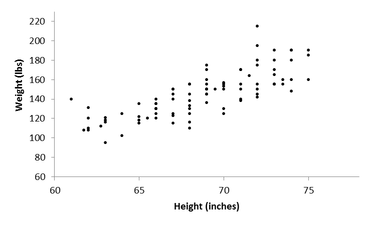
Figure 1. Relationship between height and weight in a group of university students taking part in a running study.
7. Trendline
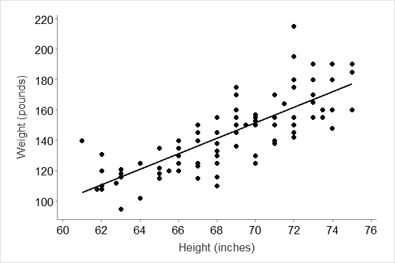
- Finally, if you would like to add in the “trend line” (the regression line showing the best relationship between the two variables, just click on “Trendline” in the Chart tools layout menu.
Specialized customization of line graphs:
Plotting two datasets on the same graph
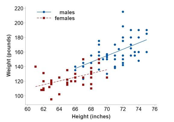
Example: Can we plot height against weight for our student participants, but separate out the male and female students and see them as separately coloured dots?
To do this in excel, we need to go back to our dataset, and do some sorting and moving of data.
The data must be set up so that what you want to plot separately are actually in separate columns… i.e. you will have one column for the independent (x- axis) variable, and then a column for each of your dependent variable groups (in this case, for the males and the females), and that they are sorted from smallest to largest in each column.
-
- Step 1: copy and paste the columns with sex, height, and weight into another part of your spreadsheet.
- Step 2: sort the data by your independent variable (in this example, height) followed by the dependent variable (in this example, weight).
- Step 3: type in labels at the top of the column for your categories (in this example, males and females) and move the data for the males or females so you have the data for one sex in one column, and the other sex into the next column
- Highlight the three columns of data (height, females, males) along with their text headings at the top (the text headings will let you provide a key to what the symbols in your graph represent)
- Click on “Insert” from the upper property bar, and choose scatterplot with no connecting lines (as you did for the example on p. 16.
As with the example starting on p. 16, you will see a graph that has all the points crowded over to the right, and many problems in formatting. Follow the instructions on pp. 16-20 to customize your graph.
Go through the steps to customize your graph, to get a professional graph that looks like the one below.
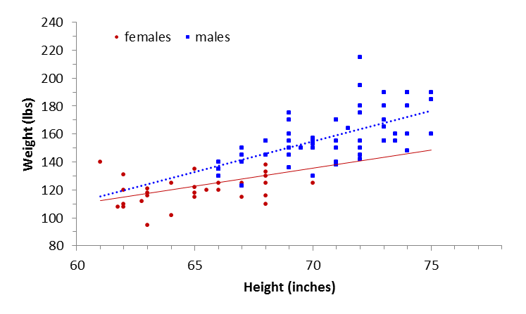
Note: it is a lot of work to get a nice graph in Excel, but it is possible. You’ll likely find Minitab to be much easier.
Graphs with two Y-axes, and 2 sets of data
It is fairly easy to plot multiple graphs on one page, but not so easy to plot data so that they have two different y-axes. We’ll use a sample set of data from Bio 326 to illustrate this.
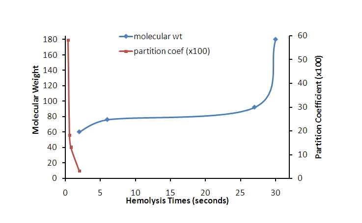
Consider a set of data like the one below. You would like them plotted on the a single graph with a single x-axis. You could plot them as in the example on page 22, but the y-axis ranges are so different you would like to be able to set up two y-axes, with different scales on them.
| X Axis Hemolysis Time | Y1 Molecular Weight | X Axis Hemolysis Time | Y2 Partition Coefficient |
| 2 | 60 | 2 | 3 |
| 6 | 76 | 0.8 | 13 |
| 27 | 92 | 0.4 | 58 |
| 30 | 180 | 0.6 | 18 |
Step 1. Highlight your data, and click on the Insert tab, then scatterplot.
You can add in lines later, so it doesn’t matter now if pick the scatterplot with no lines, scatterplot with a smoothed line, or scatterplot with straight lines, but usually you want the scatterplot with smoothed lines, so that is a good one to start with.
The graph you get won’t be quite what you want yet; be prepared for a bit of customizing.
Step 2: Click on your chart to highlight it. Then look for the “Format” tab in the top property bar.
Step 3. Click on the arrow beside “chart area” in the upper left corner, then choose the series from the drop down menu that you want to put on the second y-axis. In this case it is the “partition coefficient”.
Then click on “Format selection” to get the window to format the data series.
Under the series options, check the box for “secondary axis” and press ‘close’ Notice now how the line at the far left is now using the right hand y-axis, and is easier to read than when it was crushed down into the lower left hand corner.
You’ll now have a chart that shows both axes, and the data will be better spread out on the x-axis. This doesn’t help you to spread things out over the x-axis, but it does help with the y.
- Note that it may be possible to put a “break” in the x-axis if there is a large range between the sets of data, but with these, there is overlap, so that may not work.
Step 4. you’re going to want to add axis labels, get rid of grid lines and the like. Follow the instructions on p. 16-20 to customize your graph.
After going through that, you should have a graph that looks like the one below, or at least customized to the point that you like it. Don’t forget a complete and descriptive figure legend, since at this stage, it isn’t possible to know what you are recording the molecular weights or partition coefficients for.
Minitab version 21
Minitab Graph basics: Data set-up
Depending on the type of graph being made, data may need to be in adjoining columns, a single column, or a single column with a grouping variable in another column.
Method
- For the simple scatterplot, data for x and y axes must be in adjoining columns.
- Click on “graph” on the upper property bar, and select “scatterplot” from the drop-down menu. Notice that a large number of graph types are shown in the list; we’ll cover some of the other types in a later section.
- In the Scatterplot session window, select the “simple” scatterplot from the list of scatterplot types.
- Click OK
Choose the data to be plotted. In Minitab, you have to do this using the graph session window:
- Step 1: place your cursor in the cell just below “Y variables”, then choose your y-axis variable by highlighting it in the list at the left. Once it is highlighted, click on “Select”
- Step 2: place your cursor in the cell just below “X variables”, then choose your x-axis variable by highlighting it in the list at the left. Once it is highlighted, click on “Select”
Remember that the independent variable should be on the x-axis, and the dependent
variable should be on the y-axis. Choose your variables and place them in the appropriate boxes (In this case, we’re trying to predict weight from a person’s height, so we’ll put height as our x-axis and weight as our y-axis)
Your starting graph will look like this:
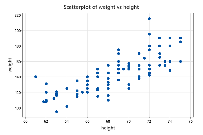
This graph starts out in much better shape than the Excel graph did, but we still need to do some things to make it look more professional to include in reports.
The things that are “wrong” with this graph (and must be fixed) are:
- Missing units for the axis labels
- Font size for axis labels and numbers should be larger
- The outer box around the graph should be removed, and the inner box should have the top and right line removed
- The title should be removed
- The shading outside of the graph area should be removed.
Note: Most manipulations of Minitab graphs can be done by clicking on the part to be changed
Basic Customization of the Minitab graph:
Adding units and changing fonts of the axis titles:
- Double click on an axis label to get this window:
- Change the font size and add in units to the text window. In this case height is given in inches.
- Change the weight as well, to give weight in pounds
- Capitalize the axis titles.
Changing font size of the axis numbers to make them easier to read:
- Double click on the numbers of the y axis to get the y- axis “edit scale” window
- Click on the “Font” tab to change the font size
- Repeat for the x-axis
Removing the right and upper axis lines:
- Click on the “Show” tab of this edit scale window. Remove the checkmark for the “high” box in the axis line. Repeat for the other axis.
Remove title from top of graph (Note: do not include a graph title if you have a figure legend)
- Highlight the title, and delete
Remove the outer box and shading around the graph:
- Double-click anywhere below the x axis to open the “edit graph and figure regions” window.
- Click on the tab for “Figure Attributes”
- For “Fill Pattern”, check “Custom”, then choose “N” for none in the “Type” box
- For borders and fill lines, check “Custom” then chose “none” in the “Type” box
- Click on the tab for “Graph attributes
- Under borders and fill lines, check “custom, and choose “None”.
Change colour and shape of points being graphed
- Double click on your points to enter the “Edit Symbols” menu.
- Click on the small arrow beside “Automatic” to see the colour chart, and choose your colour.
Now you have a professional quality graph that you can add a figure legend to and submit to your instructor.
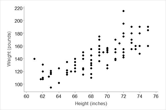
To add the trendline to your graph:
- You need to specify that you would like the trendline from the start of the graphing process in Minitab, so choose Graph from the property bar, and select Scatterplot, but this time, choose the option with the regression line.
Work through the steps of selecting your data, and customizing the graph as shown in the previous pages to create a graph that looks like the one below:
Specialized customizations of the line graph
Plotting grouped data (e.g. data where you can separate out groups, such as males and females)
- Choose “graph” from the property bar, then choose scatter plot from the drop down menu
- Now choose the “with groups” option. If you choose the “with Regression and Groups”, it will also plot the trend lines for both groups for you.
In this example, we will plot the height and weight data, separated out by the sex of the participants.
This time, our dialogue to select the data also allows you to specify grouping variables. You don’t need to manipulate the data as you did in
Excel, but just need to specify what your groups will be:
- Select your dependent and independent variables, as you did for a simple graph (by placing your cursor in the cell for the y or x variable), then highlighting the variable from the variable list, and clicking on select.
- Now place your cursor in the “Categorical variables” box, and then highlight your grouping variable (in this case, sex), and click on select.
- Click OK
Customizing hints (details of these operations can be found in the previous section):
- Remove title by highlighting and deleting
- Double click on each axis label to change the font, add units, and capitalize the label
- Double click on the area below the x axis of the graph to change the graph and figure attributes so there is no outer box, upper and right hand axis line, or shading, or gridlines
- Double click on the axis numbers if you want to increase their font size
Key:
- Click on the Key and drag it to another place on the graph if you wish to
- Double click on the numbers (1 and 2) for the key for sex, and type out the entire name for “male” and “female” to make it easier for the reader to follow
- Double click the full legend to change the font of the words in the key (you may need to resize the text box with the key to make everything fit.
Your final graph should look like the one below:
Graphs with 2 different y-axes
This example is from Bio 3260, General Physiology, where the x-axis is hemolysis time, and the y-axes are molecular weight and partition coefficients (x100)
- Set up data so that the ‘x’ data are in one column, and the ‘y’ data for each dataset are in different columns
- Click on “graph” in the upper property bar, then choose “scatterplot” from the drop down menu (as shown on p. 26).
- When you see the Scatterplots session window, choose “with connect and groups” for your graph type. (Either double click on it, or click OK)
Next, Minitab needs you to choose your variables from the session window:
- As before, select your variables by placing your cursor where you want the variable to appear, then highlighting it from the left hand list, and clicking Select. Hemolysis time is the x-axis variable for both, and the other two are the y-axis variables.
- Now click on “Multiple Graphs”. In the new window, make sure the “overlaid on the same graph” box is checked.
- Click OK, to get the first draft of your graph (which will need to be customized, as in the previous section).
Customizing the graph:
- Follow the instructions on the previous pages to remove the outer boxes and shading, alter the font of axis labels and numbers, and modify the axis labels.
- Setting up the second (right hand) y-axis
- First double click on the y-axis numbers on the left side of the graph to get the “edit scale” dialogue box
- Click on the tab for “secondary” in the top row of tabs
- Choose which axis you’d like to have on the left (primary) and right (secondary). Click on the arrows to the right of the scale boxes to make your choice.
- Customize the graph to produce the range of axis numbers and other attributes that you want, to achieve a graph looking something like the one at right.
Bar charts to show differences among groups
Spreadsheet packages vs graphing/stats packages for graphing data:
A big difference between professional graphing packages and spreadsheets is that spreadsheets won’t do graphs that require analysis before plotting them (in other words, if you want to plot the average values for a column, you have to do the averaging first in Excel then the plot average values, whereas a graphing package will do the averaging and plotting in one step). You may find it easier to work with graphing/stats packages for most of your graphing than try to struggle with the spreadsheets.
Types of Bar Charts:
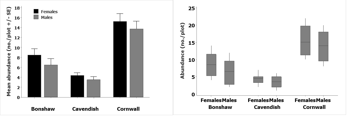
Bar charts (with or without error bars) Box and Whisker plots
- Note: Frequency Histograms are a different type of bar chart which will be covered in the next section.
Purpose of a bar chart or Box & Whisker plot
- These plots allow us compare average (mean or median) values for groups of data, and if error bars are included on the plots, we can also gain important information about the overall spread of the data.
Plain bar chart and bar chart with error bars in Excel 2010
Method:
Enter data (or open data set) for manipulation. set this up so that the groups you wish to compare are in different rows.
Use the arithmetic functions in Excel to calculate the mean and standard deviations (or Standard Error, or 95% confidence Limit, whichever error bars you are using).
If you need the standard error, calculate it using the equation:
- SE = SD/√n
Then set up two columns of data as shown for your means and standard deviations (or other error values).
Simple bar graph
- Highlight the data you would like to plot, including your column with the text labels.
- (For this example, do not highlight the SD column, since we do not what the the error bars to plot as separate bars)
- Click on the “Insert” tab on the upper property bar, then choose “column” in the graph menu (Note: Excel calls the simple bar chart a column graph).
- Choose the simple 2-D column
Note: Never use 3-D graphs unless you have data with 3 variables, where you plot 3 axes on your graph.
You’ll see the simple bar graph, allowing you to compare the numbers of chipmunks found in the three sites.
- We will return to how to customize the graph to make it more professional looking when we’ve learned how to add error bars to the graph.
(What needs to be done? Add axis labels and units, remove unnecessary headings, remove grid lines, choose a better colour for the bars…)
- Important: do not use the basic error bar function in Excel to add error bars to your graph! The basic error bar function just plots exactly the same value for an error bar on each graph. Follow the instructions below to get errors that have different values plotted.
Bar graph with error bars:
- Highlight the mean values and plot the bars using Insert, Column, and 2-D column, as in the example on p. 36
- Click on the graph to open the “Chart Tools” tab on the property bar and Click on the “Layout” tab
- Select “Error Bars”, then select “More Error Bar Options”
- In the “Format Error Bars” window, decide if you want to have error bars that just go above your bar, or if you want them to go in both directions.
- Click “Custom” , and then “specify value”.
- In the “Custom Error Bars” dialogue, click on the small red arrow at the right. That lets you go back to your spreadsheet to highlight the data values you want. Highlight the three values in the Std.Dev. column and click on the red arrow again, and click OK (Note: if you need Standard Error, Calculate it from the equation on p. 36, and make an SE column). Now click “Close”
In other words:
- Click arrow for Positive Error Value, return to spreadsheet and highlight values
- Click arrow in smaller window to return to larger window
- Click OK
Cleaning up the graph
What needs to be done?
- Remove gridlines
- Remove extraneous headings and text (e.g. “Mean” title and Mean)
- Add Y-axis label with information on Std. Dev. and units (does it need a further x-axis label?)
- Remove outer box on graph
- Make the bars look more professional (change to colour black, change spacing between the bars)
To start, double click on the graph to open the Chart Tools menu. Click on the Layout tab:
- Remove horizontal gridlines: click on Gridlines on the Chart Tools layout, select Primary Horizontal Gridlines, and choose “NONE”.
- Add axis title to y-axis:
- Choose Axis titles from the Layout tab, then add axis labels
- Change font size if necessary from the font menu under the “Home” tab.
- Remember to include what the error bar is in the y- axis label.
- Remove extra objects (such as “Mean” and “Mean” and “axis title” by clicking and deleting
Your Graph so far:
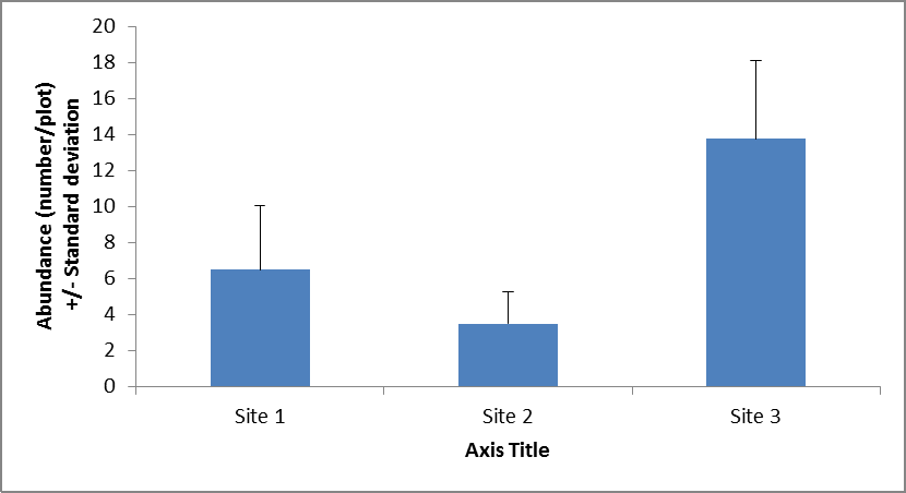
- Still need to remove outer box and tidy up the bars.
Think about other things that would improve the understanding of your graph, for example, It would also be good to identify what the sites are to help out your reader.
4. Remove border:
- Right click on the outside border of the graph, and click on “Format Chart Area”, as shown on p. 19.
- Change the “Border Colour” to “no line” from “automatic”.
5. Change x-axis labels:
- Simply go back to your original table that you’ve plotted the data from, and change the names of the x- categories. The graph will automatically update with the new names.
6. Format bars
- Bar colour: Choose the bar colour from the Design tab under Chart Tools, or right-click on any bar, and click on “Format Data Series”, and click on Fill to change the fill colour and Border colour to put a border on the bars. Avoid using colours on your bars unless you have multiple groups.
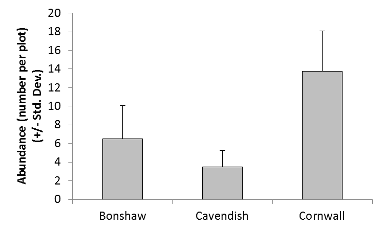
Here is the graph now, nearly done…
What still needs to be done? The spacing between the bars looks a bit odd – these can be moved a bit closer together.
Bar Spacing: Bars representing separate groups should be separated from each other
- These should only touch when they represent a graded series of numbers (such as we find in a frequency histogram). But you also don’t want them too far apart.
To set up how close bars are to each other, right-click on one of the bars, and choose “format Data Series” from the menu, then Series Options
Series overlap refers to cases where you have groups of data (e.g. if you were looking at male and female chipmunks in each of your three sites, you might want to group the males and females a bit closer together than the sites). A good value for this (if you have groups within your groups) is -20%
Gap width lets you change the distance between each series (i.e. each site). A good value here is usually 50% of the actual bar width for a single series and 70% to separate out groups.
Your final graph is a professional looking product that you can submit with your assignment.
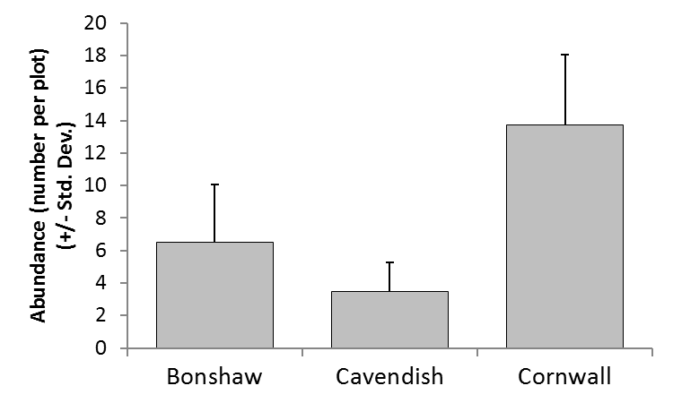
Bar graphs with groups
For this example, lets look again at our chipmunk example, but assume that we have data for both males and females. Again, in Excel you would need to calculate the means & errors to plot.
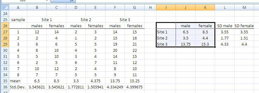
Construct your bar graph as in the previous example, but using the grouped data.
Highlight the values (and their group labels) to make a group graph.
- Choose Insert on the property bar, then “Column” from the graph menu.
- Choose the simple 2-D graph
Your graph will show your data grouped by your grouping variable (in this example, it is the sex of the chipmunks, with the key labels at right specified by your column titles in your dataset)
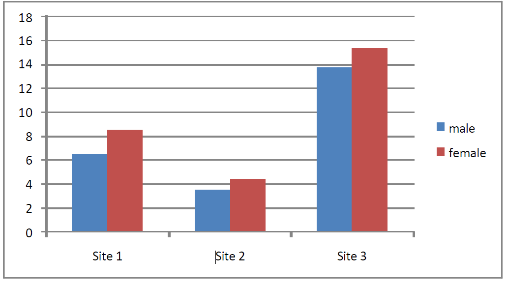
Add the error bars using the same method as for the ungrouped data, by clicking on the graph to open the Chart Tools menu, choosing the Layout tab, and clicking on Error bars. Ignore the standard choices as before, and click on More Error Bar Options.
- Now pick the plus direction, and choose the values by clicking Custom, and navigating back to the dataset to choose the values you want plotted
- Do this for each series by right-clicking on bars for each series in turn (i.e. for males, then females.
Customize your graph as before to obtain a professional quality graph. The base graph to this point is shown below:
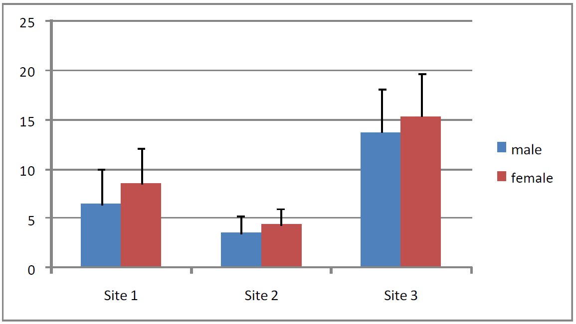
You still need to:
- Turn off gridlines
- Add y-axis label (including what the error bars refer to)
- Identify the sites
- Adjust font size as necessary
- Adjust range of y-axis numbers
- Choose colours that are more professional looking
After customizing your graph, it should like this one:
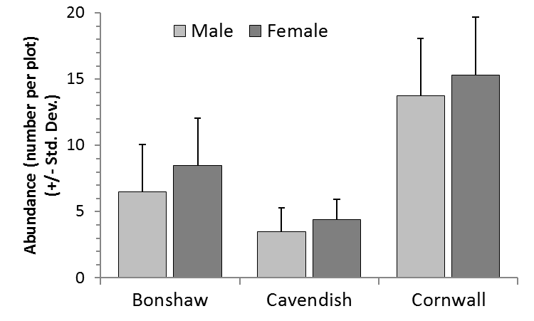
Figure 1. Chipmunk abundance (mean numbers per 1000 m2 experimental plot) from three locations on Prince Edward Island, June 15, 2001.
Plain bar chart and bar chart with error bars in Minitab 16
Getting started: Reminder of how to do data entry in Minitab
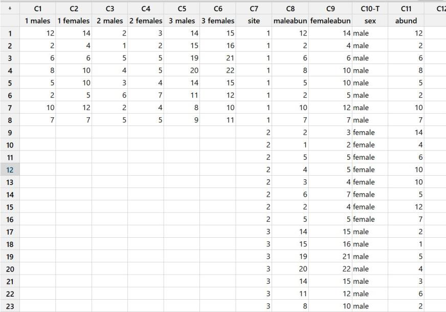
The different formats of data entry (different ones are needed for different types of analysis)
- Data in adjoining columns (see columns C1-C6 above)
- Data in one column (C11), grouping variables in other columns (C7 and C10)
- Combination: two groups of data in adjoining columns (male data vs female data) but site in one column
For most analyses in Minitab, we set it up as in scenario #2, with data in one column, and grouping variables in other columns.
Method: for All Graphs in minitab:
- Select “Graph” from the property bar, then select your graph type from the drop-down menu.
- For a simple Bar graph with no error bars, choose “Bar chart” (For a Bar graph with error bars, you will need to choose “Interval Plot” – we’ll return to these when we’ve covered the simple bar chart.)
Example 1: Simple bar graph, male data only: This is an example of when you only want to use part of your dataset. … there are two ways to do this:
- Leave data in one format, and let Minitab split the data for you
- Physically split your dataset so the part you want is in one column (e.g. males)
Let Minitab split the dataset for you:
- Select “Data” from the upper property bar
- Select “Split worksheet” from the drop-down menu
- Select the variable by which you’d like to split the worksheet (in this case, we want the males, so we’ll split it by ‘sex’).
This will split your worksheet into 2, one for the males and one for the females. This is the preferred way to handle your data, since you don’t have to be doing as much copying and pasting.
If you choose this option, follow the instructions below, but use the Male worksheet, and choose column C11, abundance
Alternatively, you can manually organize data so that the male abundance data are separated from the female data (i.e. you would set up and use column C8 in the example above).
Once you have the data ready to graph:
1. Enter the Bar Chart dialogue by selecting Graph from the property bar, then Bar Chart.
- Choose “a function of a variable” from the drop down menu
- Choose “simple” for the bars.
- Click OK
2. Select your variables
(note: if the variable box on the left is blank, click your mouse in the “graph variables” white box.
- Make sure that “Mean” is selected in the Function box
- Select the column of data you want to plot
(It would be the male abundance column if you manually split the data, or the abundance column if you let Minitab split the data for you)
- Click “select”
- Select the grouping variable (in this case, we are plotting by site, so select “site”)
- Click OK
3. Begin customizing
- Remove title
- Increase font size for axis labels, and give y-axis a better title
- Make the bars look more professional
- Remove shading and boxes
Most changes in Minitab are made by double clicking on the part of the graph you want to fix
- Remove title by clicking on it, and deleting
- Fix axis labels:
- Y-axis: double click on axis label to enter the “Edit Axis Label” dialogue, and click on the Font tab
- Change font as desired
- Type in new text for label
- Check box for “apply same font”
- X-axis: double click on label as above
- Double click on the left hand Y-axis to enter the “Edit Scale” dialogue for that axis
- To change font, click on Font tab
- To change the range of numbers, click on the scale tab
- To remove extra (right hand) y-axis line, click on “show” tab, and uncheck the box under “high”
- Double click on the x-axis to enter the scale dialogue for the x-axis
- To remove upper x-axis line, click on “show” tab, and uncheck the box labelled “high”
3. Make the bars look more professional:
- To change the colour of the bars, double click on any bar and change borders or fill from the “attributes” tab.
- To change spacing between the bars, double click on the x-axis to enter the Edit Scale dialogue
- Select the “Scale” tab
- Uncheck the box beside “Gap between clusters” and type in a different value. (0.5 means that the space between bars will be 50% of the width of the bar)
4. Remove shading and outer boxes
- Double click anywhere under the x axis
- Set the Graph attributes and Figure attributes to “custom” and then set the type so that borders and fill lines are set to “None” and fill patterns are set to ‘N’
- Click OK
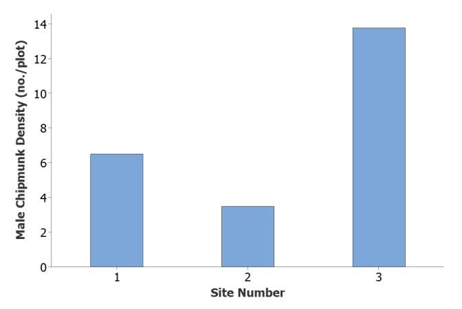
Your graph is now ready to submit:
One final thing you could do to customize this graph is if you know the names of your sites, you could type the actual names in, rather than just leave it as numbers you’ll have to explain:
To change your x-axis labels:
- Double click on your x-axis to open “Edit scale dialogue”
- Click on “Labels” tab
- Check the box beside “Specified”
- Type in the values you want (e.g. Bonshaw Cavendish Cornwall)
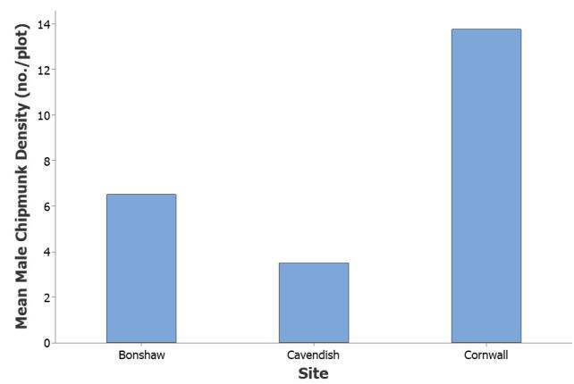
Figure 1. A comparison of average male chipmunk abundance from three locations on PEI, Summer 2011.
Example 2: Simple bar graph, both males and females on the same graph
See previous pages for setting up the data to graph
- Select Graph from the property bar, and choose Bar graph from the drop-down menu
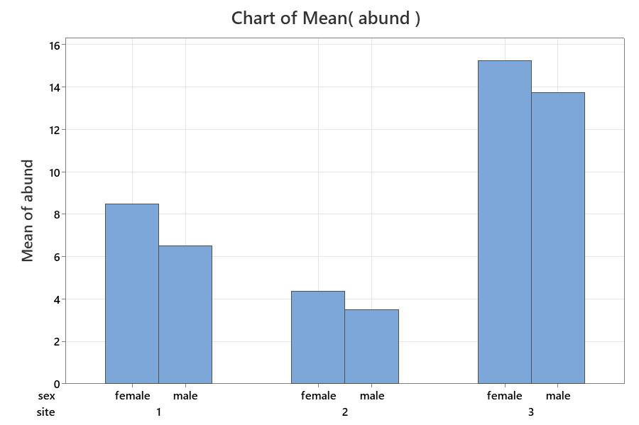
- In the Bar Chart dialogue, Select the “A function of a variable” option from the drop down menu, then choose “Cluster” for your graph type. – click OK
- In the Bar Chart function dialogue, make sure the Mean function is selected, then choose your variables:
- Your graph variable should be the one with the data numbers in it; for this example, it is abund
- Your grouping variables will be the ones you want to see for your groups:
- The first one should be the major grouping (in this case, site)
- The second one will be the sub-grouping (in this case, we want to see sex grouped within the site groups, so choose sex
4. Customize your graph:
- Remove title
- Remove outer box & shading
- Type in appropriate Y-axis and x-axis labels
- Make sure axis fonts are large enough
- Make sure bars in sub-groupings are not touching
Example 3: ungrouped bar graph with error bars (see p. 45 for how to set up data) Note: to plot the error bars with bar graphs in Minitab, you must choose “interval plot” rather than Bar Graph.
Note: Minitab will plot bars with the 95% confidence limits or with the Standard error of the mean (not with the standard deviation). Therefore, if you must plot the standard deviation, you should use another graphing program, such as Excel.
Error bars on a graph give information about how variable the data are, so we can assess whether our averages are really different from each other.
1. Standard Deviation (SD or s):
This tells us how much variation there is in a single dataset. If data are normally distributed, 66% of the data points should fall within one standard deviation of the mean.
2. Standard Error of the Mean:
This tells us how reliable we think the mean is, based on the variation in the data set (SD) and the sample size in our data (n).
SE = SD/√n: This value indicates that the mean has a 66% chance of falling within the bounds of the SE
3. 95% confidence limit:
- This is related to standard error (SE) in that it assesses how reliable or accurate the mean is, but indicates that the mean has a 95% chance of falling in the bounds shown.
Method:
- Set up data so that columns to compare are in adjoining columns (see p. 45 for example).
- Select Graph from the upper property bar, and choose Interval plot from the drop down menu
- 3In the Interval Plots dialogue, choose multiple Ys, simple (since you have multiple data sets & no groups)
- Select your data: Select the columns with the data you want to compare (you can highlight them all in one step by holding the [control] key dowN as you click on the variables)
- Click on the [Data View] button
- In the Interval Plot – Data View dialogue, check the boxes beside “interval bar” and “bar”
- Click OK to return to the previous dialogue, and click OK again.
This gives you your base graph, ready to customize:
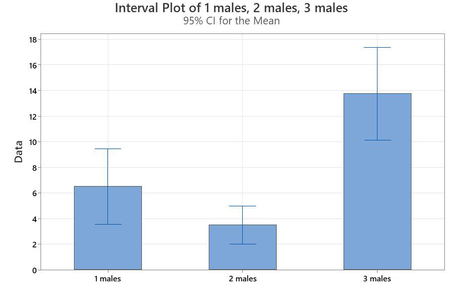
- Remove title: click on title and delete
- Remove shading and outer box: double click on shaded area, and set all the figure attributes and graph attributes to Custom, then set the fill and border options to None or [ N
- Type in an appropriate Y-axis label: double click on the label (Data), to enter the Edit Axis Label dialogue for that axis, and make the changes. Repeat for X-axis
- Increase Y-axis font size: Double click on Y-axis and change the font size using the Font tab
- X-axis Labels: Double click on the labels to enter the edit scale dialogue; click on labels tab to change the label (as shown at right), and click on the font tab to change the font size.
- Specifying the error bars: Minitab provides the 95% confidence limit by default, so you need to change this to the Standard Error.
- Double click on any error bar
To change the colour:
- In the attributes tab, click custom, then click on the arrow beside the Colour box. Choose Black
To change the type of error bar and its direction:
- In the Options tab, Check the box beside Standard Error, and choose upper one-sided from the drop down menu.
- Click OK
4. Groups with Error Bars
- Select Graph from the property bar, then choose Interval Plot
- Important: you must select “Interval Plot” to get the error bars
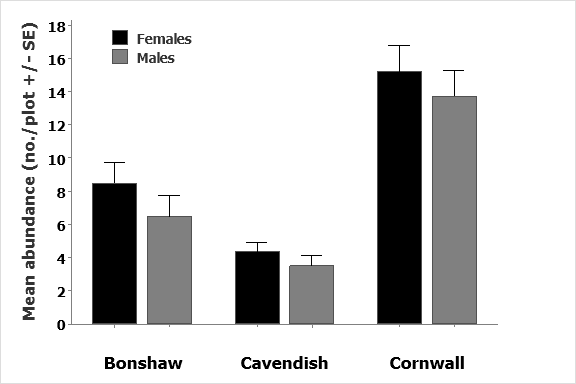
Fig. 1. Comparison of average abundances for male and female chipmunks in three locations in PEI, Summer, 2011
2. Choose Multiple Ys with groups and select variables as shown.
- Graph variable should be the columnwith all the data numbers in it
- Categorical variables should be thegroups: the first one is the main group, and the second is the subgroup.
3. Click on Data View and check the boxes beside Interval plot and bars.
- Uncheck any other boxes.
- Click OK to get the base graph for customizing.
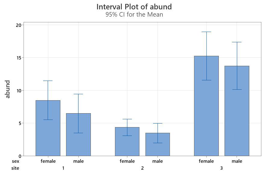
- Remove title: click and delete
- Remove shading and outer box: double click on shaded area, and set all the figure attributes and graph attributes to Custom, then set the fill and border options to None or [ N ]
- Type in an appropriate Y-axis label: double click on the label (Data), to enter the Edit Axis Label dialogue for that axis, and make the changes. Repeat for X-axis
- Increase Y-axis font size: Double click on Y-axis and change the font size using the Font tab
- X-axis Labels: Double click on the labels to enter the edit scale dialogue; click on labels tab to change the label (as shown at right), and click on the font tab to change the font size.
- Specify error bar type and colour – double click on any error bar
Now we have a graph that looks like this… what’s left to fix?
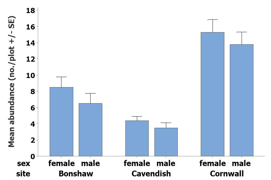
- Change colours in bars to help distinguish subgroups more easily
- Fix x-axis to look more professional
1. Bar colours
- Double click on any bar to open the edit bars dialogue
- Click on the tab for groups
You can assign attributes by group, so you can have bars from one group in one colour, and the bars from the other group in another colour. In this case, we’d like the bars for females to be a different colour than the ones for males, so select sex, and click OK
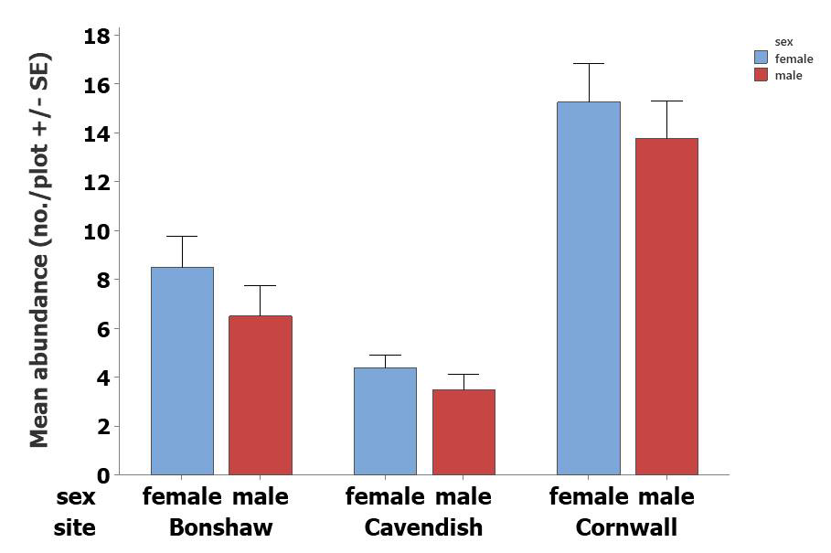
This gives a very colourful graph, with a Key included
- This means that if you wish to remove the “male” and “female from the x-axis labels, you can, and have the bars specified using the key. Alternatively, you can keep the labels in the x-axis, and delete the key.
- Click on one of the bars (you may have to click a second time to highlight all the bars in that group, then double click. That will let you enter the Edit bars dialogue just for that grouping.
- Check the box for Custom, then choose your bar colour. For this first one, pick Black
- Click OK
Now repeat for the bars in the second group. That will give you bars in two shades of grey (black and grey).
2. Fix x-axis
- Double-click on the axis labels (the words) to enter the “edit scale” dialogue. Click on the font tab to increase the font size, then click on the labels tab to type in better labels.
- Uncheck the boxes under Auto
- To remove the “male” and “female” and replace them with nothing, type in two sets of quotation marks with a space between them (i.e. “ ” “ ” )
- To change site numbers to site names, delete the numbers and type in the names, with a space between
- To remove the axis labels, just delete them. Click OK
This graph is in good shape now, but if you want to use the key (“legend”) it should have larger font.-
- Move the key to where-ever you would like by clicking and dragging it
Double click on the key to enter the edit legend dialogue.
- Change border to None to remove the box
- Click on Header Font to increase the font for the header (in this case “sex”)
- Click on Body Font to increase the font for the text in the key itself (i.e. male, female)
- Click OK
(You may have to resize the legend by clicking and dragging to get the larger font to show)
- Double click on each word if you want to modify the text.
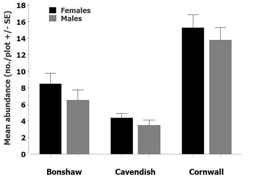
…. and you have a finished graph, ready for you to construct a figure legend.
Box and Whisker Plots
- Select Graph from the property bar, and choose Boxplot from the drop- down menu.
Note: For simple boxplots, the data must be set up so that each group is in an adjoining column
As with the bar charts, you can choose a simple plot, or one where the different y columns can be grouped together. In these examples, we’ll look at our chipmunk data and run through a simple and a grouped example.
Example 1: Simple boxplots with multiple Y-columns
- Select Multiple Ys, Simple and click OK
Select all the columns you want to graph (the data must be in adjoining columns)
Options for the Data View are shown at right.
- Most of the time, we just want the interquartile range box, and the outlier symbols
(Note: the outlier symbols plot as stars at the ends of the distribution to let us know if we have outlier values. They will only be present if we have unusually high or low values in our data set)
- Click OK
Your box plot before and after customization:
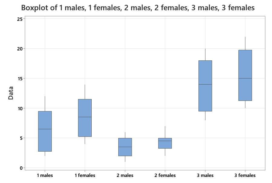
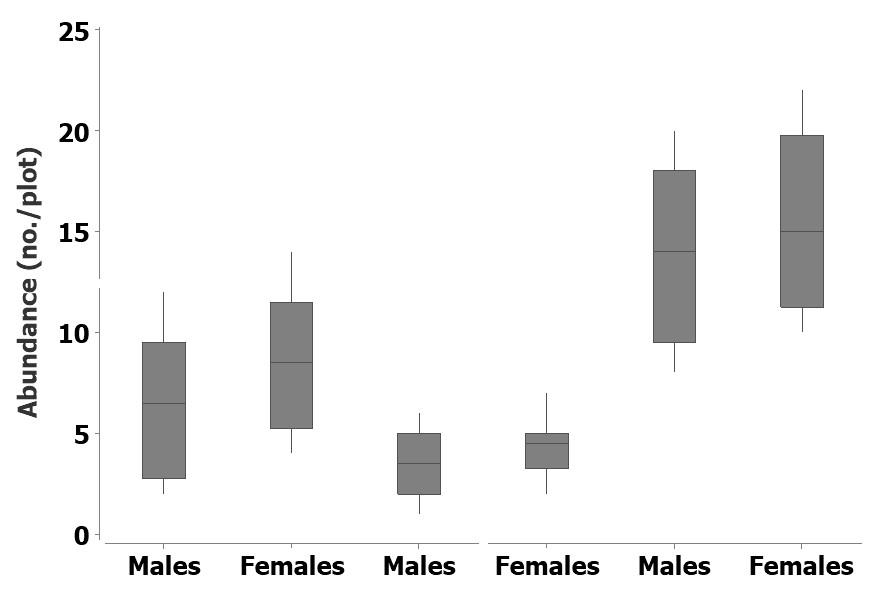
Example 2: Grouped boxplot with multiple Y-columns
NOTE: Data need to be in a single column, with grouping variables in separate columns to do grouped boxplots.
- Select Multiple Ys, with groups and click OK
Select your variables:
- The variable with your data is abundance, so that should go in the graph variable
- You are grouping by site first, then you want to see subgroups of sex, so put the grouping variables in that order.
Frequency Distributions
Frequency distributions not only give important biological data (such as how many fish fall into certain size or age classes), but are also used to help test assumptions about the mathematical “fit” of certain data. You have probably heard of the “normal” or “bell curve” distribution, for example… that is one type of a frequency distribution.
When frequency distributions are used to assess the shape (distribution) of the data, it is not usually necessary to worry about how axes are set up, since we just want to see the shape of the data. If they are being used to show actual data, however (like student mark distributions or sizes of fish or plants for life history analysis), we need to know how to modify the axes.
Frequency Histograms in Excel 2010
Frequency distributions are usually easy to do in statistical or graphing software packages, but can be much more difficult to do in spreadsheets such as Microsoft Excel. First you have to determine your intervals and type them in manually, then you have to use the computer to calculate the frequency distribution, and only then can you graph it.
Method:
Open the pulses dataset in Excel
Step 1. Determine your maximum and minimum values in your Excel dataset, so you can set your intervals. For example, in the pulses 1 column of the pulses dataset, the minimum value is 54 and the maximum value is 96.
- For this dataset, I would choose intervals that go from 50-55, 55-60, 60-65, and so on.
Important: we don’t want to count numbers twice, so what this really means is intervals that go from 50 to 54.9, 55 to 59.9, 60-64.9, and so on.
Step 2. Insert a couple of columns to the right of your Pulses 1 column. Now type your interval numbers into a blank column in your spreadsheet as shown at right (see example on next page).
Note: Just type the numbers from the left column of this example, since the right column is just an explanation of the left column numbers … i.e. what Excel is understanding from what you have typed
Your Excel spreadsheet should look something like this:
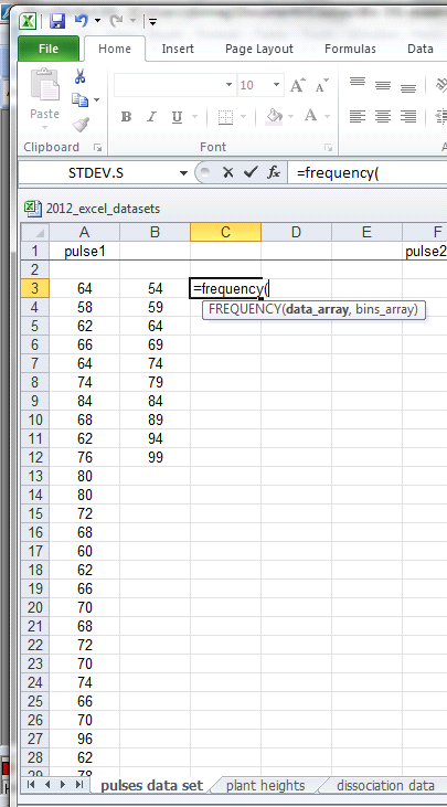
Step 3. Now click on the blank space beside the first interval on your spreadsheet, and type in =frequency(
“FREQUENCY(data_array,bin_array)” should appear as a small window below your cell. This means you must specify your data array first, and the bin array second to carry out the analysis.
- data array = the column with your data in it
- bin array = the column where you define your bins (intervals)
Specifying the data array
- First use your mouse to highlight the values in the pulse 1 dataset (your data array), then type in a comma
- Now use your mouse to highlight your bin values (the intervals), and type a closed bracket “)”
Note: these should include the rows with your interval numbers, plus one more.
- Press the down arrow.
A single number will appear. In this example, that should be the number 2
Starting at the cell with the single number, highlight the number of cells +1 (i.e. in this case, highlight 11 cells).
Step 4. Carrying out the frequency analysis:
- Press [F2], to make the formula appear again.
- Then press [control] [shift] [enter]. The frequency values should appear in the cells you highlighted.
Explanation:
- What this means is that there are 2 values between 50 and 54 (including the number 54, 3 between 5 and 59 (inclusive), and so on.
Graphing the frequency distribution:
- Highlight the data you want to graph.
- Choose the “insert” tab from the property menu, then pick the graph type you want. In this case we want a column chart, which is what Excel calls any graph that has vertical columns. Pick the simplest 2-D column graph type, and click on it.
Excel plots the rough graph opens up the Chart tools so you can modify your graph.
Checking Source Data
We highlighted our source data before beginning, so it should be okay. If you had not done this, or if you notice an error, you can click on Select Data on the Design tab, or right-click on the x-axis, and choose Select Data
- You can either type in the correct values, or click on the small red arrow beside the “Chart data range” window, to return to the spreadsheet to select your data (by highlighting).
- Highlight the appropriate data, if necessary, then click on the small red & blue box again, and that puts you back into the select data window. If all is now correct, click OK
Customize your graph:
i. Adding axis labels:
- Click on the layout tab of the Chart tools, and click on axis titles
- Choose the axis you want to add a label (title) to, and indicate where you want it by clicking on it. Do this for both the horizontal and the vertical axis.
- This action will place an axis title by each axis, and you’ll need to edit them to say what you want.
Right click on the axis title, and choose “Edit Text” from the drop-down menu. Then just type in what you want.
To change the font (e.g. to make it larger or to change the font type), click on “font”.
Do this for both axes.
This graph is still not suitable for presentation, however, since there is too much distance between the bars, the x-axis numbering is incorrect, and the borders and gridlines are not appropriate to a scientific graph.
To customize, we need to:
- Turn off the title & outer box
- Alter the x-axis so that our categories are indicated correctly
- Decide whether the bars should be touching or not, and if so, change them so they are
- Remove gridlines
ii. Turn off extraneous information
The title and bar “legend” (key) are redundant, so add nothing to our graph. Click on them and delete.
iii. Change the width and colour of the bars
- Right-click on any bar to access the Format Data Series dialogue. Click on it to open.
- Change the Gap Width from 150% to 0%
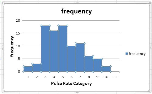
Now the default colour in Excel makes it hard to read, so that must be fixed.
Change the bar colour
- Still in the Format Data Series Dialogue, click on the Fill tab to change the colour to Grey by checking the Solid Fill and choosing a new colour from the drop down menu..
- Add a dark border to make the bars easer to see:
- Click on border color and to give the bars a black border.
- If necessary, make the border thicker in border styles
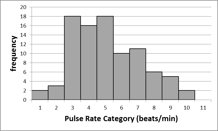
The graph is coming along, but still needs more work:
iv. Make sure tick marks are at edges of bars
Open the Format Axis window by right-clicking on the axis numbers on your graph, or by going into the Axes section under the Layout Tab, clicking on the axis you want to modify (e.g. horizontal for the x-axis), and choosing more primary horizontal axis options
- Type in new axis labels that match your data, following the instructions on the next page.
New Axis Labels
- Click anywhere on the graph to highlight it, then use the mouse to resize the graph so you have room to type your numbers below. (i.e. place your mouse on one of the resizing squares, and just shrink it upwards).
- Insert a text box from the Insert tab on the upper property bar
- Type in your new labels, based on the “bins” specified in your original spreadsheet. Remember that you set up your “bins” (intervals) so that your numbers would go up by fives, so be sure that your x-axis reflects this
v. Turn off gridlines:
- Select Gridlines from the Layout tab of the Chart Tools menu, then Primary Horizontal Gridlines
- Click on None or
- Click on the gridlines and press delete.
vi. Change font of axis numbers: Right-click on the axis numbers, then choose Font from the menu, and change your font so the numbers are large enough to see, and the font matches the rest of the document.
vii. Remove the box around the graph by right-clicking on the outer edge of the graph, then choosing “format chart area”, and turning off the border.
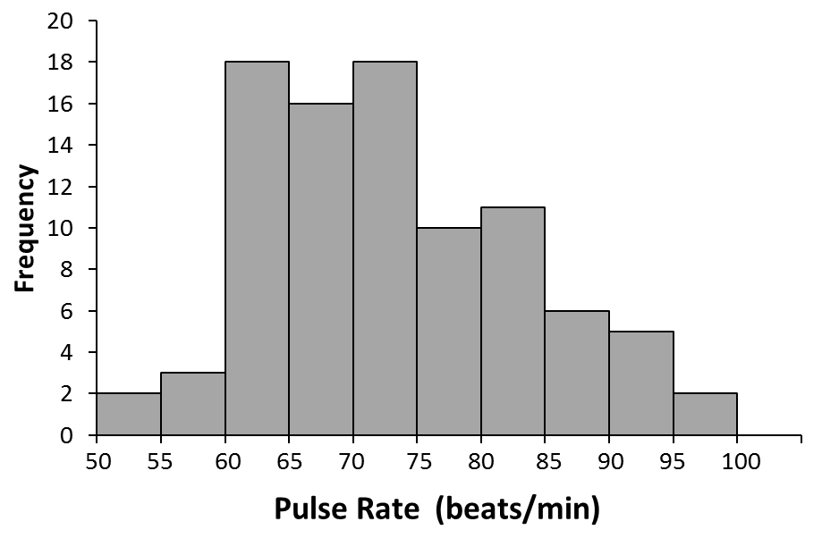
This is a publication quality graph. It clearly shows the frequency of individuals with the reported pulse rates, and a reader can understand the graph without having to read a lot of information in the text.
The figure legend finishes it off.
Fig. 1. Frequency distribution of resting pulse rates for a group of university students participating in a running experiment
Frequency Histograms with Minitab 21
Setting up the data:
Any statistical software program is set up so the data can be entered directly from your spreadsheet by copying and pasting. Spreadsheets are much easier to work with than the data entry screens of graphing or statistical packages, so get used to setting up the data in your spreadsheet, and then copying it into your graphing software. For this example, copy the Pulses dataset from Excel and paste it into the Minitab datasheet, and follow the instructions on p. 45 to type in your column headers.
Note about the Pulses Dataset: This dataset represents data from a group of physics students in a class in a large North American university. Students were asked to take their pulse rates (their “resting pulse”) then some of the students were asked to run in place for one minute. All students then took their pulse rates again. Following the exercise, all students were asked to indicate whether they were male or female, what their height and weight was, whether they smoked, and what their normal activity levels were.
Method:
To plot the frequency histogram for the Pulses 1 data (i.e. the pulse, in beats per minute, for the entire group prior to anyone running), first click on Graph, in the upper property bar. Then choose Histogram from the dropdown menu.
Pick the type of histogram you want to plot
To modify your graph, double click on the part of the graph you want to modify.
- To modify the bars, double-click on the bars:
i. Fill pattern and colour of bars:
- Under the “attributes” tab, you can modify the pattern of the bars, and the colour of the bars or border lines. Simply check the “Custom” box to make these changes
ii. Separate out groups: If you want to see various groups in your histogram, you can specify groups. In this example, I’ve specified grouping by sex.
(Note: The options tab lets you specify where the y-axis starts if you want to change that).
iii. Correcting x-axis numbering (‘bins’):
“Bins” are another name for your intervals or categories, so “binning” lets you alter how the intervals will look. This is where you can force your graph to have the x-axis intervals that your need to show your patterns.
“Midpoint” means that the computer takes the midpoint of your “bin” (category interval) and puts it right at the bottom of the bar.
- This is a poor way to display the data, since it implies that the frequency applies just to that value and not to the range of values.
“Cutpoint” means that the graph will be plotted showing the ranges of the values covered by each bar. You can:
- Let the computer choose these automatically
- Specify the number of intervals
- Specify the actual values that you want.
The best way to tailor your graph is to use “cutpoint” and to specify the ones you want, as shown at left.
- Now click ok
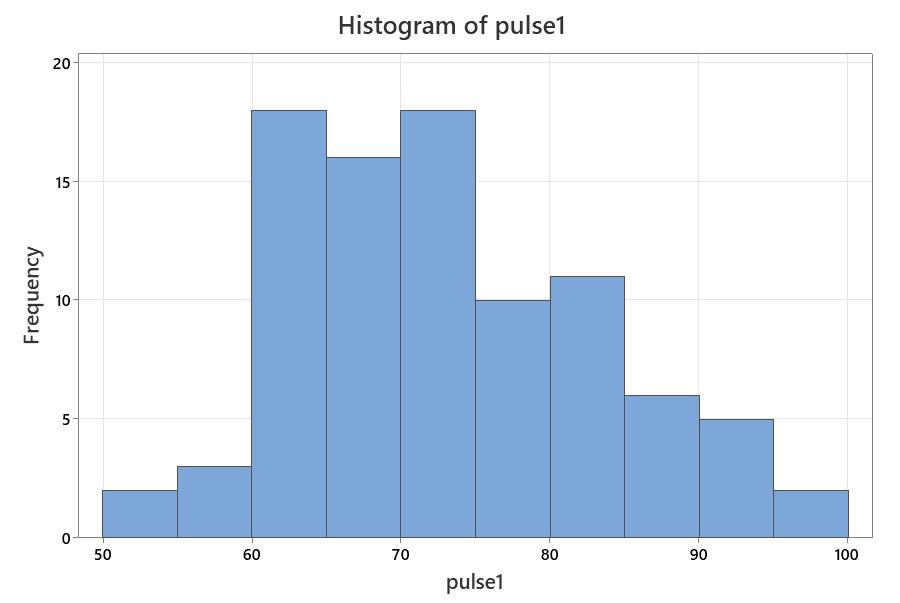
Your graph will now look like this:
The graph is now more valid scientifically, and can be customized to be suitable for including in a report or paper.
- Remove title: highlight and press delet
- Remove right and top axis lines Double click on the line you want to remove.
- In the “edit scale” dialogue, choose the “show” tab.
- Turn off the checkmark beside “high” for the axis line.
- Change axis numbers (intervals) so that there is a number for every bar:
- Double click on the axis again to get into the “Edit Scale” This time, pick the “Scale” tab.
- You can do this for either axis (or both), but the example at right is for the x
- Change “automatic” to “position of ticks” and type in the values you
- For this example, type in the values for each interval.
- Modify the axis title:
- Double click on the axis title, and change the font size or type, or type in a new label.
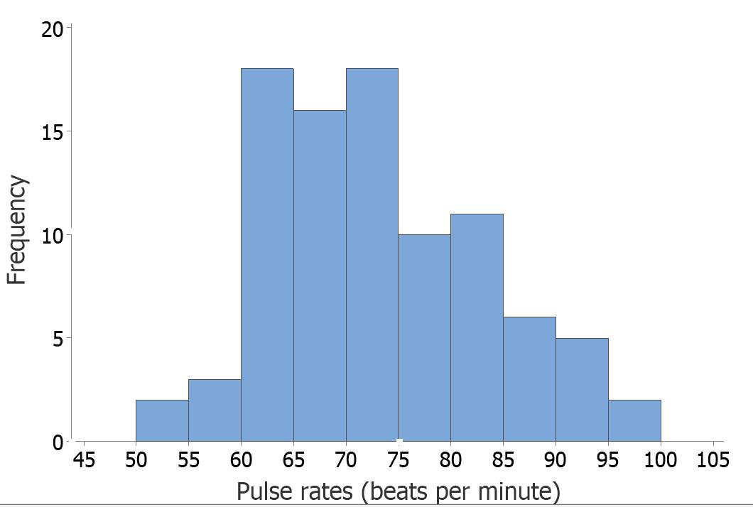
…and this gives you a pretty nice graph for your report (don’t forget the legend)

